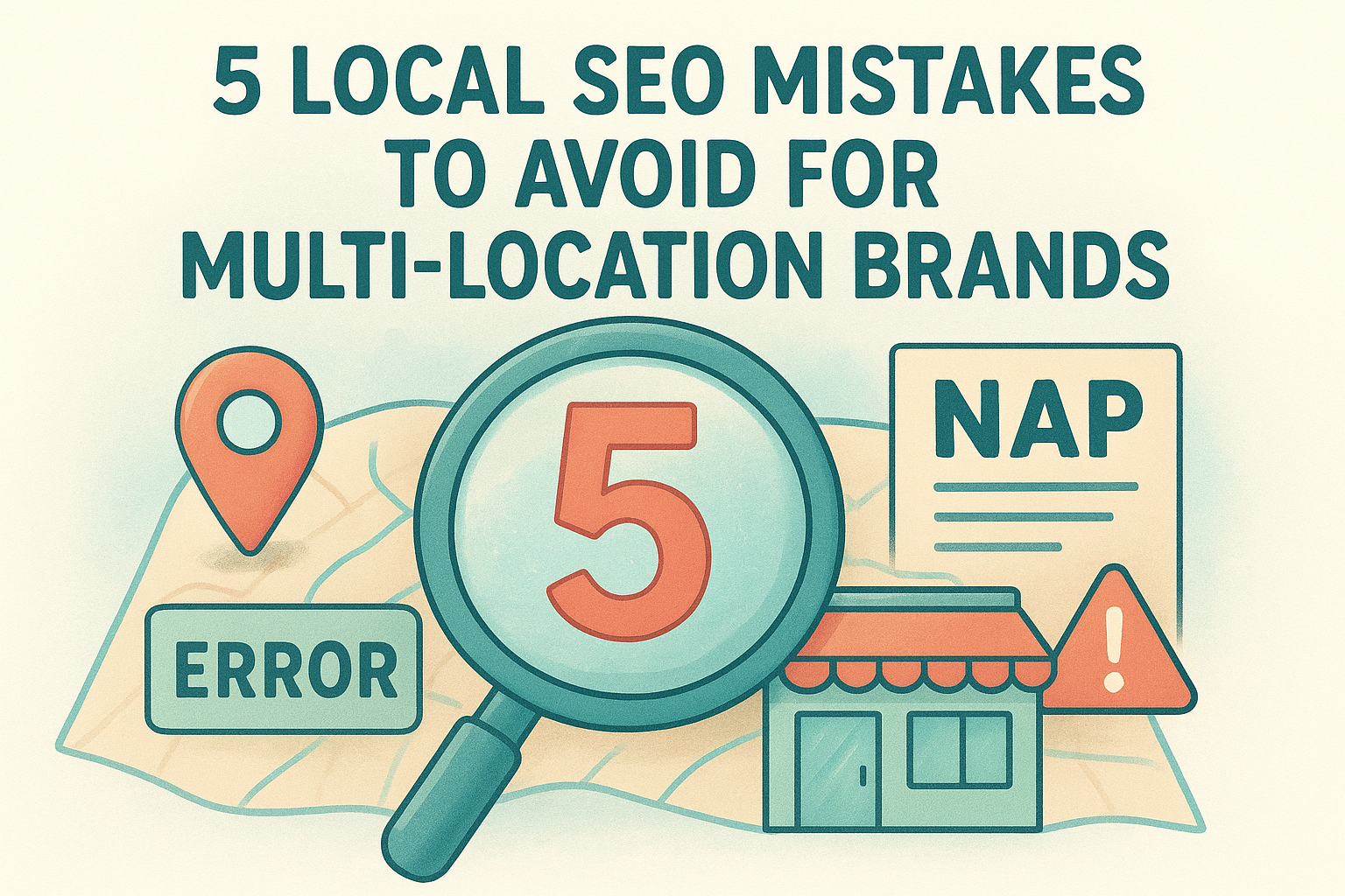
How To Create A High-Converting Landing Page That Converts
You're sending traffic to a page that looks decent, maybe even good, but the conversions aren't there. Clicks come in, visitors browse, and then they leave. If you've been wondering how to create a high converting landing page , the problem usually isn't your offer. It's the page itself. Most landing pages fail because they're built around what the business wants to say, not what the visitor needs to see in order to take action.
A high-converting landing page isn't a mystery. It's a combination of structure, clarity, and intentional design choices, each one backed by real principles that drive visitor behavior . From headline placement to call-to-action buttons, every element either moves someone closer to converting or gives them a reason to bounce. The difference between a page that converts at 2% and one that converts at 10%+ often comes down to details most businesses overlook .
At Multi Web Team, we build and manage custom websites for multi-location businesses and franchises, and landing pages are a core part of that work. We've seen firsthand what separates pages that perform from pages that just exist. This guide breaks down the full anatomy of a high-converting landing page , walks you through each essential element, and includes real-world examples you can learn from. Whether you're building your first landing page or reworking one that's underperforming, you'll walk away with a clear framework to get it right.
What a high-converting landing page is and is not
A landing page is a standalone web page built around a single purpose: getting one specific type of visitor to take one specific action. That action might be filling out a contact form, booking a call, downloading a resource, or making a purchase. What makes it "high-converting" is not flashy design or long copy. It's how precisely every element on the page serves that single goal . Nothing on the page should compete with or distract from that objective. When every word, image, and button works toward the same outcome, conversion rates rise.
A high-converting landing page removes every possible reason for a visitor to leave without taking action.
What a landing page actually is
A landing page is purpose-built. Visitors arrive on it from a specific source , whether that's a paid ad, an email campaign, a social post, or an organic search result. Because you know where they came from and what they were promised before they clicked, you can design the entire page around that specific expectation . This is what separates a landing page from a general website page: the context is controlled, the message is focused, and the path forward is singular.
When you think about how to create a high converting landing page, the core idea is alignment. Every sentence on the page should reinforce the same message: here is what you get, here is why it matters, and here is how to claim it. A strong landing page typically includes these core elements:
- A headline that matches the ad or link the visitor clicked
- A clear value proposition that explains the benefit in plain terms
- Social proof such as testimonials, reviews, or verifiable results
- A form or CTA button that makes the next step obvious and low-effort
- Trust signals like credentials, guarantees, or recognizable client logos
What a landing page is not
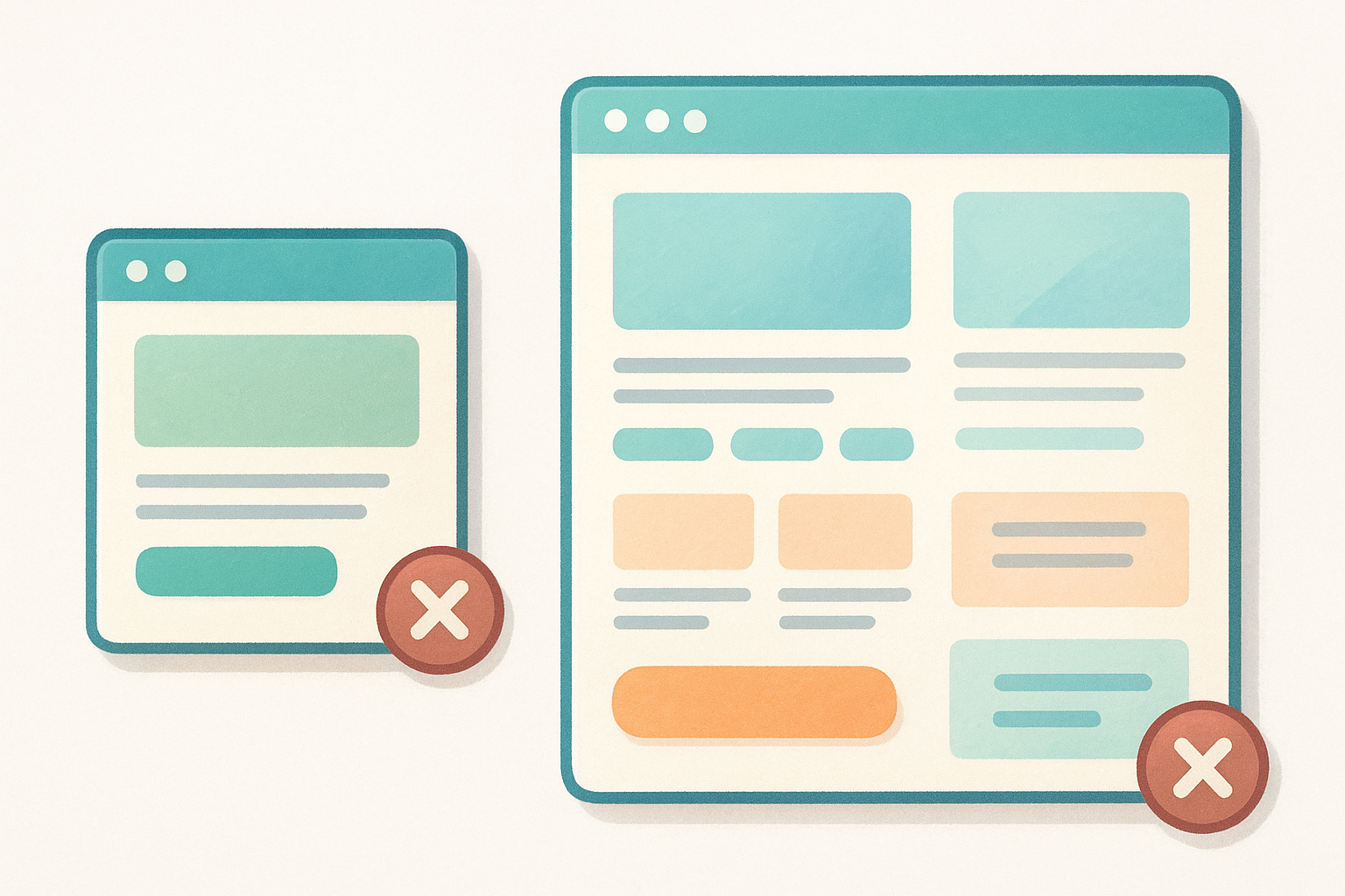
Many businesses treat their homepage or a general service page as a landing page, and this almost always hurts conversion rates . Those pages serve multiple audiences with multiple goals at the same time. A homepage has full navigation menus, links to blog posts, general brand messaging, and a dozen different paths to exit. All of that works against the focused attention a landing page needs to guide a visitor toward one decision.
Here is a direct comparison to help you see the difference clearly:
| Feature | Landing Page | General Website Page |
|---|---|---|
| Navigation menu | Removed or minimal | Full site navigation |
| Goal | Single conversion action | Multiple purposes |
| Audience | Defined and segmented | Broad and varied |
| Incoming traffic | Controlled source (ad, email) | Multiple uncontrolled sources |
| CTA | One repeated action | Multiple competing links |
| Content focus | Specific offer or campaign | General brand or service info |
Your landing page also is not a one-size-fits-all template you drop content into and leave alone. The page needs to reflect the specific audience segment you're targeting with each campaign. A franchise owner responding to a local paid ad has different concerns and questions than a national brand manager who found your services through an organic search result. Treating both visitors the same way, on the same page, with the same message is one of the most consistent reasons landing pages fail to convert at a meaningful rate. Build each page for one audience, one source, and one goal.
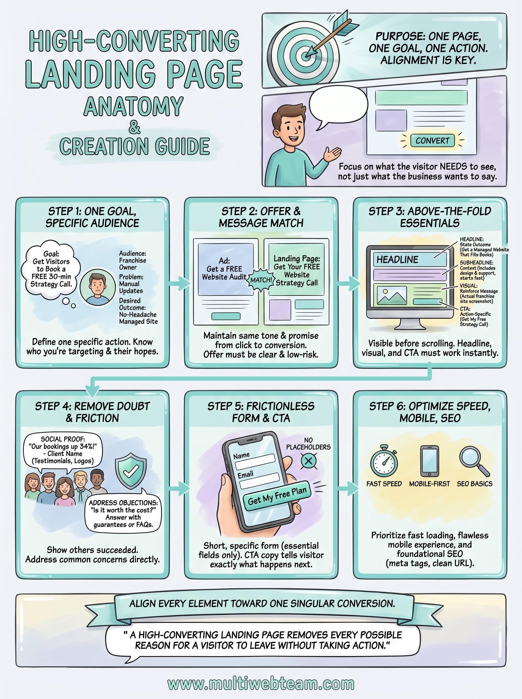
Step 1. Choose one goal and define your audience
Before you write a single headline or pick a color scheme, you need to lock in one conversion goal and get specific about who you're trying to convert . This is the foundation of how to create a high converting landing page that actually performs. Without a defined goal and a clear audience profile, every other decision you make on the page becomes a guess.
Define the single action you want visitors to take
Your page can only serve one purpose. If you want visitors to book a call, the page should drive them to book a call. If you want them to download a checklist, every element should point toward that download. Mixing two goals , like asking visitors to both schedule a demo and sign up for a newsletter, splits their attention and drops your conversion rate on both actions .
The moment you add a second goal to a landing page, you cut the effectiveness of the first one.
Be specific when you define that goal. "Get leads" is not a goal. "Get visitors to submit a contact form requesting a free 30-minute consultation" is a goal. Write it out in one sentence before you build anything else. Then test every element you add against that sentence: does this move someone closer to submitting that form, or does it distract them?
Build a profile of the visitor you're targeting
Once your goal is set, you need to know exactly who you're building this page for . Not a vague category like "small business owners," but a specific person: what problem brought them to this page, what they already know, what they're afraid of, and what outcome they're hoping for . The more precisely you define that visitor, the more directly you can speak to them.
Use this quick-profile template before you build your page:
| Question | Your Answer |
|---|---|
| Where is this visitor coming from? | (e.g., Google Ads, email campaign, Facebook ad) |
| What did they see or read before clicking? | (e.g., ad headline, email subject line) |
| What problem are they trying to solve? | (e.g., too many manual website updates) |
| What objection will they have? | (e.g., "Is this worth the monthly cost?") |
| What does success look like for them? | (e.g., a fully managed website with no headaches) |
Fill this out for each campaign separately. When you treat different audience segments as the same visitor, your messaging turns generic, and generic pages do not convert .
Step 2. Build an offer and message match
When someone clicks your ad or email link, they arrive with a specific expectation . Message match means your landing page immediately confirms that expectation. If your ad says "Get a free website audit," your headline should say something very close to that. Breaking this match is one of the fastest ways to lose a visitor within the first three seconds they spend on your page.
What message match means in practice
Message match is not just about repeating the same words from your ad. It is about maintaining the same tone, promise, and visual context across the entire journey from click to conversion. A visitor who clicked a Google Ad promising a discount for franchise websites should land on a page that leads with that discount, not a generic service overview. Misalignment at this stage creates doubt , and doubt kills conversions before you ever get a chance to make your case.
The second your page contradicts what your ad promised, your visitor starts looking for the exit.
Use this message match checklist to audit your current or planned pages before you publish:
- Does your headline directly reflect the ad headline or email subject line?
- Does the opening paragraph reinforce the specific offer mentioned in the ad?
- Do the images or visuals match the context of the campaign?
- Is the CTA language consistent with the action promised before the click?
How to define and present your offer
Your offer is what you give the visitor in exchange for their action. A weak or vague offer is one of the main reasons pages fail even when the traffic quality is solid. When thinking about how to create a high converting landing page, the offer needs to be specific, immediately clear, and low-risk to accept. "Contact us" is not an offer. "Book a free 20-minute call and receive a custom website plan for your franchise " is an offer.
Structure your offer using this template before you write a single line of body copy:
| Offer Element | Example |
|---|---|
| What they get | Free 30-minute website strategy call |
| Who it is for | Multi-location business owners |
| What it costs them | Nothing upfront |
| What happens next | A custom action plan delivered within 24 hours |
Filling in each row keeps your offer concrete and stops you from burying the value in language that visitors have to decode on their own.
Step 3. Write the above-the-fold section that works
The above-the-fold section is everything visible before a visitor scrolls . Most visitors decide within three to five seconds whether to stay or leave, which means your headline, subheadline, visual, and primary call-to-action button all need to do real work the moment the page loads . If this section fails to hold attention immediately, the strength of the rest of your page becomes irrelevant.
Write a headline that states the outcome, not the feature
Your headline is the single most important line on the page. When thinking about how to create a high converting landing page, the headline must state a clear outcome or benefit , not a description of what you do. "Custom Websites for Franchise Businesses" describes a service. "Get a Fully Managed Website That Fills Your Locations' Appointment Books" states a result. Visitors respond to outcomes , not features, so write your headline around the transformation they gain, not the product you sell.
Use this checklist to test any headline before you publish:
| Headline Test | Pass or Fail |
|---|---|
| Does it state a specific benefit or outcome? | |
| Is it free of industry jargon or vague terms? | |
| Does it match the ad or source that sent traffic here? | |
| Can a first-time visitor understand it in under five seconds? |
A headline that makes someone say "that's exactly what I need" is the only headline worth keeping.
Place your subheadline, visual, and CTA with purpose
Your subheadline exists to support the headline by adding one layer of specific context or clarification . It should answer the most immediate follow-up question the visitor has after reading the headline. If your headline promises a fully managed website, the subheadline might explain who qualifies, what is included, or how fast they can get started . Keep it to two sentences or fewer. Any longer and it starts competing with the headline for attention.
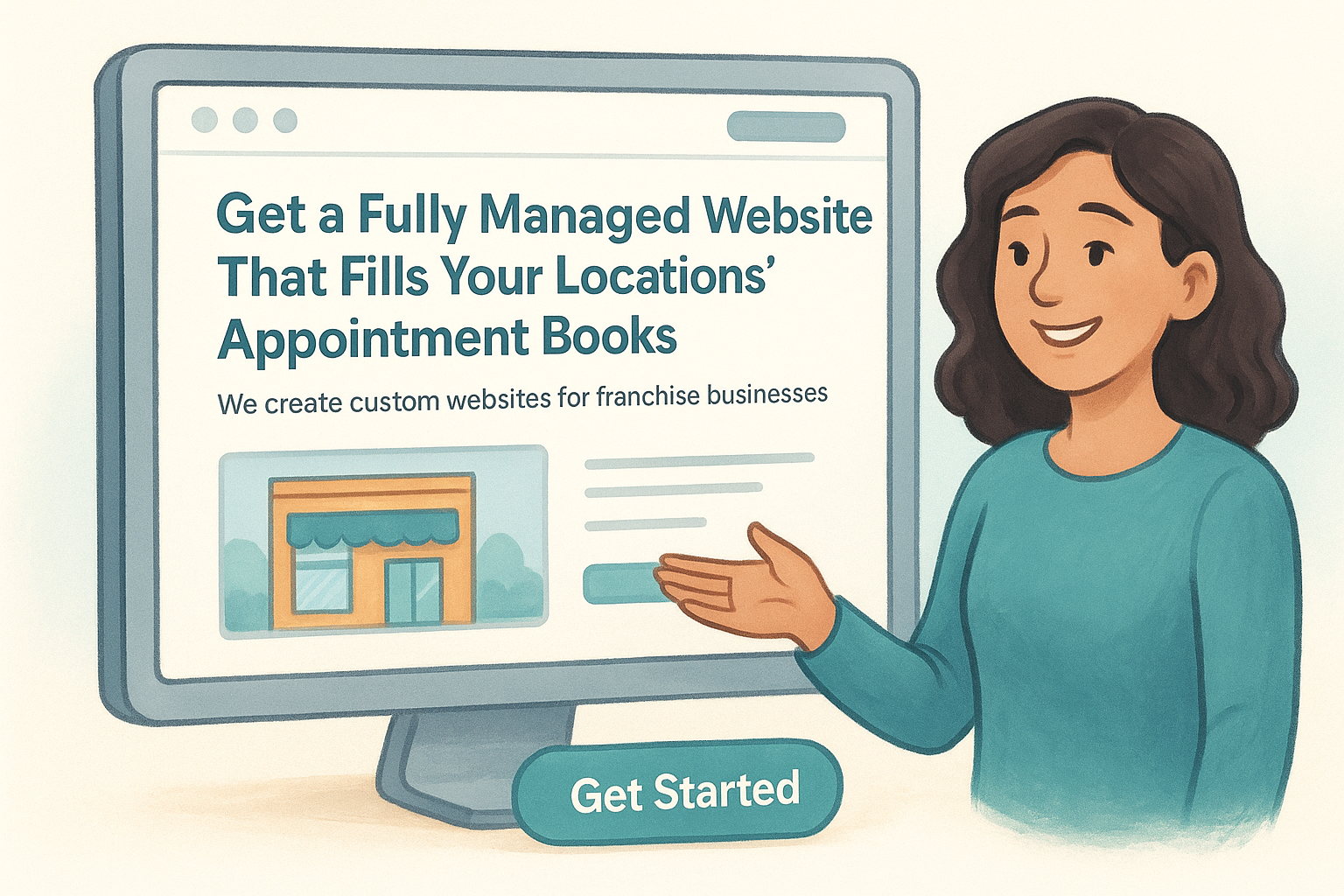
The visual you place above the fold should reinforce the message rather than decorate the page. A generic stock photo of a smiling person using a laptop tells visitors nothing useful. A clean screenshot of an actual franchise website you built immediately shows them what they are getting. Match every visual directly to the specific outcome your headline promises.
Place your CTA button within the visible area so it requires no scrolling to find. Use action-specific language on the button itself. "Get My Free Strategy Call" converts better than "Submit" or "Contact Us" because it tells visitors exactly what happens the moment they click , removing uncertainty and lowering the mental effort required to take that step.
Step 4. Add the sections that remove doubt and friction
After a visitor gets past your above-the-fold section, they don't immediately convert. They scroll. They look for reasons to trust you, reasons to believe the offer is real, and reasons to feel safe taking that next step. When you understand how to create a high converting landing page, you recognize that the sections below the fold exist for one purpose : to remove every doubt and reduce every point of friction standing between the visitor and your CTA. If you skip this work, even a strong headline and offer won't be enough to close the gap.
Use social proof to show others have succeeded
Visitors arrive skeptical. They've seen promises before, and your job is to show them that real people with real problems have already gotten results from what you're offering. Social proof does this more efficiently than any benefit statement you write yourself. Testimonials, case studies, client logos, review scores, and specific results all serve the same function: they shift the visitor's mental frame from "I wonder if this works" to "other people like me already trust this."
The moment a visitor sees someone like themselves getting results, their doubt shrinks and their confidence in converting rises.
When you add testimonials, make them specific and outcome-focused rather than generic. Use this template to collect testimonials that actually move visitors:
| Testimonial Element | Example |
|---|---|
| Who said it | Name, title, and business type |
| What problem they had | "We were managing five locations with no web support" |
| What result they got | "Our appointment bookings went up 34% in two months" |
| Why they'd recommend you | "The team handles everything so we don't have to think about it" |
Address objections directly before they stop the conversion
Every visitor reading your page carries a set of unspoken objections : Is this too expensive? Will this work for my type of business? What happens if I don't like the results? If you don't address these questions inside the page copy, visitors leave to find answers somewhere else, and most of them don't come back. Identify the three most common objections your audience has and handle each one with a direct response, a guarantee, or a clarifying statement placed in its own section.
An FAQ block below your main content handles secondary objections in a format that's easy to scan and quick to read . Keep each answer short, direct, and free of filler language. A single clear sentence often outperforms a full paragraph because it respects the visitor's time and keeps them moving toward your CTA.
Step 5. Design the form and CTA for easy action
The form and CTA button are where conversion actually happens. Everything else on the page builds toward this moment, so if your form asks too much or your button says too little, you lose visitors who were ready to act. The form and CTA need to be frictionless by design , meaning the visitor completes this step without stopping to think or second-guess themselves . Length, label clarity, button copy, and placement all affect whether someone follows through or abandons the page at the last step.
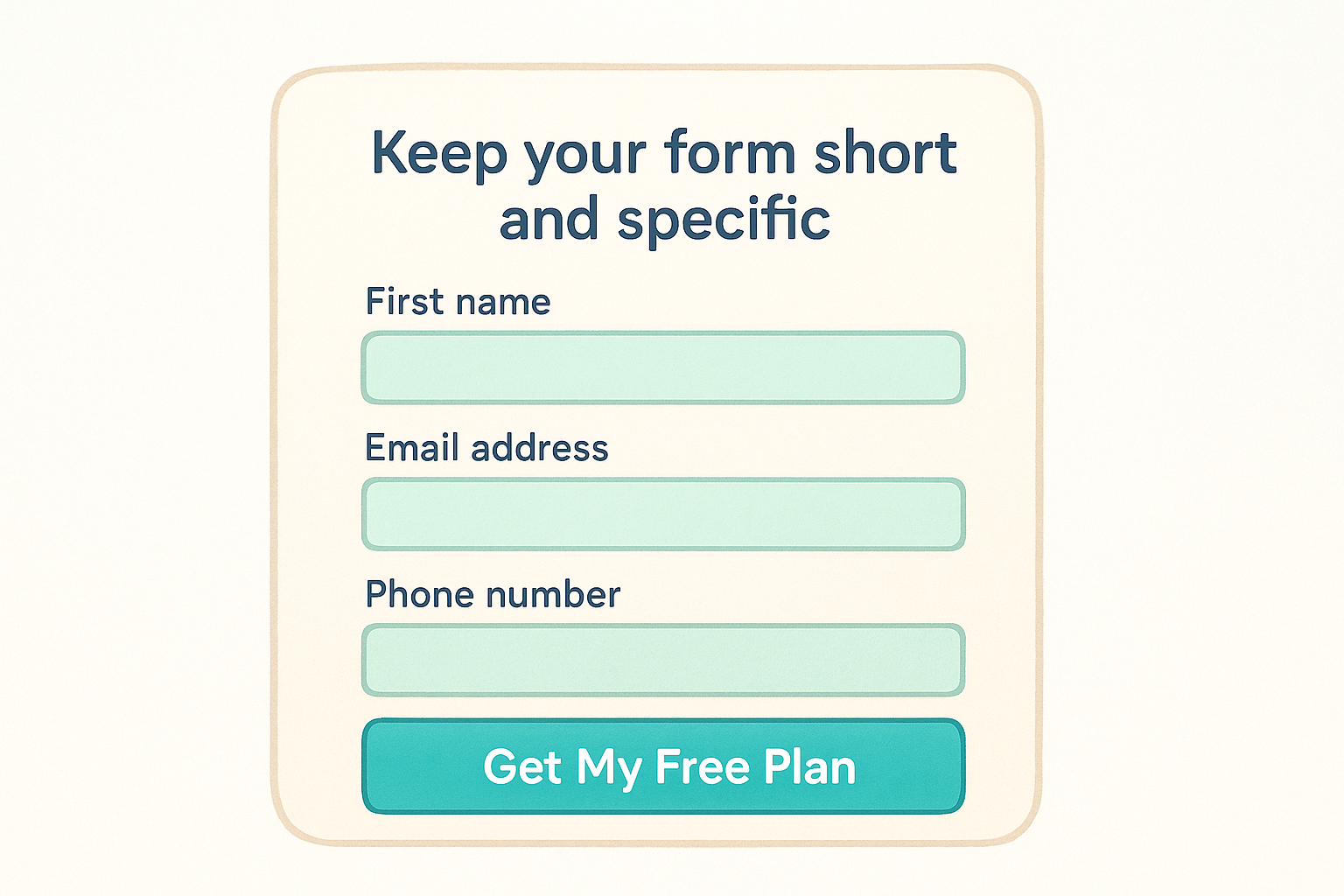
Keep your form short and specific
Most forms ask for more information than the conversion actually requires. Asking for a phone number, company size, number of locations, budget range, and best contact time all in one form adds friction with every additional field . Research from marketing studies consistently shows that reducing form fields increases submission rates. Start by asking only for what you need to take the next step, and collect everything else after the visitor has already converted.
The more fields you add to a form, the higher the cost you impose on the visitor before they receive any value.
Use this form field template as a starting point and remove any field your team does not actively use within 48 hours of receiving a submission:
| Field | Include? | Reason |
|---|---|---|
| First name | Yes | Personalizes follow-up |
| Email address | Yes | Required for any follow-up |
| Phone number | Optional | Only if your team calls leads |
| Company name | Optional | Only if B2B and relevant |
| Number of locations | Only if essential | Adds friction; collect post-conversion |
| Message or notes box | Avoid | Open fields increase abandonment |
Label each field clearly above the input box, not as placeholder text inside it. Placeholder text disappears the moment someone starts typing , which forces them to remember what belongs in that field and creates unnecessary confusion.
Write CTA copy that removes hesitation
Your CTA button copy should tell the visitor exactly what happens the moment they click , not just prompt a generic action. "Submit" tells them nothing. "Get My Free Website Plan" tells them precisely what they receive. Write your button label from the visitor's perspective, using first-person language to make the action feel personal and immediate.
Test your button copy against these four standards before you publish:
- Is it action-specific? The visitor knows what they are getting, not just what they are doing.
- Is it outcome-focused? The copy references the benefit, not the process.
- Is it low-risk in tone? Words like "free," "no commitment," or "instant" reduce hesitation.
- Is it consistent with the offer stated in your headline and subheadline?
Place the CTA button in a high-contrast color that stands out from the page background, and repeat it at the bottom of the page so visitors who scroll all the way through never have to scroll back up to convert.
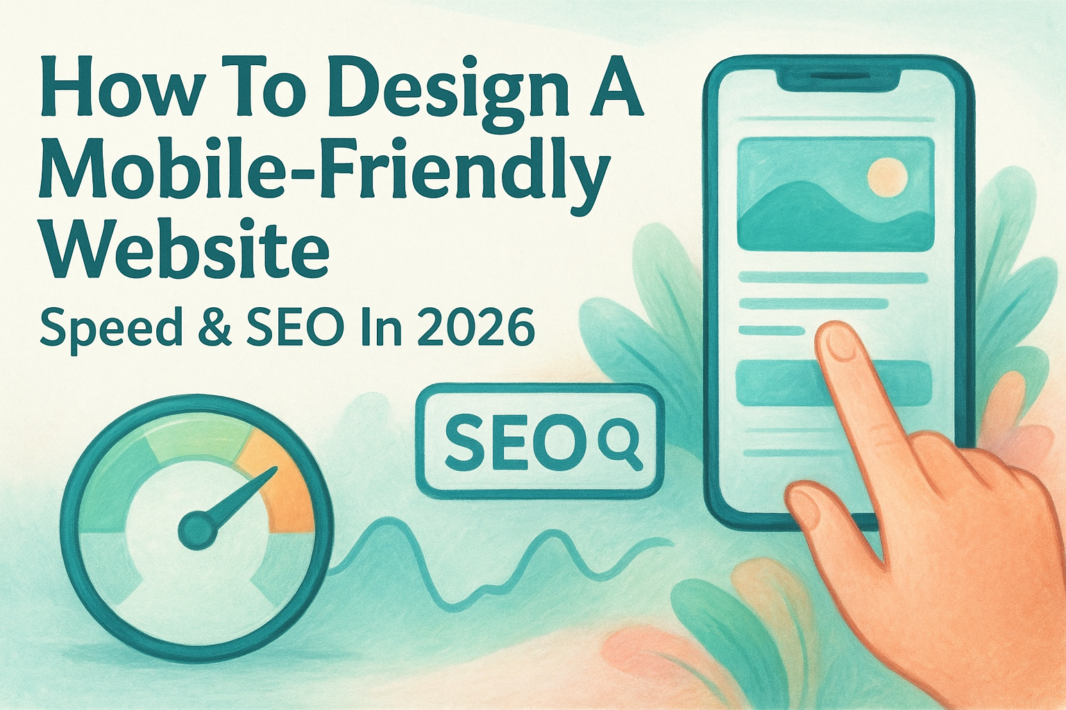
Step 6. Optimize for speed, mobile, and SEO basics
A landing page that converts well on paper still fails if it loads too slowly, breaks on a phone screen, or never reaches the right visitors through search. When you're thinking about how to create a high converting landing page, technical performance is not optional. These three areas, speed, mobile usability, and basic SEO, directly affect whether your page gets seen and whether visitors stay long enough to convert once they arrive.
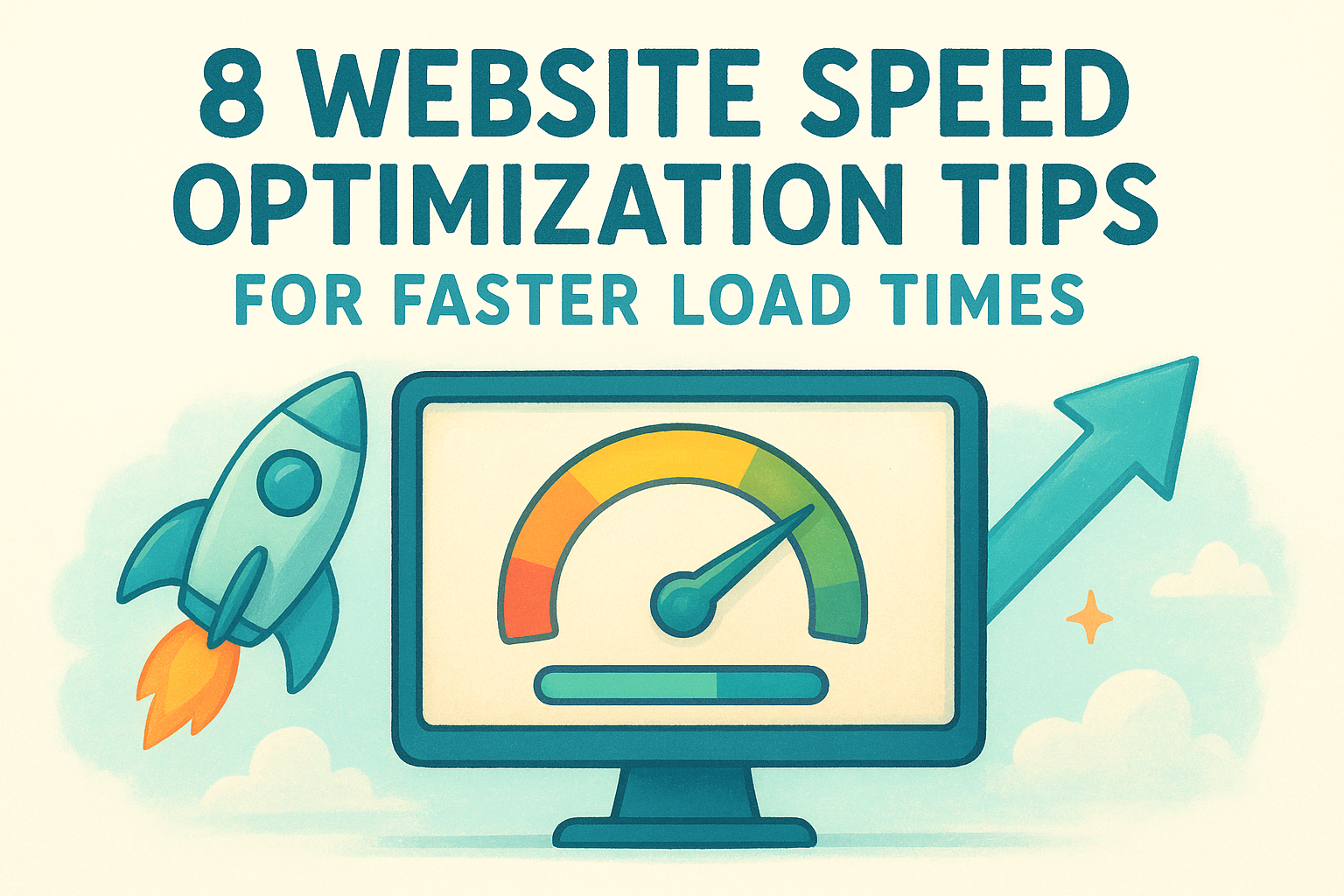
Speed kills conversions when your page loads slowly
Every second of load time costs you visitors. Google's research shows that as page load time increases from one second to three seconds , the probability of a visitor bouncing increases by 32%. At five seconds, that number jumps significantly. You don't need a perfect score, but you need a fast enough page that visitors don't leave before it finishes loading.
A page that takes four seconds to load has already lost a significant portion of the audience your ad budget paid to reach.
Run your page through Google PageSpeed Insights and focus on fixing the issues flagged as high-impact. The most common culprits are uncompressed images, too many third-party scripts, and render-blocking resources in the page header. Compress every image before uploading, defer scripts that aren't needed on initial load, and use a content delivery network if your hosting supports one.
Design for mobile before desktop
More than half of all web traffic now comes from mobile devices , which means your landing page must function flawlessly on a small screen before you worry about how it looks on a monitor. Use the following checklist to audit your page for mobile readiness before you publish:
| Mobile Check | What to Look For |
|---|---|
| Text size | Body text reads clearly at 16px or larger |
| Button size | CTA buttons are at least 44px tall and easy to tap |
| Form fields | Input boxes are large enough to tap without zooming |
| Images | Visuals scale and crop correctly on narrow screens |
| Load time | Page loads in under three seconds on a 4G connection |
Apply the SEO basics that help the right visitors find your page
Paid traffic is not the only source of visitors. Organic traffic from search adds long-term value without ongoing ad spend, and a few foundational SEO choices make a real difference in whether your page ranks for relevant queries. Write a meta title and meta description that include your primary keyword and clearly describe what the visitor receives. Use one H1 tag, which is typically your headline, add descriptive alt text to every image, and build a clean URL slug that reflects the page topic rather than a string of numbers or random characters.
Wrap-up and next steps
Now you have a complete framework for how to create a high converting landing page that actually moves visitors to take action. Every step in this guide builds on the one before it: a clear goal and audience profile gives your offer direction, message match keeps visitors from bouncing, and a focused above-the-fold section earns their attention long enough to make your case. From there, removing doubt, simplifying your form, and optimizing for speed and mobile closes the gap between a visitor who is curious and one who converts.
Put this into practice one page at a time. Pick your highest-priority campaign, work through each step, and measure the results before scaling. If you run a multi-location business and want a team that handles the design, optimization, and ongoing management for you, Multi Web Team builds and manages custom, conversion-focused websites built specifically for franchises and growing businesses.