10 Best Website Design Examples For Lawyers In 2026
Most law firm websites look the same. A stock photo of a handshake, a wall of legal jargon, and a contact form nobody fills out. If you are searching for best website design for lawyers , you already know that generic template will not win you clients or make you stand out from the firm down the street.
This list skips the theory and shows you real examples. You will see how top-performing law firm sites handle practice area pages , build trust with potential clients in the first five seconds, and turn visitors into consultations instead of bounces. Each example breaks down what actually works, from navigation choices to the way firms present case results and attorney bios.
Whether you run a solo practice or manage marketing for a firm with several offices, you will walk away with a clear picture of what separates a forgettable site from one that generates leads. We also point out multi-location considerations for firms with several branches, since local visibility matters just as much as design. By the end, you will know exactly what to ask for when you brief your next redesign.
1. Multi Web Team for multi-location law firms
If your firm operates across multiple cities or has satellite offices staffed by different attorneys, most web design studios will hand you a single homepage and call it done. Multi Web Team builds differently. The agency designs one cohesive site architecture that still lets each office rank and convert on its own, which is exactly the gap most law firm websites fail to close when they expand past one location.
Design highlights
Every location gets its own dedicated page with a local phone number, office photos, attorney headshots, and directions, but the pages share the same visual language so the firm feels like one brand, not five disconnected microsites. Multi Web Team structures practice area pages so they can be duplicated and localized per city without duplicate-content penalties, and the navigation adapts based on where a visitor lands, showing nearby offices first. The design leans on clean typography, clear calls to action above the fold, and fast-loading pages, since slow sites push potential clients straight to a competitor's contact form.
A multi-location law firm website only works if every office feels local while the brand still feels like one firm.
Here is how the core structure typically breaks down for a firm with multiple locations:
| Element | Purpose |
|---|---|
| Central homepage | Establishes firm-wide branding and overall trust signals |
| Location pages | Local SEO targeting, office details, local attorney bios |
| Shared practice area templates | Consistent messaging, localized per office |
| Unified contact system | Routes leads to the correct office automatically |
Who it's for
This approach suits firms with two or more offices, franchised legal brands, or personal injury and family law practices expanding into new metro areas. It also fits firms that have tried managing multiple location pages themselves and ended up with outdated content, mismatched branding, or pages that never rank locally because nobody had time to optimize them. If your marketing team already juggles case intake, court dates, and client calls, adding website maintenance to that list rarely goes well.
Multi Web Team's subscription model removes the upfront cost barrier that usually stops smaller firms from building a proper multi-location presence. Instead of paying a large design fee and then per-hour rates for every update, firms pay one monthly subscription that covers design, unlimited content changes, and ongoing SEO management for every office listed on the site. That matters for firms adding a new location every year or two, since the site structure already supports growth instead of requiring a rebuild each time.
What you can learn from it
The biggest lesson here is that location pages cannot be an afterthought. Many firms bolt on a "Locations" page late in the process, and it shows: thin content, no local trust signals, and no localized calls to action. Study how Multi Web Team treats each office page as a mini-homepage with its own conversion goal instead of a directory entry.
Copy the pattern of separating brand consistency from local relevance. Your firm-wide colors, logo, and messaging should stay identical across every page, but the details, testimonials, and even the attorney featured should change based on the office a visitor is viewing. This is the same principle behind the best website design for lawyers with multiple branches: consistency builds trust, localization builds rankings and relevance. If you skip either half, you end up with a site that either feels generic everywhere or fractured and off-brand depending on which office page someone lands on.
2. Dolman Law Group's content-driven design
Dolman Law Group built its personal injury site around a library of detailed, plain-English articles instead of thin service pages padded with keywords. Content depth is the whole strategy here: every practice area links to guides that answer the questions a real accident victim types into Google at 2 a.m., like how long a claim takes or what happens if an insurer denies a claim. That approach turns the website into a resource people bookmark, not just a page they bounce from after reading a paragraph of boilerplate.
Design highlights
The layout stays simple on purpose so the content can carry the weight. Clean headers break up long-form pages, internal links connect related articles to practice area pages, and a persistent contact bar keeps a phone number and chat option visible no matter how far someone scrolls. Visual hierarchy does a lot of the work: bold subheadings and short paragraphs make dense legal information skimmable, which matters when most visitors are stressed, in pain, or reading on a phone in a waiting room.
A law firm site that answers questions before a client asks them earns trust faster than one that only asks for a phone call.
Who it's for
This model fits firms with the bandwidth to produce and update legal content regularly, since a content-driven site goes stale fast without fresh posts and updated statutes. Personal injury, mass tort, and other high-competition practice areas benefit most, because organic search traffic in those niches rewards firms that publish more useful information than the ten other firms bidding on the same keywords. It also suits firms already running a blog or FAQ page that never gets the SEO structure it deserves.
What you can learn from it
Follow the pattern of building topic clusters instead of standalone pages. Group related questions under one practice area, link them together, and update older posts instead of only publishing new ones. Notice, too, how the design avoids clutter: no popups fighting for attention, no auto-playing video, just clear paths from a question to an answer to a contact form. If your firm already writes client-facing content, audit whether it actually links back to a page that converts, or whether it dead-ends without a next step.
3. Bick Law's bold environmental law branding
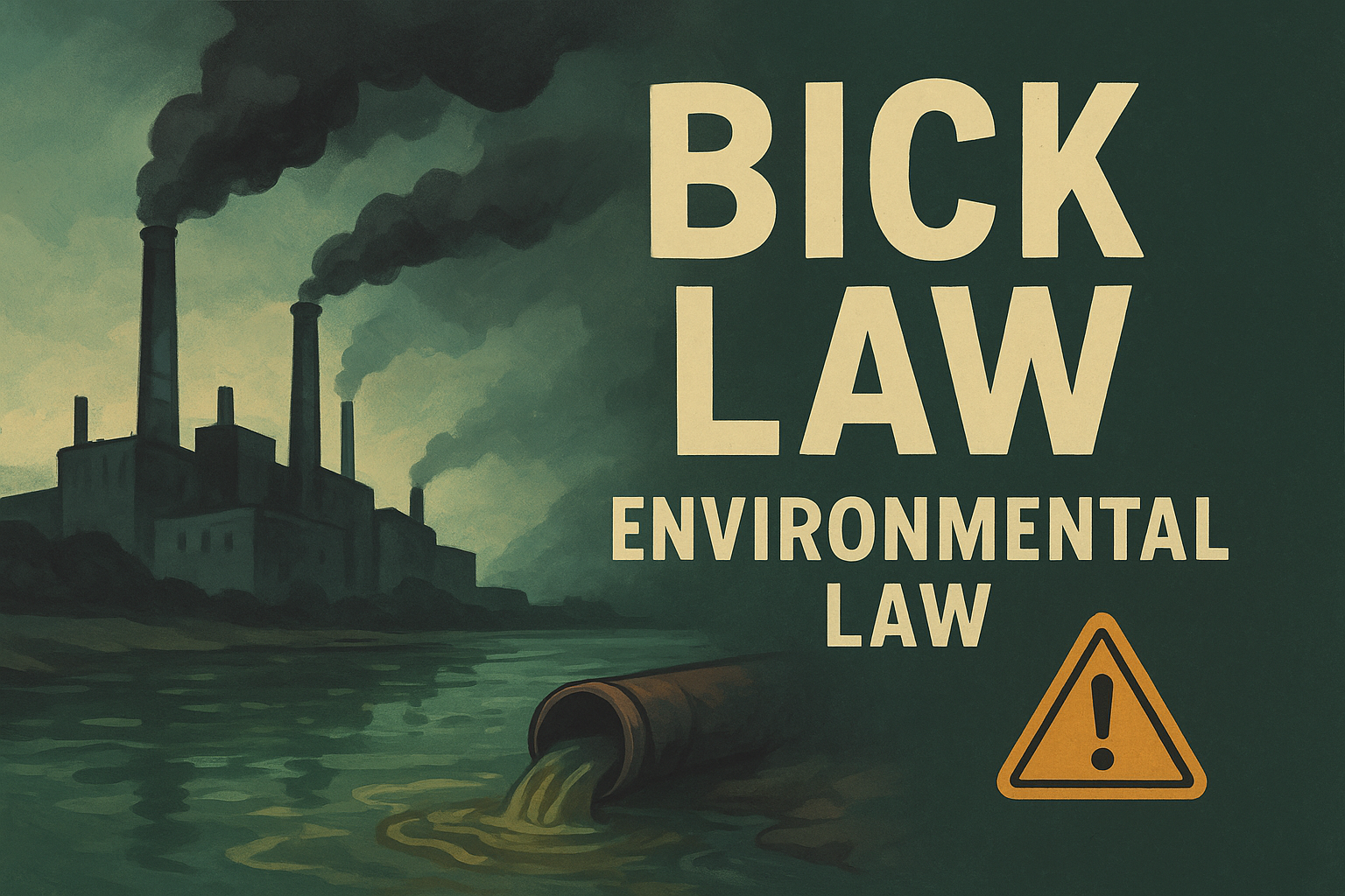
Bick Law handles toxic exposure and environmental contamination cases, and the site refuses to look like a generic personal injury template. Dark, moody photography of industrial sites and polluted water paired with a stark color palette sets the tone before a visitor reads a single word. This is branding built for a specific fight, not a firm trying to appeal to everyone with a legal problem.
Design highlights
The homepage leans on strong imagery instead of stock photos of gavels or handshakes, using real environmental scenes that mirror what a client experienced. Bold typography in oversized headers pairs with a limited color scheme of blacks, greens, and warning-style accents that reinforce the environmental danger angle without needing extra copy to explain it. Case results appear early and often, formatted in short, scannable blocks rather than buried in a testimonials page, so visitors see proof of results within seconds of landing.
A niche legal brand should look like it was built for one fight, not adapted from a template for every practice area.
Navigation stays narrow on purpose. Instead of a dozen practice area links, Bick Law limits menu items to the handful of contamination and toxic exposure cases it actually handles, which keeps the site focused and signals real specialization instead of a firm trying to be everything to everyone.
Who it's for
This approach fits firms with a genuine niche practice area, especially ones tied to a specific type of harm, industry, or ongoing litigation like water contamination or chemical exposure. It works less well for general practice firms or those handling a wide range of case types, since the branding is intentionally narrow and would feel misleading if stretched across unrelated services. Firms building a reputation around one type of case, particularly in mass tort or environmental law, gain the most from this kind of focused visual identity.
What you can learn from it
Commit to a visual identity that matches your niche instead of defaulting to safe, neutral law firm design. If your firm handles a specific type of case, let the color palette, imagery, and copy reflect that specialty rather than blending in with every other firm's blue-and-gray template. Notice how limiting the menu and homepage focus actually builds authority. A narrow, confident site convinces visitors you are the specialist for their exact problem, which matters more in a niche practice than trying to look broadly appealing.
4. Paceline Law's niche cyclist branding
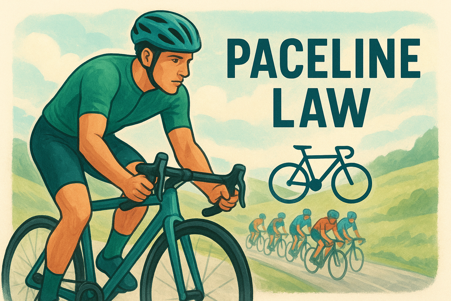
Paceline Law represents injured cyclists, and the site commits fully to that identity instead of hedging toward a general personal injury look. Cycling-specific imagery of riders, road bikes, and group rides replaces the usual stock photography of cars and courtrooms, and the firm name itself borrows cycling terminology, which signals to any cyclist landing on the page that this attorney actually understands the sport, not just the injuries that come from it.
Design highlights
Color choices and typography echo the energy of road cycling rather than the muted blues most law firms default to. Sharp, athletic visuals pair with copy that uses real cycling terms, like drafting, group rides, and right-hook collisions, instead of generic phrasing about "motor vehicle accidents." The homepage gets straight to the point about what kind of cases the firm handles, and practice area pages break down specific crash scenarios cyclists actually face, from dooring incidents to hit-and-runs, rather than a single catch-all injury page.
A website that speaks your client's language in their own terms builds trust faster than one that only speaks in legal terms.
Case studies and client stories feature real cyclists describing their accidents in detail, which does more to build credibility with a niche audience than a generic testimonial ever could. The layout keeps things uncluttered, letting the bold visuals and specific language carry the page instead of stacking on extra badges, awards, or unrelated content.
Who it's for
This branding model fits attorneys who represent a specific community rather than the general public. Cyclist injury law is a clear example, but the same approach works for firms focused on motorcyclists, rideshare drivers, or any other group with its own culture and vocabulary. It suits firms confident enough in their niche to turn away cases outside that lane, since the entire site is built to attract one type of client and would dilute its impact if stretched to cover unrelated injury types.
What you can learn from it
Study how specificity outperforms broad appeal when you already have a defined audience. Generic personal injury language speaks to nobody in particular, while cycling-specific terms immediately tell the right visitor they found the right firm. If your practice already serves a distinct group, whether by profession, hobby, or shared experience, build your site's language and imagery around that group instead of defaulting to industry-wide templates that speak to everyone and convince no one.
5. Bryan Brown Law's honest, relatable approach
Bryan Brown Law skips the polished, corporate attorney persona entirely. The site leans on plain-spoken video content where the attorney talks directly to the camera like he is explaining a legal problem to a friend at a barbecue, not reading from a script. That tone extends across the whole site, and it works precisely because it feels like the opposite of the stiff, over-produced law firm sites clients have learned to distrust.
Design highlights
Video sits front and center on nearly every page, and the production quality stays intentionally casual rather than studio-polished. Conversational copywriting matches the video tone, using short sentences and everyday language instead of legal jargon padded onto every page for SEO. Client testimonials appear as short video clips rather than text quotes, which makes the proof feel harder to fake and easier to trust. The color palette and layout stay simple, almost minimal, so nothing distracts from the attorney's face and voice, which is really the product being sold here.
A client who feels like they already know your attorney before calling is far more likely to actually pick up the phone.
Navigation stays shallow, usually two clicks or less to reach a practice area or the contact form, since the goal is getting someone from curious to booked without friction. Mobile formatting gets particular attention, with video thumbnails sized to load fast and play cleanly on a phone screen, which matters given how many personal injury searches happen from a phone right after an accident.
Who it's for
This model suits solo practitioners and small firms where the attorney is genuinely comfortable on camera and wants to build a personal brand rather than a corporate one. It works particularly well for practice areas where clients feel vulnerable or embarrassed, like personal injury, family law, or criminal defense, since a warm, relatable presence lowers the barrier to that first call. Firms with multiple attorneys who lack one clear face for the brand will struggle to replicate this approach without diluting it.
What you can learn from it
Borrow the underlying principle even if you skip the video format: show your actual personality, not a sanitized version written by committee. Record even one short, honest video answering a common client question and put it on your homepage. Authenticity reads instantly, and it separates a firm that feels human from the dozens that all sound identical.
6. FVF Law's community-driven brand design
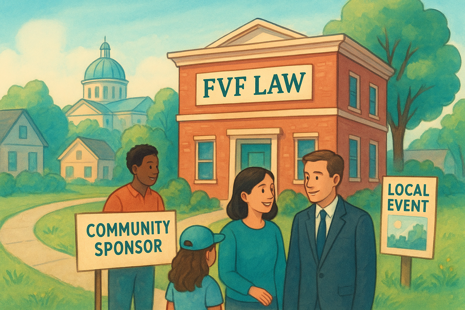
FVF Law built its brand around the neighborhoods it serves instead of the case types it handles. Local identity drives every design decision here, from the imagery of recognizable city landmarks to copy that name-drops specific streets, courthouses, and neighborhoods where the firm has actually worked cases. Visitors get the sense this firm belongs to the community, not that it parachuted in to run ads and disappear.
Design highlights
Photography favors real local scenes over stock imagery of skylines or courtrooms that could belong to any city in the country. Community-focused messaging shows up in sponsorship mentions, local event photos, and attorney bios that reference where each lawyer grew up or went to school nearby. The color palette stays warm rather than the cold blue-and-gray combination most firms default to, which makes the site feel approachable instead of corporate.
A law firm site that feels like it belongs to the neighborhood earns trust faster than one that could be copy-pasted into any city.
Layout choices reinforce the local angle too. Testimonials mention specific towns, case results list the county or district where the outcome happened, and the contact page includes directions phrased the way a local would give them, not a generic map embed. Even the footer ties back to community involvement, listing charities or local organizations the firm supports.
Who it's for
This approach fits firms deeply rooted in one metro area or region, especially those competing against larger, less personal firms advertising heavily on billboards and television. Regional firms with genuine ties to their community, through sponsorships, local schools, or long attorney tenure in the area, gain the most from this branding. It works less well for firms trying to expand into new markets quickly, since the local credibility this design leans on takes years to build authentically and cannot be faked with stock photos of a city you just entered.
What you can learn from it
Lean into whatever local roots your firm actually has instead of hiding behind generic branding. Mention real neighborhoods, real courts, and real community involvement rather than vague claims about "serving the area." If your firm sponsors a little league team or shows up at a county fair, put that on the site. Specific, verifiable local detail builds more trust than any stock photo of a courthouse ever will.
7. Nicolet Law's trust-building video testimonials
Nicolet Law leans hard on real client video testimonials instead of the usual paragraph of text quotes buried at the bottom of a page. Video testimonials appear near the top of key practice area pages, not tucked into a separate reviews section nobody clicks, so a visitor sees an actual person describing their case outcome within seconds of landing. That placement decision alone does more for credibility than any five-star badge or logo wall ever could.
Design highlights
The homepage opens with a rotating set of short client videos, each one framed with the person's first name, general case type, and outcome, which keeps things specific without overpromising results to future clients. Structured trust signals show up throughout the layout too: attorney credentials, years handling a specific case type, and links to verified review platforms sit close to the video content, reinforcing each other instead of standing alone. The color scheme stays clean and professional, letting the video thumbnails and their human faces do the emotional work while the surrounding design stays quiet and out of the way.
A video testimonial answers the question every new client is silently asking: can I actually trust this firm to handle my case?
Navigation groups practice areas clearly, and each practice area page repeats the video testimonial pattern with content relevant to that specific case type, so a car accident visitor sees car accident clients, not an unrelated workers' comp story.
Who it's for
This format suits firms that already have satisfied clients willing to go on camera, which usually means firms with a steady caseload and a team comfortable asking for that favor after a case closes. Personal injury and other practice areas built on trust and emotional decision-making benefit most, since a stressed visitor responds to seeing a real person more than reading polished copy. Firms without a system for collecting video testimonials will need to build one before this approach works.
What you can learn from it
Start collecting short video testimonials the moment a case resolves well, while the client's gratitude is fresh. Place them high on the page, tied to the specific practice area they relate to, not lumped into one generic reviews tab. A single genuine video does more to move a hesitant visitor toward calling than another paragraph explaining why your firm cares about its clients.
8. Hendler Flores Law's emotional storytelling
Hendler Flores Law builds its immigration and personal injury pages around real client stories instead of legal process explanations. Narrative-driven copy walks a visitor through what a family actually went through, from the fear of a denied visa application to the relief of a case finally resolved, before the page ever mentions filing deadlines or statutes. That sequencing matters, since most visitors arrive scared or confused, not ready for a checklist of legal requirements.
Design highlights
Photography favors real families and individuals over stock images of scales or courthouses, and captions tie each photo to a specific outcome the firm secured. Warm color choices , soft typography, and generous white space keep the tone gentle rather than clinical, which suits an audience often dealing with trauma or high-stakes immigration status. Long-form story sections break into short paragraphs with pull quotes from actual clients, so the page reads more like a feature article than a legal brochure.
A law firm site that tells a client's story before explaining the law meets people where they actually are.
Calls to action appear at natural pauses in the story, right after an emotional beat, instead of only at the top and bottom of the page. That placement catches visitors while the story still has their attention.
Who it's for
This format fits firms handling immigration, family law, or personal injury cases where clients carry real emotional weight into their search for an attorney. Multilingual practices serving immigrant communities benefit especially, since a story-first approach translates across cultural context better than dense legal text. It suits firms with strong client relationships and permission to share detailed, identifiable stories, which smaller or newer practices may not yet have.
What you can learn from it
Collecting one detailed client story with their consent and building a page around it beats a dozen generic testimonials. Structure the page so the story comes first and the legal explanation follows, not the reverse. Readers connect with people before they trust a process, and a site that respects that order converts better than one that leads with legal terminology and hopes empathy shows up later.
9. Fight4Vets' interactive benefits calculator
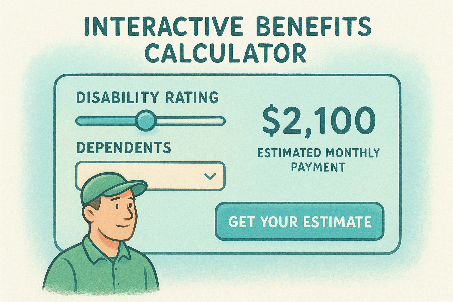
Fight4Vets represents veterans filing disability claims, and the site skips the usual wall of text explaining VA rules in favor of a tool that does the explaining for you. Interactive benefits calculator sits front and center on the homepage, letting a veteran enter details about their disability rating and dependents to get an estimated monthly payment before they ever talk to an attorney. That single feature turns a confusing bureaucratic process into something a visitor can actually understand in under a minute.
Design highlights
The calculator itself uses simple sliders and dropdown menus, styled to match the site's overall color palette so it feels native to the page rather than a bolted-on widget. Instant results appear without a page reload, and the tool nudges visitors toward a consultation right after showing their estimate, which is the exact moment someone wants clarity on next steps. Supporting pages break down VA disability ratings, appeal timelines, and common denial reasons using the same plain-language approach, with short explainer graphics instead of dense paragraphs.
A tool that gives visitors a real answer before they call does more to earn trust than any page of legal explanation.
Navigation keeps the calculator accessible from nearly every page through a persistent link in the header, since the firm clearly treats it as the site's main conversion engine rather than a novelty feature buried on one landing page.
Who it's for
This approach fits practice areas where clients face a genuinely confusing process with quantifiable outcomes, like veterans benefits, workers' compensation, or Social Security disability claims. Firms with technical expertise in a specific claims process gain the most, since building a useful calculator requires real knowledge of how ratings, formulas, or eligibility rules actually work. It suits practices willing to invest in custom development rather than a template site, since an interactive tool like this rarely comes standard.
What you can learn from it
Look for the one calculation or estimate your potential clients search for constantly, then build a tool that answers it instantly. Even a simple version, like a settlement range calculator or an eligibility checklist, gives visitors something more useful than another paragraph of legal explanation. Interactive tools also tend to keep visitors on the page longer, which signals relevance to search engines and gives your firm more chances to convert that attention into a booked consultation.
10. Steinberg Law Firm's modern legacy redesign
Steinberg Law Firm has practiced for decades, and the redesign had to solve a real tension: keep the credibility of a long-standing name while shedding the dated look that made the firm seem stuck in 2005. Modern legacy branding is the throughline here, pairing decades of case history with a site that loads fast, reads clean on a phone, and doesn't feel like it was built the same year the firm opened its doors.
Design highlights
The homepage leads with years-in-practice and case result numbers, but presents them in a clean stat bar rather than a cluttered awards page from 1998. Updated typography and a simplified navigation menu replace what was likely a dense, text-heavy layout typical of older firm sites, while attorney bios keep the tenure and experience but drop the stiff, formal photography for something more current. Case results and client reviews sit in scannable cards instead of long paragraphs, so decades of proof get delivered in seconds, not pages of reading.
A firm with real history doesn't need a dated site to prove it, modern design and decades of credibility work better together than either one alone.
Mobile performance gets clear priority too, with shorter forms, sticky call buttons, and pages that load quickly even on a slow connection, since older, larger sites often carry technical debt that a redesign has to strip out.
Who it's for
This approach suits established firms that already have the trust signals, referrals, reputation, years in business, but whose website actively undercuts that credibility with outdated design. It fits firms nervous about losing their identity in a redesign, since the goal is modernizing presentation without erasing the history that makes the firm credible in the first place. Newer firms without that track record won't get the same lift from this strategy, since there is no legacy yet to translate into design.
What you can learn from it
Audit your own site for the gap between your firm's actual reputation and what the design communicates. If your history and results are strong but your site looks a decade old, a redesign focused on presenting that proof cleanly will do more for conversions than any amount of new content. Keep the substance, modernize the delivery.
Finding the right design direction for your firm
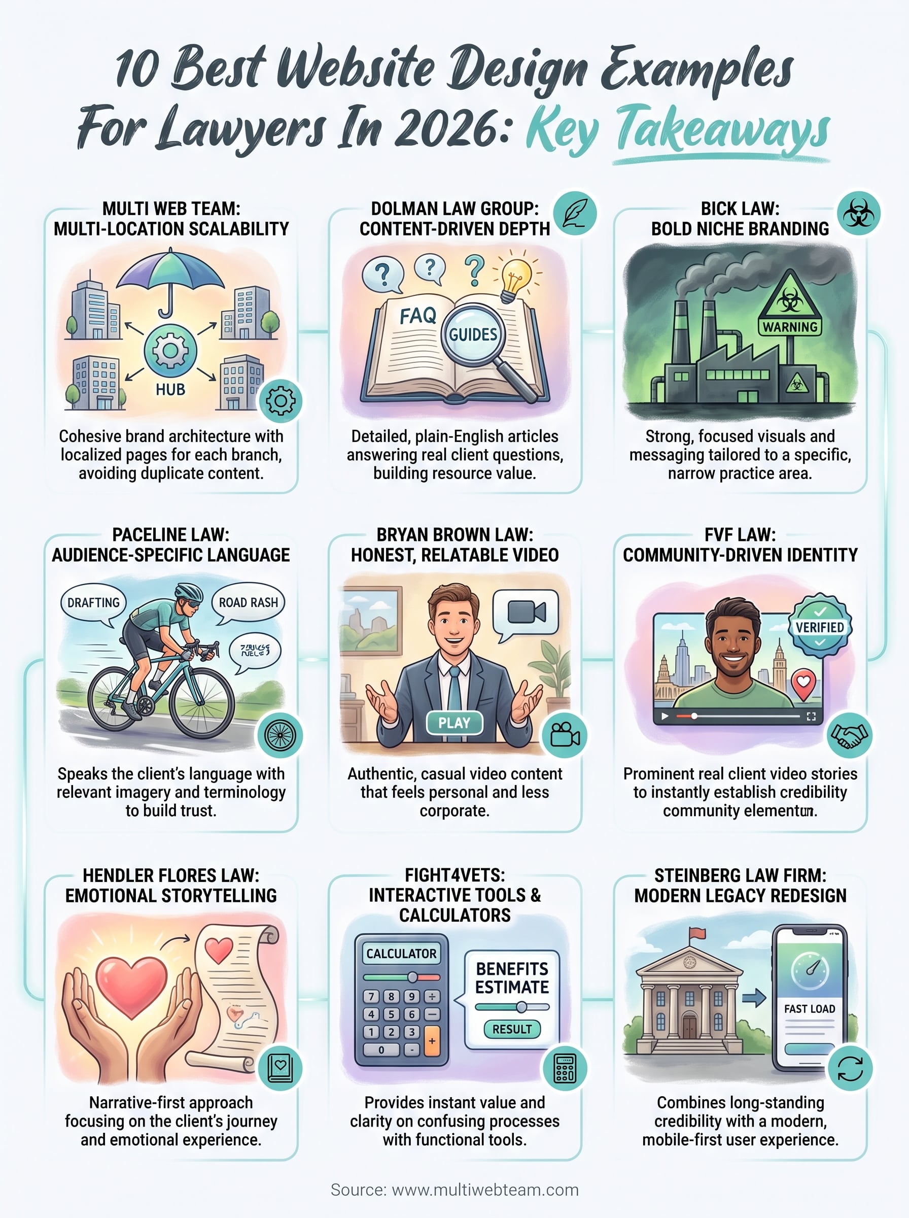
Every example above solves a different problem, but they share one trait: the design choices match the firm's actual clients, not a generic template. Niche branding works for a firm with a defined audience, video builds trust for a solo attorney comfortable on camera, and interactive tools fit practices with a quantifiable process to explain. Pick the pattern that matches your firm's reality, not the one that just looks the best in a screenshot.
Growing past one office adds a layer most of these examples never had to solve. Multi-location firms need every office to rank locally while the brand stays consistent, and that structure rarely survives a DIY site builder or a one-time design project. If your firm is opening new locations faster than your website can keep up, talk to Multi Web Team about building a site that grows with every new office instead of needing a rebuild each time.