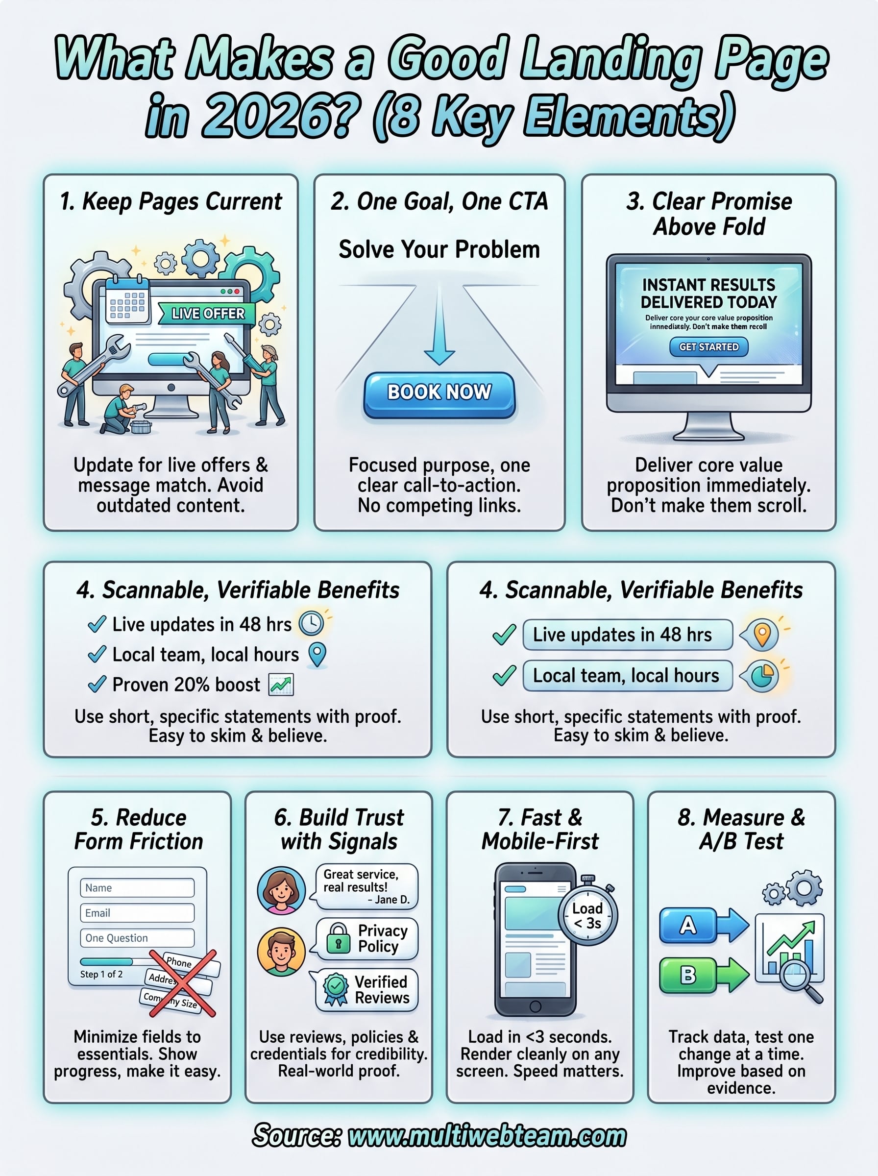
8 Things That Answer: What Makes A Good Landing Page In 2026
Most landing pages fail. Not because they're ugly or broken, but because they ignore the basics. A business can spend thousands driving traffic to a page that looks fine on the surface, and still watch visitors leave without converting. So, what makes a good landing page in 2026? It comes down to a handful of elements that work together to guide a visitor toward one specific action.
At Multi Web Team, we build and manage custom websites for multi-location businesses and franchises. That means we create a lot of landing pages, for individual locations, seasonal promotions, new service launches, and everything in between. We've seen firsthand what converts and what just sits there collecting dust.
This article breaks down 8 specific things that separate high-performing landing pages from forgettable ones. Whether you're building a page for a single campaign or rolling one out across dozens of locations, these principles apply. No abstract theory here, just practical elements you can check against your own pages right now.
1. Get a web team that keeps landing pages current
A landing page isn't a one-time project. Offers change , audiences shift , and what worked six months ago may no longer convert today. Having a dedicated web team means your pages stay aligned with your current promotions, pricing, and messaging without you managing every update yourself.
What it changes on the page
Maintained landing pages reflect accurate information and live offers. When your team keeps content fresh, visitors land on pages that match the ad or link that brought them there. That alignment between source and destination, called message match , directly reduces bounce rates and increases the chance a visitor takes action. Without it, even a well-designed page falls flat.
Why it matters for conversions
Stale landing pages cost you money. If a visitor clicks an ad for a spring promotion and lands on a page still showing last fall's deal, they leave immediately. Outdated content signals distrust , and a visitor who doesn't trust your page won't convert . Understanding what makes a good landing page starts with recognizing that relevance is not a nice-to-have, it's a requirement.
A landing page that doesn't reflect your current offer is just a leak in your ad spend.
How to implement it
Work with a web team that can execute quick turnaround updates , ideally within 24 to 48 hours of your request. Set up a clear, repeatable process for submitting changes, whether that's a shared document, a ticketing system, or a direct point of contact. Your team needs to understand that landing page updates are time-sensitive , especially during promotions, product launches, and seasonal campaigns where every day of delay costs conversions.
Multi-location and franchise considerations
Multi-location businesses face a compounded version of this problem. Each location may run different promotions and serve different local audiences , which means a single outdated page can drag down performance for an entire market. A centralized web team that understands your full business structure can update individual location pages without breaking your overall site consistency or brand standards.
Mistakes to avoid
The biggest mistake is treating landing pages like permanent fixtures. Set a review cadence , at minimum quarterly, to audit every active landing page and confirm it still reflects your current offers , contact details, and service areas. Letting pages go unreviewed is how small inaccuracies turn into conversion problems.
How Multi Web Team supports ongoing landing page work
Multi Web Team handles unlimited updates under a monthly subscription , so your landing pages stay current without per-change fees or hourly billing. When a promotion ends, a location expands, or your messaging shifts, your pages change with it without you having to chase down a developer or budget for another round of work.
2. Focus on one goal and one call to action
Every landing page needs a single purpose. When you give visitors multiple paths or competing calls to action , you split their attention and reduce the likelihood any one action gets taken. One goal, one CTA, one outcome.
What it changes on the page
A focused landing page strips out navigation links, secondary offers, and unrelated content that could pull a visitor sideways. Every element, from the headline to the button copy , points toward one action. This structure creates a clear path that guides visitors forward without confusion.
Why it matters for conversions
When someone asks what makes a good landing page , focus ranks near the top of any honest answer. Visitors make fast decisions. A page with one CTA gives them a single choice , which is always easier than evaluating three competing options.
The fewer decisions a visitor has to make, the more likely they are to make the one you want.
How to implement it
Start by naming your one conversion goal before writing anything. Then cut every element that doesn't directly support that goal, including social links, footer menus, and secondary offers. One button, one message, one outcome.
Multi-location and franchise considerations
Each location needs its own focused landing page tied to that market's specific offer. A shared, generic page spread across multiple locations dilutes the goal and the local relevance visitors expect.
Mistakes to avoid
Stacking CTAs is one of the most common ways businesses lose conversions. Avoid placing these competing options on the same page:
- "Book Now" alongside "Learn More"
- Phone numbers, contact forms, and chat widgets all at once
- Promotional offers mixed with unrelated service links
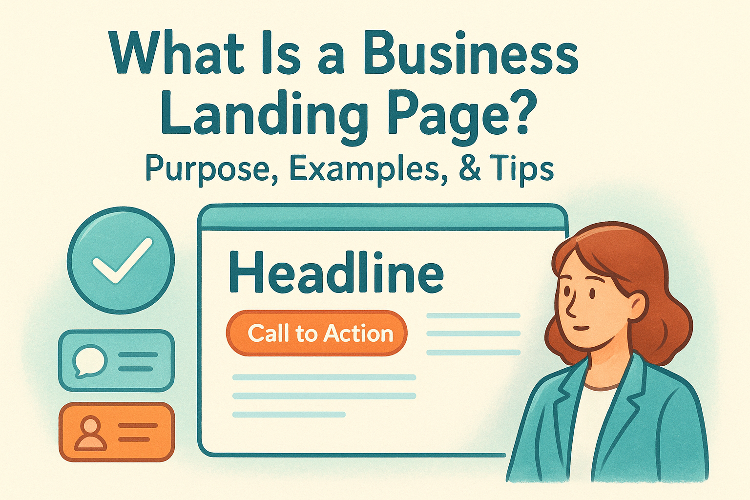
3. Lead with a clear promise above the fold
The first thing a visitor sees on your landing page determines whether they stay or leave. Above the fold refers to the content visible before any scrolling, and that space needs to deliver your core value proposition immediately . If a visitor can't tell what you offer within a few seconds, they're gone.
What it changes on the page
A strong above-the-fold section replaces vague taglines with a specific, direct promise tied to the visitor's need. Your headline, subheadline, and primary CTA should all appear in this zone so visitors don't have to scroll to understand what the page offers.
Why it matters for conversions
This is central to understanding what makes a good landing page . Visitors decide within seconds whether a page is worth their time, and a clear promise keeps them oriented and moving forward toward your goal.
Your headline is the first test every visitor runs on your page, and most pages fail it.
How to implement it
Write a headline that names the specific outcome your offer delivers, then follow it with a subheadline that adds one line of context. Keep the zone clean and uncluttered so the message lands without distraction.
Multi-location and franchise considerations
Each location's landing page should open with a headline that reflects its specific market and offer . A generic headline shared across all locations weakens local relevance and reduces conversions from location-specific traffic.
Mistakes to avoid
Avoid these common above-the-fold errors:
- Leading with your company name or brand history instead of the visitor's benefit
- Using clever wordplay that obscures what you actually offer
- Placing your CTA below the fold on the initial page load
4. Make benefits easy to scan and hard to doubt
Visitors don't read landing pages the way they read articles. They skim, scan, and jump , looking for evidence that your offer solves their problem. If your benefits are buried in long paragraphs or stated without proof, visitors move on without converting.
What it changes on the page
Scannable benefit sections replace dense text blocks with short, specific statements that visitors can absorb in seconds. Pairing each benefit with a concrete detail, a number, a timeframe, or a real outcome, turns a vague claim into something worth believing .
Why it matters for conversions
This is a core part of understanding what makes a good landing page . If a visitor can't quickly confirm your offer delivers what they need, doubt replaces momentum , and doubt kills conversions.
Clarity beats cleverness every time on a landing page.
How to implement it
Use bullet points or short columns to list three to five specific benefits. Write each one in terms of the visitor's outcome, not your feature set. "Get updates live within 48 hours" outperforms "fast turnaround" because it gives visitors a concrete expectation to hold onto.
Multi-location and franchise considerations
Benefits should reflect location-specific realities where possible. A franchise location serving a specific city can call out local service areas, local team members, or local hours to make the benefits feel grounded and relevant to that audience .
Mistakes to avoid
Avoid listing benefits that are impossible to verify or that every competitor claims equally, like "great customer service" or "high quality." Vague benefits create doubt rather than confidence.
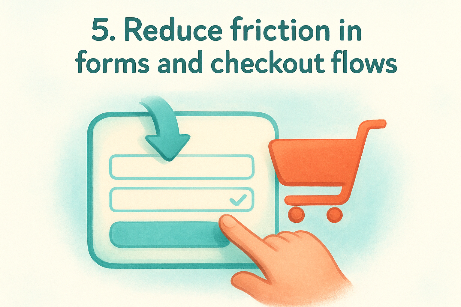
5. Reduce friction in forms and checkout flows
Forms and checkout steps are where conversions die most quietly. A visitor can read your headline, believe your benefits, and still abandon the page the moment they hit a form with too many fields or a checkout process with too many steps . Friction at this stage is direct conversion loss, and it's often invisible to the business owner who built the page.
What it changes on the page
Reducing friction means cutting your form down to only the fields you genuinely need to move a lead forward. Shorter forms look less demanding, load faster visually, and get completed more often than long ones that make visitors feel like they're filing paperwork.
Why it matters for conversions
This is a direct answer to what makes a good landing page : removing every obstacle between visitor intent and action. Each extra field a visitor has to fill out is a decision point where they can quit and go somewhere else.
If you wouldn't fill out your own form on a phone, your visitors won't either.
How to implement it
Ask for the minimum information required to follow up: a name, an email, and at most one qualifying question. If your checkout has multiple steps, show a progress indicator so visitors know how close they are to finishing rather than guessing.
Multi-location and franchise considerations
Location-specific forms should route leads to the correct local team automatically , so visitors never have to select a branch or repeat themselves. Routing errors create confusion and slow response times, both of which hurt conversion rates.
Mistakes to avoid
- Asking for phone, address, and company size when you only need a name and email
- Using generic error messages that don't tell the visitor which field failed or why
- Hiding required fields until the visitor clicks submit
6. Build trust with real-world signals and clarity
Visitors decide whether to trust your page before they read a single word of your offer. Real-world signals, like reviews, testimonials, and clear policies , do the work of building that trust before your CTA ever appears.
What it changes on the page
Trust signals replace the invisible doubt visitors carry when they arrive. Adding customer reviews , credential badges, or clear refund and privacy policies gives visitors external confirmation that your offer is legitimate and your business is real.
Why it matters for conversions
Understanding what makes a good landing page requires understanding why people hesitate. Visitors convert when they feel safe, not just interested. A page without trust signals asks visitors to take a leap with no safety net.
Real proof from real customers does more work than any headline you write yourself.
How to implement it
Place at least two or three specific testimonials near your CTA, and make sure each one names a real outcome rather than generic praise. Link your privacy policy directly on any form so visitors can verify how you handle their data.
Multi-location and franchise considerations
Each location page should feature reviews tied to that specific location , not generic company-wide praise. Local testimonials feel more credible to local visitors and reinforce that your business is active and present in their area.
Mistakes to avoid
Avoid using stock photos as fake testimonials or displaying review counts without linking to a verifiable source . Visitors spot manufactured trust signals quickly, and a single suspicious element can undermine everything else on the page.
7. Make it fast, mobile-first, and accessible
Page speed and mobile design are not technical details left to developers. They directly control whether a visitor stays long enough to read your offer or bounces before the page finishes loading. If your landing page loads slowly or breaks on a phone, every other improvement you make means nothing .
What it changes on the page
A fast, mobile-optimized page loads critical content within two to three seconds and renders cleanly on any screen size. Text stays readable without zooming, buttons are large enough to tap, and forms work without requiring a pinch-and-scroll to complete. These changes reduce frustration before it starts.
Why it matters for conversions
This is a practical answer to what makes a good landing page : your page has to work before it can convert. Google's own research shows that the probability of bounce increases sharply as load time climbs past three seconds. Mobile users have less patience , not more.
A page that loads slowly is a page that's already losing.
How to implement it
Compress images before uploading, reduce unnecessary scripts, and use a hosting setup built for performance. Test your page on Google's PageSpeed Insights to identify specific issues pulling your score down.
Multi-location and franchise considerations
Location pages often carry heavy local photo assets that slow load times. Optimize images at the location level so one slow page doesn't drag down your entire site's reputation in search.
Mistakes to avoid
- Designing on desktop and assuming the mobile experience will follow
- Embedding autoplay video that blocks fast loading on slower connections
8. Measure results and run clean A/B tests
You can't improve what you don't measure. Tracking performance data and running structured A/B tests turns your landing page from a static guess into a system you actively refine over time.
What it changes on the page
Testing forces you to make one specific change at a time , whether that's a headline, a button color, or a form length, and measure its impact on conversions. Data replaces opinion-driven decisions with evidence that shows what your actual visitors respond to.
Why it matters for conversions
This is a practical side of what makes a good landing page : knowing your numbers. A page with a 2% conversion rate that you measure and test can become a 4% page without changing your traffic at all, which doubles your results from the same ad spend.
The data already on your page tells you more than any best practice guide ever will.
How to implement it
Set a clear baseline metric before running any test, typically your current conversion rate over at least two weeks of traffic. Run one variable at a time, let it reach statistical significance , and document what changed and what the outcome was before testing the next element.
Multi-location and franchise considerations
Run tests at the location level when possible, since what converts in one market may underperform in another. Track results separately per location so aggregate data doesn't mask individual page problems that need attention.
Mistakes to avoid
- Ending tests too early before reaching statistical significance
- Changing multiple elements at once and losing track of what drove the result
- Ignoring mobile conversion data separately from desktop results
Next Steps
Now you know what makes a good landing page : a focused goal, a clear promise, scannable proof, minimal friction, trust signals, fast performance, and ongoing measurement. These eight elements work together, and skipping any one of them creates a weak point that costs you conversions. None of them work in isolation , and none of them stay effective if you set them and walk away.
The hardest part for most multi-location businesses isn't knowing what to fix. It's having the team and the time to keep every location's pages current, tested, and performing. That's exactly the problem Multi Web Team was built to solve. If you want landing pages that stay sharp across every location without adding to your internal workload, see how Multi Web Team manages it for you. Your pages should be working for your business, not sitting there collecting dust.