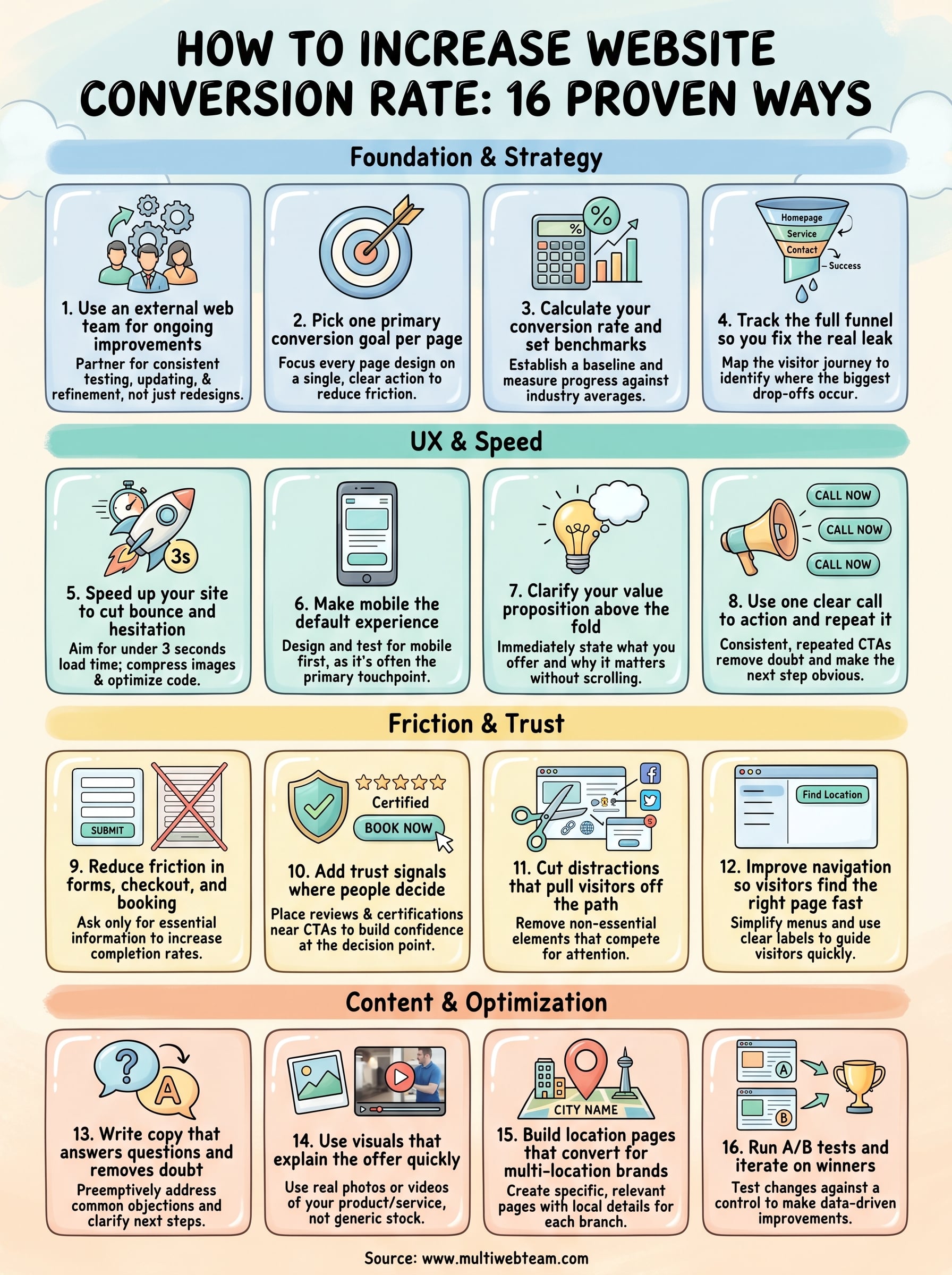
How to Increase Website Conversion Rate: 16 Proven Ways
Most websites convert between 2% and 5% of their visitors. That means for every 100 people who land on your site, 95 or more leave without taking action. If you're running a multi-location business or franchise, those lost conversions multiply across every location page, every service area, and every local search result that brings someone to your door. Learning how to increase website conversion rate isn't optional, it's the difference between a website that works and one that just exists. And for businesses managing dozens of locations, even a 1% improvement translates into significant revenue across the board.
Here's the thing most business owners get wrong: they assume more traffic is the answer. But driving visitors to a site that doesn't convert is like pouring water into a leaky bucket. Your website's design, structure, and content all play a direct role in whether someone picks up the phone, fills out a form, or walks into your nearest location. The good news? Conversion rate optimization doesn't require guesswork. There are specific, proven changes you can make, many of them straightforward, that reliably move the needle.
At Multi Web Team, we build and manage websites for multi-location businesses and franchises, so we see firsthand what drives conversions across location pages and what kills them. This article breaks down 16 proven ways to improve your website's conversion rate , from quick fixes you can implement this week to deeper strategic shifts. Whether you manage five locations or fifty, these tactics will help you turn more of your existing traffic into actual customers , without spending another dollar on ads.
1. Use an external web team for ongoing improvements
Most conversion improvements don't happen in a single redesign. They happen through consistent testing, updating, and refinement over weeks and months. That's why partnering with an external web team is one of the most effective first steps you can take when figuring out how to increase website conversion rate.
What to do
Hire or partner with a dedicated web team that handles your site's ongoing changes, from updating copy and visuals to monitoring performance data and rolling out improvements. For multi-location businesses , this means someone is always watching each location page and making adjustments based on real visitor behavior . You don't need to wait for a quarterly redesign or submit tickets to an overloaded IT department. The work happens continuously, in the background, while you run your business.
Give your external team clear goals and access to your analytics so they can prioritize changes that will actually move conversion numbers. Share your customer feedback, seasonal promotions, and any new services so the site stays accurate and relevant at all times.
Why it improves conversions
A stale website loses trust fast. If visitors land on a page with outdated information, broken links, or promotions that ended two months ago , they leave. An external team prevents this by keeping every page current and functional. More importantly, they bring an outside perspective that identifies friction points you may have stopped noticing because you're too close to your own business.
Ongoing updates signal to visitors that your business is active and trustworthy, which directly reduces bounce rates and increases the likelihood of conversion.
Regular attention to your site also means conversion problems get caught early rather than left to quietly drain your results for months.
How to measure success
Track your overall site conversion rate before and after you bring on an external team, and give the relationship at least 90 days to produce meaningful data.
Look at specific metrics like form submission rates, phone call clicks, and time on page across your location pages. If those numbers trend upward over the first few months, the team is doing its job. Set a simple monthly review cadence so small wins don't go unnoticed and you can build on what's working.
2. Pick one primary conversion goal per page
One of the fastest ways to undermine your own conversions is to give visitors too many options at once. Every page on your site should have a single, clear action you want visitors to take, and every design and copy decision on that page should support that one goal.
What to do
Review each page on your site and assign it one primary conversion goal . A location page's goal might be to get a phone call. A service page's goal might to drive a quote request. Strip out any competing CTAs that pull attention away from that primary action. If you include secondary links, make them visually subordinate so they don't compete with your main button.
For multi-location businesses , this matters at the individual location level too. Each location page should point toward one local action, such as calling that specific branch or getting directions.
Why it improves conversions
When visitors face multiple competing actions, they often choose none of them. This is a direct conversion killer, and it happens more often than most business owners realize. A page focused on one clear goal removes that friction and makes the next step obvious.
The simpler the choice you give a visitor, the more likely they are to make it.
How to measure success
Set up goal tracking in Google Analytics for each page's primary action and monitor the conversion rate for that specific goal monthly. Any drop is a signal to revisit the page copy or CTA placement. This focused approach also makes it easier to learn how to increase website conversion rate over time, because you're reading one clean data signal per page instead of guessing which CTA drove results.
3. Calculate your conversion rate and set benchmarks
You cannot improve what you don't measure. Before you focus on how to increase website conversion rate, you need to know your current baseline and what a realistic target looks like for your industry and page type.
What to do
The formula is simple: divide the number of conversions by total visitors , then multiply by 100. If your location page gets 500 visitors a month and 20 of them call, your conversion rate is 4%. Set this up in Google Analytics by configuring goals for each action you care about, whether that's form submissions, phone clicks, or direction requests.
Once you have your baseline, benchmark it against your industry average . Most service-based businesses fall between 2% and 5% , but high-intent local pages can convert above 8% when well-optimized.
Knowing your number removes the guesswork and gives every future change a clear standard to beat.
Why it improves conversions
Without a baseline, you're making changes based on gut feeling rather than data . Tracking your conversion rate monthly forces you to treat your website as a business asset with measurable performance. It also reveals which pages are underperforming so you can prioritize your time and budget on changes that will produce the highest return.
How to measure success
Set a specific monthly conversion rate target for each page, not just the site as a whole. Check your numbers at the same time each month so you're comparing consistent data. If a page consistently sits below your benchmark, that page moves to the top of your improvement list first.
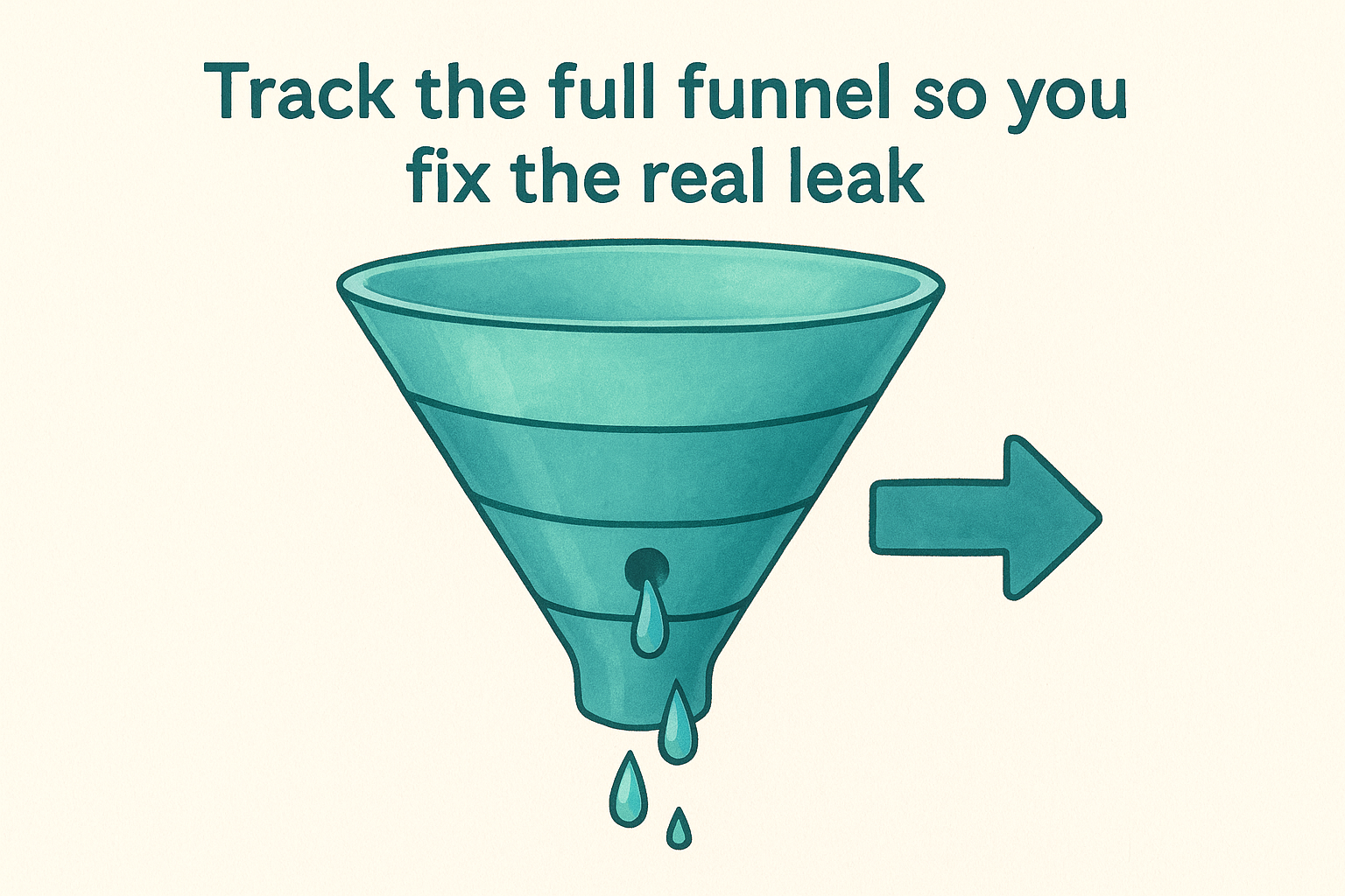
4. Track the full funnel so you fix the real leak
Most conversion problems aren't on the page you think they are. If your homepage looks clean but you're still not converting, the actual problem might sit two or three steps deeper in the visitor journey. Tracking your full funnel tells you exactly where people drop off so you stop guessing.
What to do
Map out every step a visitor takes from landing on your site to completing the conversion. For a multi-location business , this might look like: homepage → service page → location page → contact form → thank-you page. Set up a funnel visualization in Google Analytics so you can see the drop-off percentage at each step. Pay attention to which stage loses the most visitors, not just which page gets the least traffic.
Why it improves conversions
Without funnel data, you risk optimizing the wrong page entirely. You might spend a week rewriting your homepage while the real friction point is your contact form asking for too much information. When you know which step bleeds the most visitors, you can focus your energy where it actually matters. This is one of the most direct ways to understand how to increase website conversion rate without adding more traffic or spending more on ads.
Fix the biggest leak in the funnel first, and your entire conversion rate improves automatically.
How to measure success
Compare funnel completion rates before and after each change you make at a specific step. If you reduce the drop-off from your location page to your contact form by even 10%, that improvement flows through to your final conversion number. Track this data monthly and look for consistent movement in the right direction at each stage .
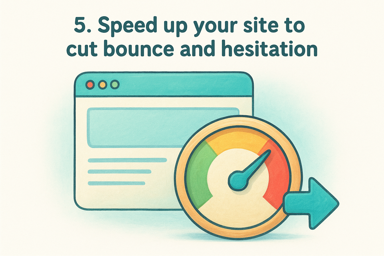
5. Speed up your site to cut bounce and hesitation
Page speed is a conversion factor, not just a technical metric. Research from Google shows that 53% of mobile visitors abandon a page that takes longer than three seconds to load . If your site is slow, visitors leave before they ever see your offer, and no amount of great copy or design can fix that.
What to do
Start by running your site through Google PageSpeed Insights, which gives you a free performance score and a prioritized list of fixes. The most common culprits are uncompressed images, unused JavaScript, and slow server response times . Compress images before uploading them, enable browser caching, and consider a content delivery network (CDN) if you serve visitors across multiple regions. For multi-location businesses, every location page needs to meet the same speed standard , not just your homepage.
Why it improves conversions
Speed affects how visitors feel before they consciously evaluate your offer. A slow page creates doubt and friction even if the visitor doesn't realize why they feel hesitant. When your site loads fast, visitors trust the experience immediately and stay long enough to read your message and take action. This is one of the more direct levers you have when thinking about how to increase website conversion rate without changing a single word of your copy.
A one-second delay in page load time can reduce conversions by 7%, according to industry benchmarks.
How to measure success
Track your Core Web Vitals scores monthly inside Google Search Console. Focus on Largest Contentful Paint (LCP), which measures how fast your main content appears. Set a target of under 2.5 seconds for LCP and monitor whether your conversion rate climbs as load times improve.
6. Make mobile the default experience
Mobile traffic now accounts for the majority of web visits across most industries, yet many business websites still treat mobile as an afterthought. If your site isn't built for mobile first , you're losing conversions from the visitors most likely to act on impulse, such as someone searching for a nearby location while they're already out.
What to do
Design and test every page on a small phone screen before you evaluate it on a desktop . Check that buttons are large enough to tap without zooming, that text doesn't require horizontal scrolling, and that your primary call to action sits within thumb reach on the screen. For multi-location businesses , pay special attention to your location pages, since most visitors finding you through local search are on a mobile device and need fast access to your phone number and directions.
Why it improves conversions
Mobile visitors behave differently than desktop visitors. They make faster decisions and abandon pages faster when something feels clunky or hard to navigate. A site that loads cleanly on mobile, presents information clearly, and makes the next step obvious keeps those visitors engaged long enough to convert. This is one of the more underrated levers when thinking about how to increase website conversion rate, because the fix often comes down to layout and tap targets rather than new content .
A mobile experience that frustrates visitors costs you conversions that no amount of traffic growth can recover.
How to measure success
Use Google Search Console to review your mobile usability report and identify pages with flagged issues. Then compare your mobile conversion rate against your desktop rate monthly inside Google Analytics to close the gap over time.
7. Clarify your value proposition above the fold
Visitors decide within seconds whether your site is worth their time. If the first thing they see doesn't explain what you offer and why it matters to them , most will leave before scrolling. Your value proposition needs to be visible the moment the page loads, without any clicking or scrolling required.
What to do
Write a single, direct headline that tells visitors exactly what you do and who you do it for. Pair it with a short supporting line that addresses the main reason someone would choose you over a competitor. Avoid generic phrases like "solutions" or "services" and replace them with specific, outcome-focused language that speaks directly to your customer's situation. If you run multiple locations, each location page should reflect that specific area in the headline so visitors immediately know they've landed in the right place.
Why it improves conversions
When your value proposition is unclear, visitors default to bouncing rather than reading further to figure out what you offer. A strong above-the-fold message reduces the cognitive work a visitor has to do and keeps them on the page long enough to act. This is one of the most reliable answers to how to increase website conversion rate without changing your traffic sources at all.
The clearer your headline, the less your visitor has to trust their assumption about whether your site is relevant to them.
How to measure success
Track your bounce rate and average time on page before and after you update your value proposition. A meaningful improvement in either metric signals that visitors are reading past the fold and engaging with your content instead of leaving immediately.
8. Use one clear call to action and repeat it
Visitors don't read websites the way you might expect. They scan, scroll, and jump around , which means your call to action needs to appear more than once and say the same thing every time. Inconsistent or competing CTAs create confusion that kills conversions before they happen.
What to do
Choose one primary action for each page, such as "Call Now," "Request a Quote," or "Get Directions," and place it in multiple spots: above the fold, mid-page, and near the bottom. Keep the button text identical each time so visitors don't have to wonder whether clicking a different button leads somewhere different. Resist the urge to add secondary CTAs that dilute the message, even if they feel helpful in the moment.
Why it improves conversions
Every time a visitor has to stop and evaluate which button to click, you introduce hesitation and doubt into the experience. A repeated, consistent CTA removes that friction and makes the next step feel obvious. This is a straightforward but frequently overlooked answer to how to increase website conversion rate without redesigning your entire site from scratch.
A visitor who sees the same clear action repeated throughout a page is far more likely to take it than one who encounters three different options competing for attention.
How to measure success
Track CTA click-through rates inside Google Analytics by setting up event tracking on each button. Compare click rates on pages with a single repeated CTA against pages that still carry multiple competing buttons. Pages with one unified CTA consistently outperform cluttered pages, and the data will show you exactly how much lift you're gaining from the change.
9. Reduce friction in forms, checkout, and booking
Forms and booking flows are where conversions either happen or fall apart. Even a well-designed page loses visitors the moment they hit a long form, a confusing checkout step, or a booking tool that asks for information you don't actually need .
What to do
Audit every form on your site and cut any field that isn't essential to completing the transaction. If you're collecting contact requests, name, phone number, and a brief message are usually all you need. Require account creation only when it's genuinely necessary, since forced registration is one of the most consistent reasons visitors abandon the process entirely.
For multi-location businesses , make sure your forms and booking tools automatically connect to the right location based on where the visitor landed. Forcing someone to manually select a location from a dropdown introduces unnecessary friction at the exact moment they're ready to commit.
Why it improves conversions
Every extra field or step you add to a form increases the chance the visitor gives up before finishing. Short, focused forms reduce cognitive load and make the action feel quick and low-risk. When figuring out how to increase website conversion rate, simplifying your forms often delivers faster results than any other change because it removes a direct barrier right before the conversion point.
Fewer fields consistently produce higher completion rates, even when the resulting lead requires a follow-up question.
How to measure success
Track your form completion rate by comparing the number of visitors who start a form against those who submit it. A completion rate below 50% is a signal that your form is asking for too much or presenting too many steps.
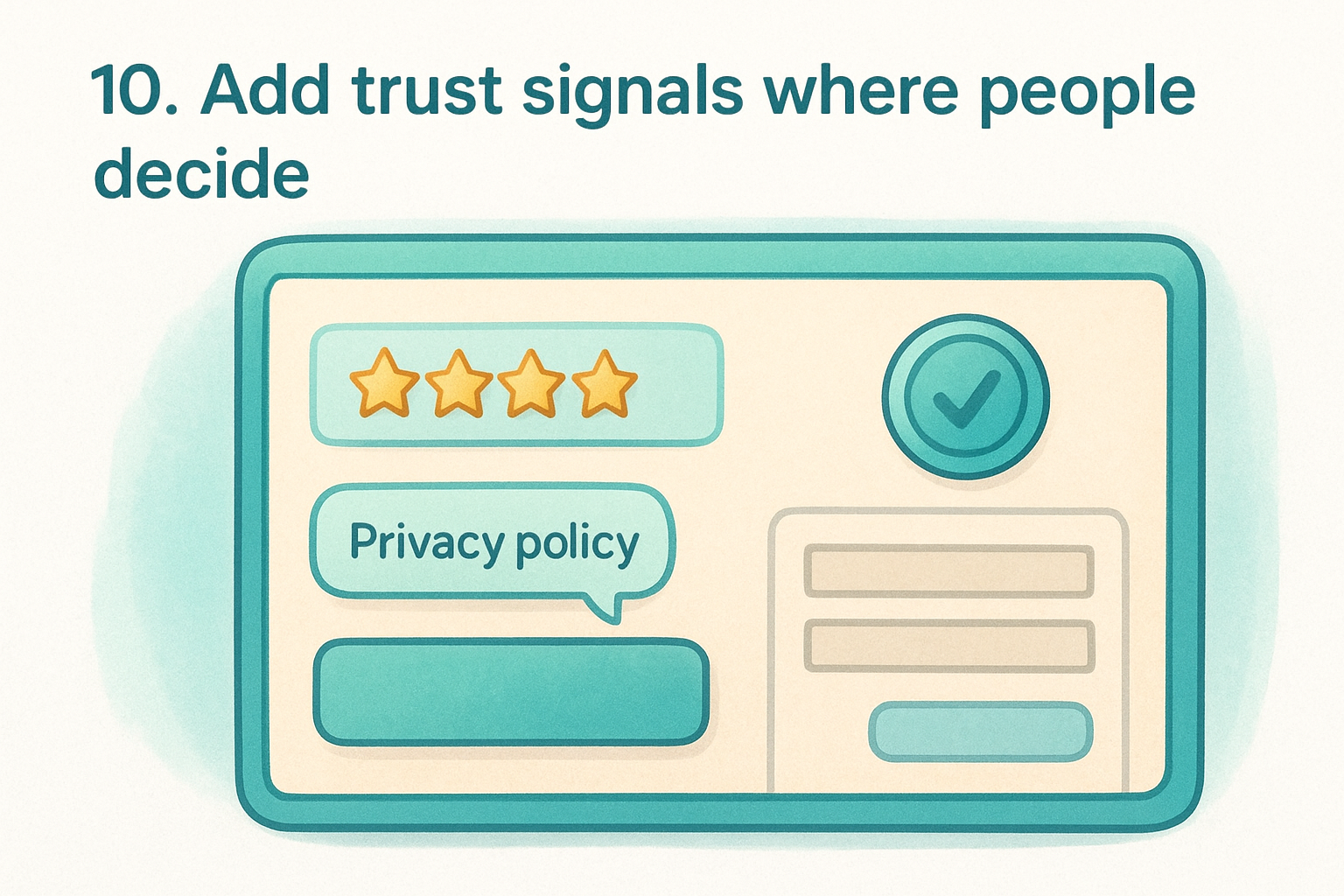
10. Add trust signals where people decide
Trust signals work best when they appear exactly where visitors hesitate, not tucked away on an About page or buried in a footer. If someone is about to call your location or submit a contact form, a nearby review, a recognized certification badge, or a clear privacy statement can be the difference between a conversion and a visitor who second-guesses themselves and leaves.
What to do
Place trust signals directly adjacent to your CTAs and forms rather than scattering them randomly across the page. This includes star ratings from Google reviews, specific customer testimonials that mention real outcomes, industry certifications, and a short note explaining how you handle personal data. For multi-location businesses , display reviews tied to each specific location rather than generic company-wide praise, since local visitors connect more readily with feedback from people in their own community.
Why it improves conversions
Visitors are cautious, especially when sharing personal contact information or committing to a service for the first time. Social proof and credibility markers reduce perceived risk at the exact moment a decision happens. This is one of the most reliable tactics when thinking about how to increase website conversion rate, because it addresses the hesitation that sits between interest and action rather than trying to build trust earlier in the visit.
Trust placed at the decision point converts more than trust placed anywhere else on the page.
How to measure success
Compare your form submission and CTA click rates before and after adding trust signals near those elements. Also track your bounce rate on conversion-focused pages over the following 30 to 60 days. If visitors are staying longer and completing more forms, the trust signals are working where it counts.
11. Cut distractions that pull visitors off the path
Your website likely has more on it than any single visitor needs to see. Excess navigation links, social media widgets, and unrelated content all compete for attention and pull visitors away from the one action you want them to take. Removing these distractions is one of the most underrated answers to how to increase website conversion rate without touching a single word of your copy.
What to do
Go through each of your high-traffic pages and remove or hide anything that doesn't directly support the conversion goal for that page. For multi-location businesses , check each location page individually, since extra links or widgets can fragment visitor attention right when they're closest to calling or booking. Focus your cleanup on these common offenders:
- Navigation menus with too many links on dedicated landing pages
- Social media feeds that send visitors off your site entirely
- Sidebar content that promotes unrelated services or blog posts
- Pop-ups or banners that appear before the visitor has read your core message
Why it improves conversions
Every link that takes a visitor somewhere else is a potential exit from your conversion path . When you reduce the number of options on a page, you concentrate attention on the one step that matters. A visitor who encounters fewer detours is far more likely to follow through to the end.
The fewer exits you offer on a conversion page, the more visitors reach the finish line.
How to measure success
Monitor your exit rate on key conversion pages monthly inside Google Analytics. A consistent drop in exit rate after removing distractions confirms that more visitors are staying on the intended path instead of clicking away before they convert.
12. Improve navigation so visitors find the right page fast
Poor navigation is a silent conversion killer. When visitors can't quickly find what they came for, they don't search harder, they leave. Clear, intuitive navigation keeps people moving toward your conversion goal instead of bouncing out of frustration.
What to do
Simplify your main menu to only the pages that matter most for your primary visitor types. Remove links that serve internal purposes but add no value to someone arriving from search. For multi-location businesses , make sure your locations page is always one click away from any page on the site, since local visitors often land somewhere general and need a fast path to their nearest branch. Use descriptive link labels like "Find Your Location" rather than vague terms like "About Us" or "More."
Why it improves conversions
When visitors have to hunt for information, they lose confidence in your business. A confusing menu creates doubt about whether you can even meet their needs. Streamlined navigation removes that friction and keeps visitors on a direct path toward the action you want them to take. This is a practical, frequently overlooked answer to how to increase website conversion rate that costs nothing to implement beyond a focused audit of your current menu structure.
The easier you make it to find the right page, the fewer visitors you lose before they ever reach your conversion point.
How to measure success
Track navigation click reports in Google Analytics to see which menu links visitors actually use. Any link that receives near-zero clicks is a candidate for removal, since it adds visual clutter without helping anyone.
13. Write copy that answers questions and removes doubt
Visitors arrive at your site carrying unspoken questions , and if your copy doesn't answer those questions, doubt fills the gap before they ever reach your CTA . A visitor who isn't sure you can help them will not take action regardless of how well-designed your page is.
What to do
Review your copy from the perspective of a first-time visitor who knows nothing about your business. Identify the three to five questions a skeptical visitor would ask before committing, such as what the cost is, how quickly you respond, or what happens after they submit a form. Answer each one directly on the page where the conversion takes place.
- Address pricing concerns by explaining your model clearly, even if you don't list exact figures
- Confirm next steps so visitors know exactly what happens after they call or submit a form
- Replace vague phrases like "contact us for more information" with specific, reassuring language
Why it improves conversions
Copy that preemptively answers objections removes the mental friction that causes visitors to pause and reconsider. When someone reads your page and finds their question already answered , their confidence in your business rises immediately. This is a practical way to approach how to increase website conversion rate without redesigning your layout or increasing ad spend.
Visitors who feel informed convert at a higher rate than visitors who feel uncertain.
How to measure success
Track time on page and scroll depth on your key conversion pages monthly. A meaningful increase in both metrics, combined with a rising conversion rate , tells you your copy is resolving doubt and holding attention rather than losing visitors before they reach your CTA.
14. Use visuals that explain the offer quickly
Visitors process images faster than text, which means the wrong visuals slow comprehension while the right ones accelerate it. Every photo, graphic, or video on your conversion pages should do a specific job: help visitors understand your offer faster and feel more confident acting on it.
What to do
Replace generic stock photos with images that show your actual product, service, or location in use . If you run a multi-location service business, use real photos from each location rather than recycled images across every branch. Short videos work especially well on service pages because they let you demonstrate the process or outcome in under 60 seconds , which removes doubt more efficiently than paragraphs of text can.
Consider using annotated screenshots or simple diagrams if your service involves steps a visitor might find confusing. Clear visual explanations reduce the questions visitors carry into your CTA button, which directly raises your completion rate.
Why it improves conversions
When your visuals match what visitors expect to receive, they feel less risk in taking the next step . Mismatched or vague images create the opposite effect, introducing uncertainty right before a decision. This is a practical and often underused angle on how to increase website conversion rate, because most businesses update their copy before they ever question whether their images are working.
Visuals that reflect your real offer build trust faster than any headline can.
How to measure success
Track scroll depth and time on page on your key service or location pages after updating visuals. Rising engagement combined with a higher CTA click rate confirms your images are pulling visitors forward rather than stalling them.
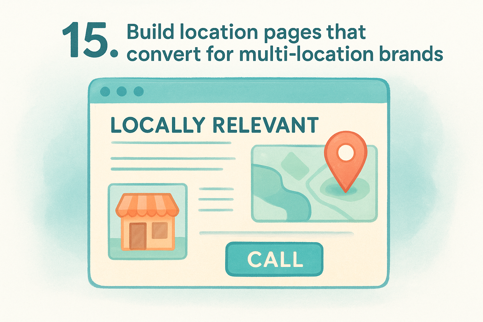
15. Build location pages that convert for multi-location brands
Generic location pages that swap out only a city name and address waste some of your highest-intent traffic. When someone searches for your service in a specific area, they land expecting locally relevant information , not a template that could belong to any branch. Treating each location page as its own conversion asset is one of the most direct ways to understand how to increase website conversion rate across a multi-location operation.
What to do
Build each location page around the specific branch, not just the brand. Include the local phone number, address, hours, and a map embed, but also add location-specific photos, staff names, and nearby landmarks that confirm you actually serve that area. Structure each page around a single conversion goal, such as a phone call or direction request, and place that CTA above the fold where mobile visitors see it immediately.
- Use the local city and neighborhood in your headline and first paragraph
- Add reviews pulled from that specific location rather than company-wide testimonials
- Link to the location page from your main locations hub so visitors navigate to it easily
Why it improves conversions
Visitors landing on a local page decide within seconds whether the content matches their intent. A page that speaks to their specific area reduces the mental distance between landing and acting , because it confirms they're in the right place without requiring them to dig for confirmation.
A location page built for a specific community converts better than a generic page built for every location at once.
How to measure success
Track phone call clicks and form submissions separately for each location page inside Google Analytics. Pages that fall below your baseline conversion rate are the first candidates for a copy and layout review.
16. Run A/B tests and iterate on winners
Every tactic in this list works better when you test it against a control before committing to it site-wide. A/B testing replaces guesswork with direct evidence from your own visitors , which is always more reliable than assuming what will work.
What to do
Set up A/B tests through Google's tools or a comparable platform that splits your traffic between two page variations . Test one variable at a time so you know exactly which change produced the result. Common elements worth testing include:
- Headlines and value propositions above the fold
- CTA button text, color, and placement
- Form length and the number of required fields
Run each test until you reach statistically significant results , which generally means at least 100 conversions per variation .
Why it improves conversions
Opinions about what will convert better are almost always wrong in ways that real data immediately corrects . When you test systematically, you accumulate a record of what your specific audience actually responds to , rather than what a best practice suggests they should.
Small wins compound, and a series of tested improvements can significantly raise your overall conversion rate within a year.
This is one of the most rigorous approaches to how to increase website conversion rate because every change you keep is grounded in evidence , not intuition.
How to measure success
Track your conversion rate lift for each winning variation and document every test result , including those that produced no change.
Over time, this archive reveals which page elements matter most to your visitors and gives your next round of tests a smarter starting point .
Where to start
Sixteen tactics can feel like a lot to tackle at once, but you don't need to run all of them in parallel to see results. Start by calculating your current conversion rate and identifying which page in your funnel loses the most visitors. That one page is where your first hour of work goes. From there, work down the list based on what your data shows, not based on what feels most urgent.
If you manage multiple locations and want a team that handles this work for you, the simplest answer to how to increase website conversion rate is to stop treating your website as a one-time project. Consistent updates, local optimization, and ongoing testing compound over time into measurable growth across every branch. Multi Web Team builds and manages websites specifically for multi-location businesses that need exactly that kind of continuous attention. See how it works and find out whether it fits your operation.