9 Law Firm Website Design Tips That Win More Clients
Most law firm website design tips you find online focus on solo practitioners with a single office and a simple contact form. That advice falls apart the moment you're running a firm with multiple practice areas, several attorneys, or offices in more than one city. Visitors expect to find the right lawyer, the right location, and proof you can handle their case within seconds, or they click back to Google and call your competitor instead.
This article gives you the specific design decisions that turn a law firm site into a client-generating asset , not just a digital business card. We cover layout choices, trust signals, mobile performance, and the local search optimization work that gets each office showing up when someone nearby searches for representation.
We've built and managed sites for multi-location businesses long enough to know which design choices actually move the needle versus which ones just look nice in a portfolio. The nine tips below reflect what works for firms competing in crowded, high-stakes markets where a slow page or a confusing intake form costs you real cases, not just website traffic.
1. Design your homepage for your ideal client
Your homepage has about five seconds to answer one question for a visitor: does this firm handle cases like mine? Someone searching for a divorce attorney and someone searching for a truck accident lawyer have completely different problems, fears, and vocabulary. A generic homepage that talks about "trusted legal counsel" without naming a practice area or a client type forces visitors to hunt for relevance, and most won't bother. Personal injury clients , family law clients , and business litigation clients all need to see themselves reflected in your messaging within the first screen they load.
Why it matters
Firms with multiple practice areas often default to a broad, safe headline that tries to speak to everyone. That approach speaks to no one. Visitors arriving from a Google search for "custody lawyer near me" want to see custody-specific language, not a generic tagline about integrity and experience. When the homepage matches the intent behind the search, bounce rates drop and time on site goes up, both of which signal relevance to search engines and, more importantly, keep a stressed potential client engaged long enough to call.
A homepage that speaks to everyone convinces no one.
How to do it
Structure the top of your homepage around the specific person you want to convert, not the firm's history or awards. Use these building blocks:
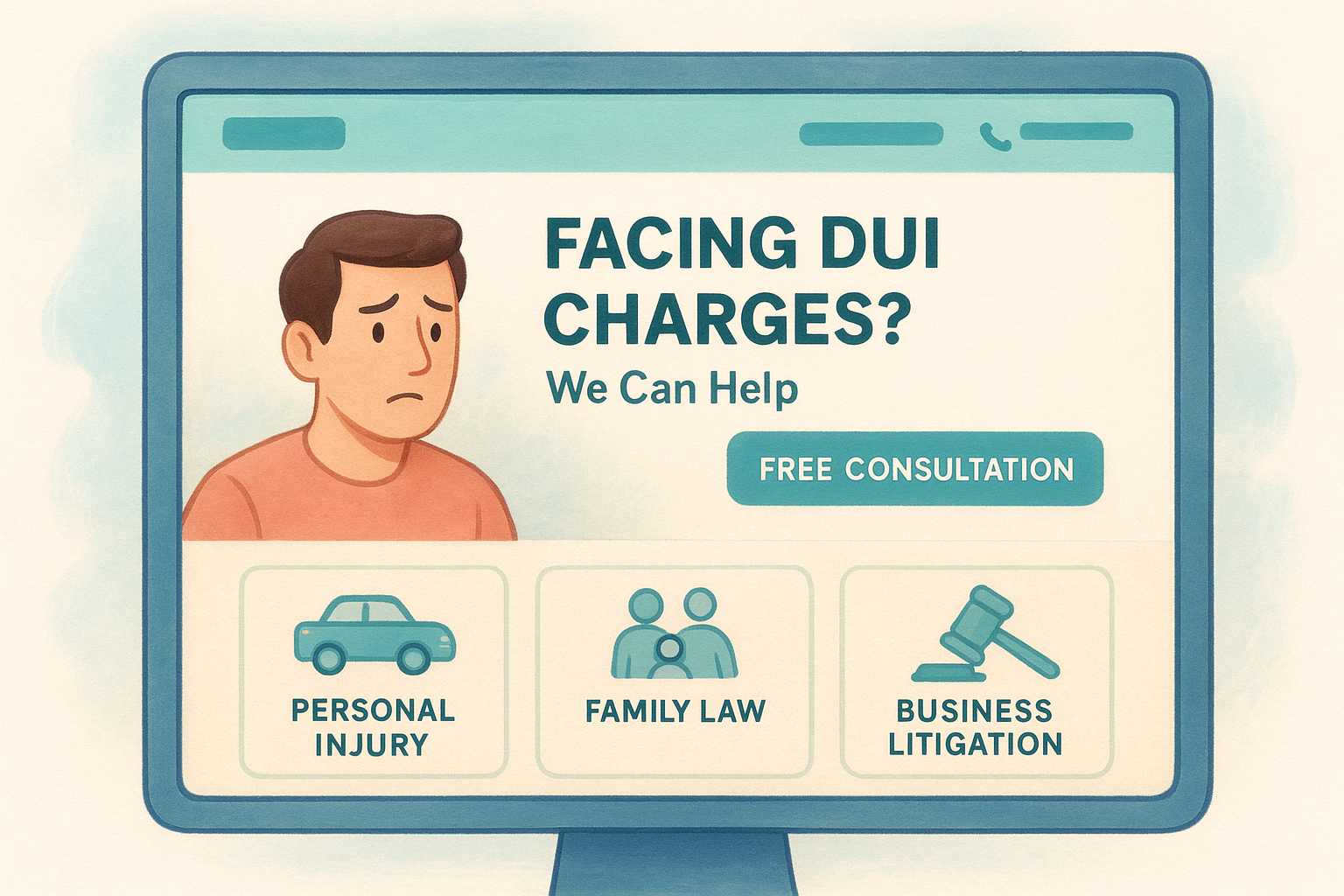
- A headline naming the client's problem , not your firm's mission statement ("Facing DUI Charges in Ohio? We Can Help" beats "Committed to Excellence Since 1998")
- A subheadline with a clear next step , like scheduling a free consultation or calling a direct line
- Practice area tiles or cards above the fold so visitors self-select into the right path immediately
- A visible phone number and contact button in the header, repeated in the hero section
- Location cues if you serve multiple cities, so visitors know you cover their area before they scroll further
If your firm has one dominant practice area driving most of your revenue, lead with that. If your caseload is split fairly evenly across two or three areas, use a segmented layout that lets each visitor pick their path in one click rather than making them guess which page applies to them.
Mistakes to avoid
The most common failure is burying practice areas in a dropdown menu while the homepage talks in vague generalities about "aggressive representation." Another frequent mistake is leading with attorney photos and bios before addressing the visitor's actual legal problem; save the credentials for supporting sections further down the page. Also skip large rotating image sliders on the hero section. They slow load times, and most visitors never see the second or third slide before they scroll past or leave.
2. Simplify navigation so visitors find answers fast
A law firm site with ten practice areas, five attorneys, and three office locations can easily balloon into a navigation menu with twenty links. That's a mistake. Visitors don't browse a law firm website the way they browse a retail store; they arrive with one specific legal problem and want a fast path to the answer. Confusing navigation sends them back to the search results, often straight to a competitor with a cleaner menu.
Why it matters
Every extra click a visitor has to make before finding relevant information increases the odds they abandon the site entirely. Studies on user behavior consistently show that people judge a site's credibility within seconds of landing, and a cluttered or unclear menu reads as disorganized, which undermines trust in a firm they're about to hand a serious legal matter to. Clear navigation also helps search engines understand your site structure, which supports your rankings for practice-area and location pages alike.
If visitors can't find their answer in two clicks, they'll find another firm that made it easier.
How to do it
Group practice areas under a single dropdown labeled clearly, such as "Practice Areas," and list no more than seven or eight items inside it. Keep your top-level menu to five or six items total: Home, Practice Areas, Attorneys, Locations, Results or Reviews, and Contact. Add a persistent "Free Consultation" button separate from the main menu so it never competes for attention. For multi-location firms, include a location selector or dropdown that lets visitors jump straight to their nearest office page.
Mistakes to avoid
Don't nest menus more than two levels deep; visitors rarely hover through three layers of dropdowns before giving up. Avoid generic labels like "Services" or "What We Do" when "Practice Areas" is clearer and more searchable. Skip mega-menus packed with attorney headshots and firm history links that push the actual practice-area links below the fold on mobile.
3. Make contact info and calls to away be impossible to miss
People visiting a law firm site are often dealing with an arrest, an injury, a divorce, or a deadline. They don't want to hunt for a phone number buried in a footer or a contact form hidden three clicks deep. Prominent contact information and clear calls to action turn browsers into callers, and that's the whole point of the site.
Why it matters
A visitor who can't find your phone number in five seconds assumes you're hard to reach as a client too. That impression costs you the call before it ever happens. Law firm leads are time-sensitive; someone who just got served papers or was pulled over isn't going to scroll through your entire site looking for a way to reach you. Fast access to contact options shortens the path from interest to action, which directly affects how many visitors convert into consultations.
A visitor who can't find your phone number in five seconds won't waste time looking for a lawyer who's hard to reach.
How to do it
Put your phone number in the header of every single page, formatted as a clickable link so mobile visitors can tap to call. Add these elements across your site:
- A sticky "Call Now" or "Free Consultation" button that stays visible while scrolling on mobile
- A short contact form on every practice area page, asking for name, phone, and a one-line case description, nothing more
- Live chat or a callback request widget for visitors browsing after office hours
- Multiple CTAs repeated at the top, middle, and bottom of long pages
Keep the language on buttons specific: "Get a Free Case Review" converts better than a generic "Submit."
Mistakes to avoid
Don't make visitors scroll to the footer to find your number, and don't hide your contact form behind a separate page reachable only through a small text link. Avoid long forms asking for case details, employer information, or income before someone even talks to a human. Also skip CTA buttons that blend into your color scheme; they need contrast to actually get noticed and clicked.
4. Write clear, jargon-free content for each practice area
Attorneys write like attorneys. That instinct works fine in a brief, but it kills conversions on a website. A visitor searching for help after a car accident doesn't know what "comparative negligence" means, and they shouldn't have to look it up to understand if you can help them. Among the law firm website design tips that actually move the needle, clear content ranks above almost everything except contact visibility, because confused visitors don't call.
Why it matters
People hire lawyers precisely because they don't understand the legal system, so content stuffed with statutes and Latin phrases alienates the exact person you're trying to reach. Plain-language content builds confidence instead of intimidation, and it signals that you'll explain their case the same way once they're a client. Search engines also reward content that matches how real people search, and nobody types "tortious interference" into Google when they mean "my business partner screwed me over."
If a worried client can't understand your website, they'll assume they won't understand you either.
How to do it
Write each practice area page around the questions a client actually asks: What does this cost? What happens next? How long will this take? Follow this structure for every page:
- A plain-language explanation of the legal issue in the first two paragraphs
- A short FAQ section answering the three or four questions you hear most in consultations
- Real outcomes or case examples without violating confidentiality rules
- A clear next step , like a consultation request, at the end of the page
Read your draft out loud. If it sounds like a contract, rewrite it.
Mistakes to avoid
Don't copy boilerplate practice-area descriptions from a template vendor; Google recognizes duplicate content, and clients recognize generic writing. Avoid burying the actual explanation under paragraphs of firm history or credentials. Skip walls of unbroken text with no headers or lists, since stressed visitors skim, they don't read.
5. Optimize your site for mobile speed and performance
Someone searching for a lawyer after a car accident or an arrest is almost always doing it on a phone, often in a parking lot or a police station waiting room. If your site takes six seconds to load or makes them pinch and zoom to read a paragraph, they close the tab and call the next firm on the results page. Mobile performance isn't a technical afterthought for a law firm site, it's the deciding factor in whether a visitor becomes a client.

Why it matters
Google uses mobile-first indexing, meaning it evaluates the mobile version of your site to determine rankings, not the desktop version. A slow, clunky mobile experience hurts your visibility before a visitor even arrives. Research from Google's own performance data shows that as page load time increases from one to five seconds, bounce probability jumps sharply. For a firm competing on local search rankings across several offices, that's lost cases, not just lost traffic.
A slow mobile site doesn't just lose visitors, it loses cases before the phone ever rings.
How to do it
Run your site through a free speed testing tool and fix what it flags. Prioritize these fixes:
- Compress images and serve them in modern formats instead of full-size JPEGs
- Minimize plugins and scripts that aren't essential to the page
- Use a fast, reputable hosting provider built for business traffic, not shared budget hosting
- Enable browser caching so repeat visitors load pages instantly
- Test tap targets to confirm buttons and links are easy to hit on a small screen
Mistakes to avoid
Don't install every marketing plugin your agency recommends without checking the performance cost. Avoid autoplay videos on mobile, since they burn through data and slow the whole page down. Skip oversized hero images that look sharp on a desktop monitor but take forever to load on a phone with weak signal.
6. Meet ADA accessibility standards on every page
A law firm site that's hard to use for visitors with disabilities isn't just bad practice, it's a legal exposure problem for a business whose entire brand is legal compliance. ADA accessibility covers things like screen reader compatibility, color contrast, and keyboard navigation, and it affects a larger share of your potential clients than most firms assume. Skipping this step also puts you at risk of the same kind of demand letters your own firm might send to other businesses.
Why it matters
Courts have increasingly treated websites as places of public accommodation under the ADA, and law firms have been sued over inaccessible sites just like retailers and restaurants. Beyond the legal risk, inaccessible design locks out visitors who use screen readers, can't perceive low-contrast text, or navigate by keyboard instead of a mouse. Every one of those visitors could be a client with a case, and an injury or disability-related practice area makes this especially relevant since accessibility needs overlap heavily with your client base.
A law firm that can't be sued for practicing what it doesn't preach shouldn't have a website that invites that exact lawsuit.
How to do it
Start with the Web Content Accessibility Guidelines as your baseline standard, targeting at least WCAG 2.1 AA compliance. Work through these fixes:
- Add descriptive alt text to every image, including attorney headshots and office photos
- Ensure color contrast meets minimum ratios between text and background
- Make every element keyboard-navigable without requiring a mouse
- Label form fields clearly so screen readers can announce them correctly
- Add captions to any video content on attorney bio or results pages
Mistakes to avoid
Don't rely solely on an accessibility overlay widget as your entire compliance strategy; many of these tools don't fix underlying code issues and have drawn their own lawsuits. Avoid low-contrast color schemes chosen purely for aesthetics over readability. Skip PDF-only content, like attorney bios or case results, without an accessible HTML alternative for screen reader users.
7. Build trust with reviews, credentials, and case results
Hiring a lawyer is one of the highest-stakes decisions a person makes, right up there with choosing a surgeon. Visitors arrive skeptical, because they've heard the stories about lawyers who overpromise and underdeliver. Trust signals like reviews, bar credentials, and verifiable case results do the convincing that a headline or a stock photo of a courthouse never will. Without them, even a well-designed site reads as unproven.
Why it matters
People rarely hire the first lawyer they find; they compare two or three firms before calling. Third-party validation shortens that comparison shopping by answering the unspoken question every visitor has: has this firm actually won cases like mine? Google also factors trust signals into how it evaluates YMYL content, a category that includes legal services, so a site with visible credentials and reviews tends to perform better in search than one relying on claims alone.
Claims about your firm mean nothing until someone else backs them up.
How to do it
Pull these elements onto your homepage and every practice area page, not just a dedicated testimonials page nobody visits:
- Embedded Google reviews with star ratings visible near the top of the page
- Bar association logos and certifications displayed near attorney bios
- Verified case results , including settlement amounts where ethics rules allow disclosure
- Video testimonials from real clients, which carry more weight than text alone
- Awards and rankings from recognized legal publications, linked to the original source
Refresh this content regularly so visitors see recent wins, not results from five years ago.
Mistakes to avoid
Don't fabricate or exaggerate case results; state bar advertising rules govern this closely, and getting caught costs far more than the marketing benefit. Avoid burying your reviews on an external profile visitors have to click away to find. Skip generic five-star badges with no attribution, since anonymous praise reads as fake and erodes the exact trust you're trying to build.
8. Strengthen local SEO for every office location
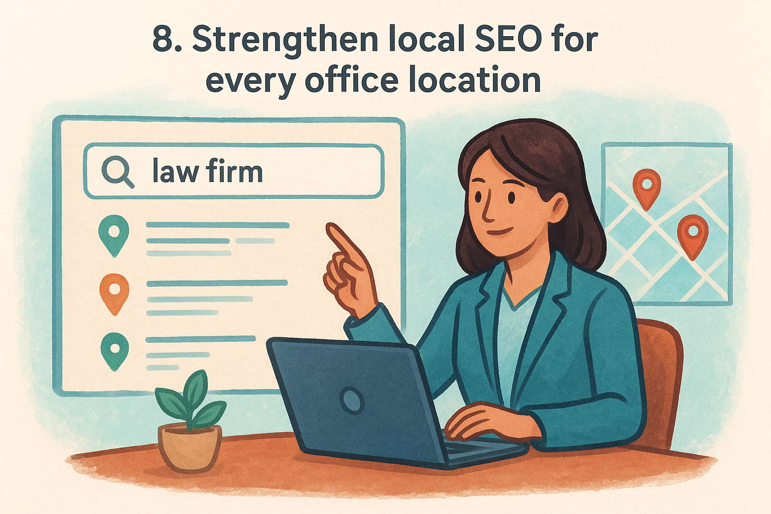
A multi-location firm faces a different SEO problem than a solo practice. Each office needs to rank on its own for searches like "personal injury lawyer Tampa" or "family law attorney Naples," and a single generic contact page listing every address won't get any of them there. Local SEO for a law firm means treating each location as its own mini-site within the larger firm, with unique content, citations, and signals that tell Google which office actually serves that city.
Why it matters
Searchers rarely type your firm name; they type a practice area plus a city, and Google matches that query to pages with strong location relevance. Without dedicated pages, all of your offices compete against each other for the same generic homepage, and none of them win. Among the law firm website design tips that pay off fastest, building out location pages tends to produce the most measurable traffic gains within a few months.
One page trying to rank for five cities usually ranks for none of them.
How to do it
Build a dedicated page for every office with unique content, not a copy-pasted template with the city name swapped out. Include:
- A unique Google Business Profile for each location, fully verified and categorized
- City-specific content , mentioning nearby courthouses, neighborhoods, or local landmarks
- Consistent NAP data (name, address, phone) matching exactly across the site and directories
- Location-specific reviews embedded on that office's page
- A map embed and driving directions for each address
Mistakes to avoid
Don't publish near-duplicate location pages that swap only the city name; Google's algorithms flag this as thin content, and it hurts every page involved, as Google's own spam policies make clear. Avoid listing multiple office addresses on a single contact page hoping it covers all cities. Skip inconsistent phone numbers or suite information across directories, since mismatched NAP data confuses both search engines and clients trying to find you.
9. Keep your website updated with fresh, relevant content
A law firm website isn't a brochure you print once and forget. Laws change, staff changes, and a page announcing a "2019 award" or listing an attorney who left the firm two years ago quietly tells visitors nobody's paying attention. Stale content signals neglect, and neglect is the last impression a firm wants to give someone deciding who handles their case.
Why it matters
Search engines crawl your site regularly, and they notice when nothing changes for months at a time. Fresh content gives Google new signals to index and gives returning visitors, referral sources, and past clients a reason to check back. Beyond rankings, outdated practice area pages that reference old statutes or expired filing deadlines create real liability if a visitor relies on incorrect information before ever speaking with an attorney.
A website that never changes tells visitors the firm behind it might not be changing either.
How to do it
Treat your site like an ongoing project, not a one-time launch. Build a simple content calendar around these updates:
- Monthly blog posts answering common client questions or covering recent case results
- Quarterly audits of practice area pages to confirm laws, deadlines, and statistics still hold up
- Attorney bio updates whenever staff joins, leaves, or earns a new credential
- Seasonal updates for practice areas tied to timing, like tax law or family law changes around the school year
- Fresh reviews and case results added as they come in, not saved up for a redesign
This is exactly the kind of ongoing maintenance that gets skipped once a site launches and everyone moves on to other work.
Mistakes to avoid
Don't change dates on old pages without actually updating the content; Google can detect this, and it fools no one. Avoid publishing thin, keyword-stuffed blog posts written purely to hit a schedule instead of answering real questions. Skip letting practice area pages sit untouched for years while your competitors' sites reflect current law and recent wins.
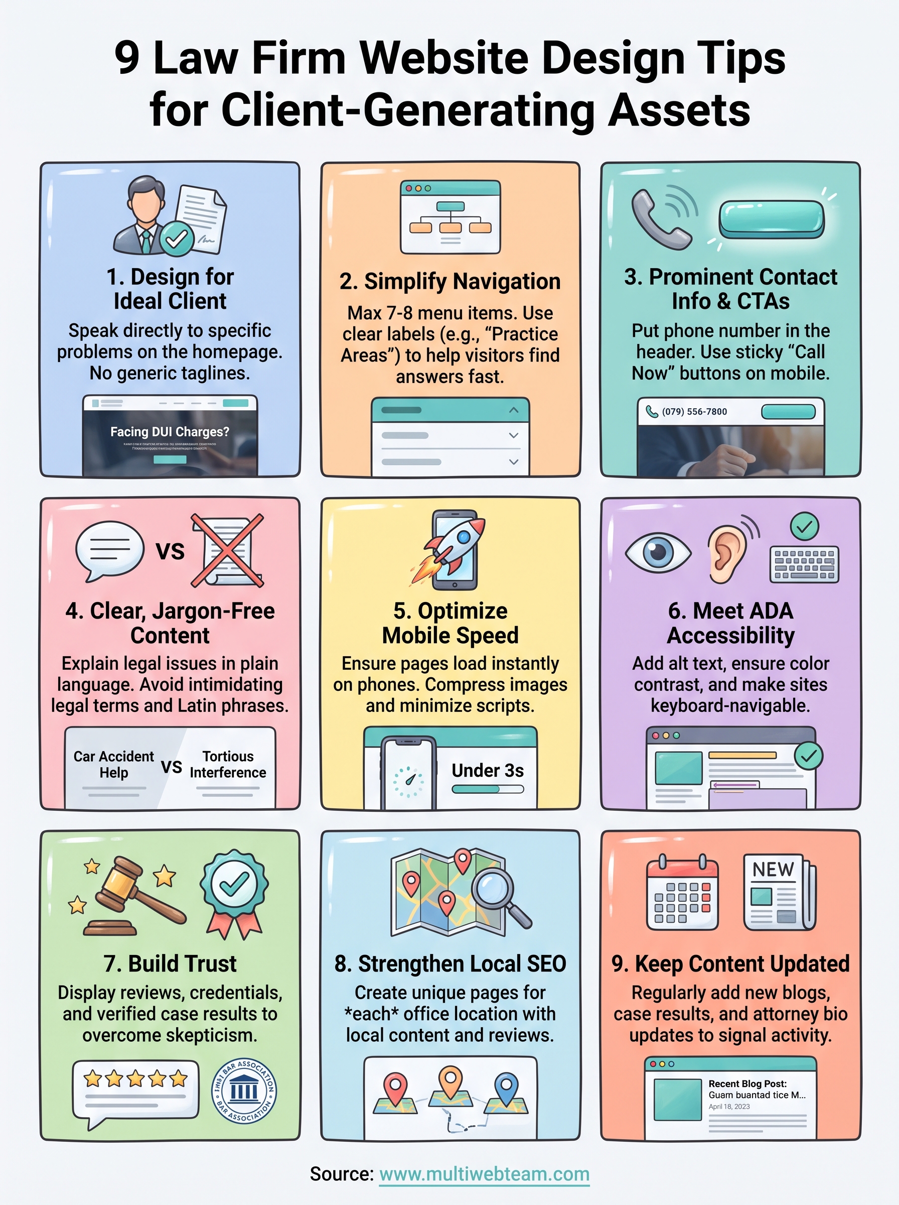
Putting these tips to work for your firm
None of these nine changes work in isolation. A fast, accessible homepage still loses cases if the phone number is buried, and strong reviews won't matter if each office lacks its own optimized page. Law firm website design succeeds when every piece, from navigation to local SEO to fresh content, works together to move a worried visitor toward a call.
The harder truth is that most firms don't have the internal bandwidth to execute all nine tips and then keep maintaining them month after month. Attorneys practice law, not web design, and that's exactly the gap a dedicated web team exists to close. If you'd rather hand off the ongoing updates, SEO work, and design decisions to people who do this for multi-location firms every day, see how Multi Web Team can manage your firm's website so you can get back to the cases that pay the bills.