
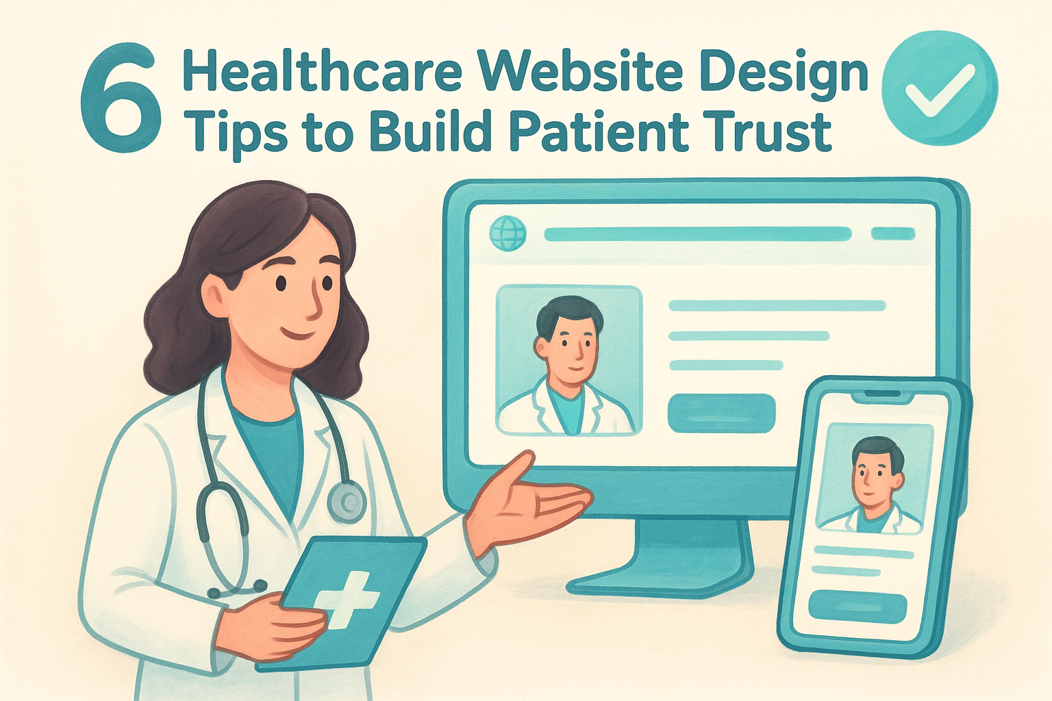
Build patient trust with these 6 healthcare website design tips. Optimize for mobile, ensure HIPAA compliance, and improve accessibility for your practice.
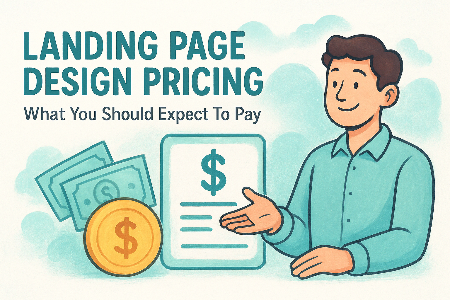
Get a clear breakdown of landing page design pricing. Compare market rates, see what drives costs, and learn how to budget for pages that actually convert.
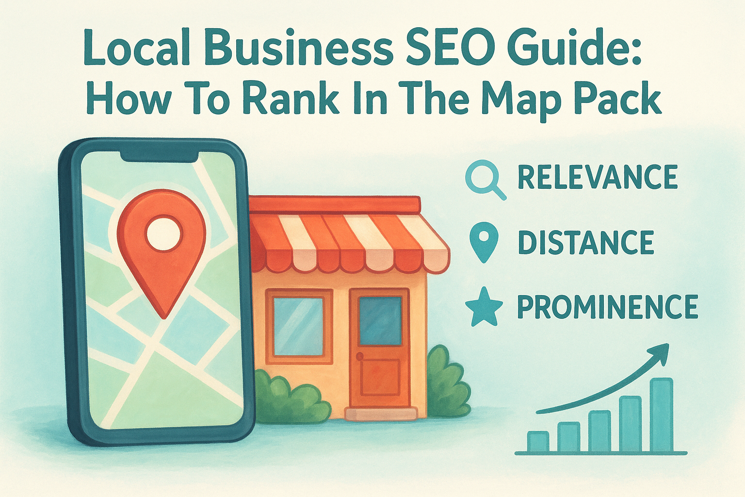
Rank higher in the Map Pack. This local business seo guide shows you how to optimize profiles, fix NAP data, and manage reviews for all your locations.
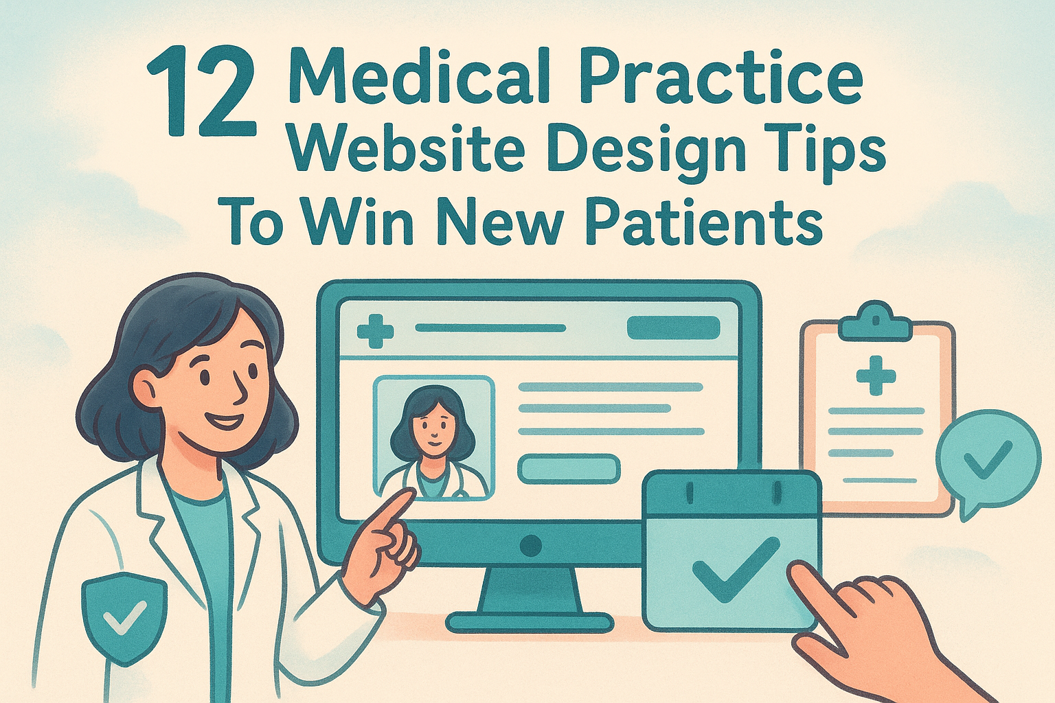
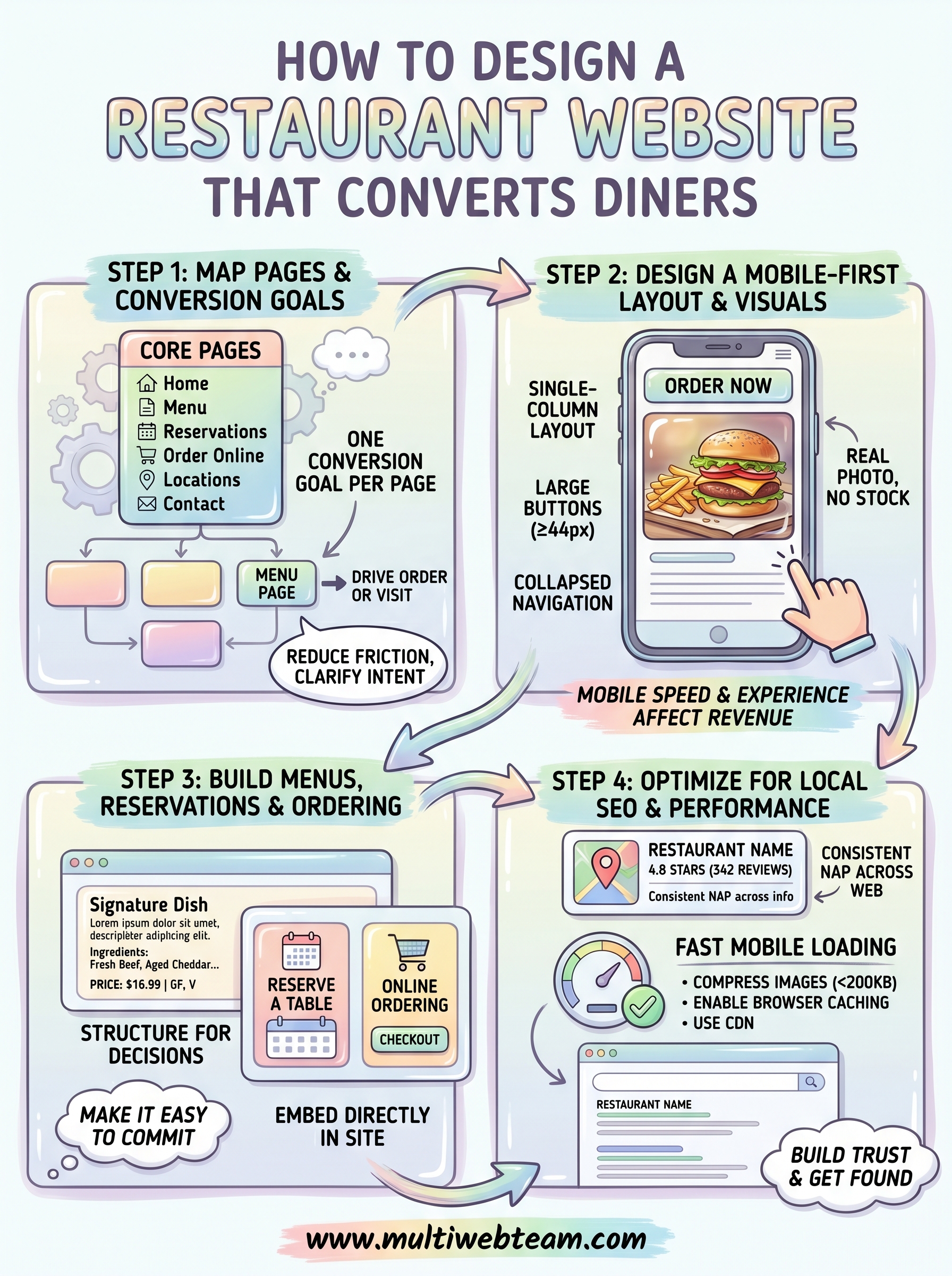
Win new patients with these 12 medical practice website design tips. Learn to optimize multi-location SEO, mobile speed, and CTAs to grow your practice.
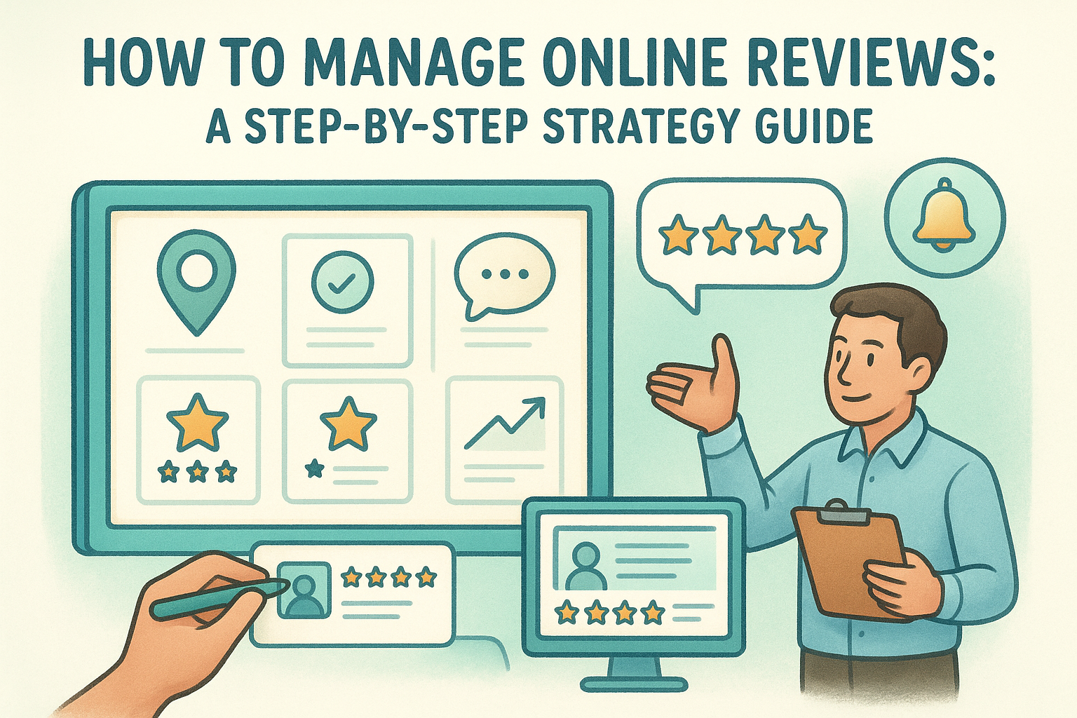
Learn how to manage online reviews across all locations. Build a system to monitor feedback, use response templates, and boost your local SEO rankings.
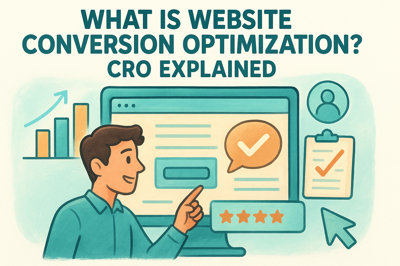
What is website conversion optimization? Learn how to turn traffic into revenue using data-driven testing and local tactics to grow your business.
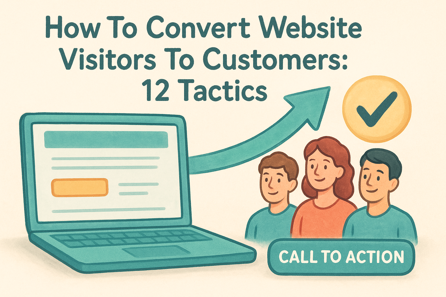
Discover how to convert website visitors to customers using these 12 tactics. Learn to optimize site speed, simplify contact forms, and build buyer trust.
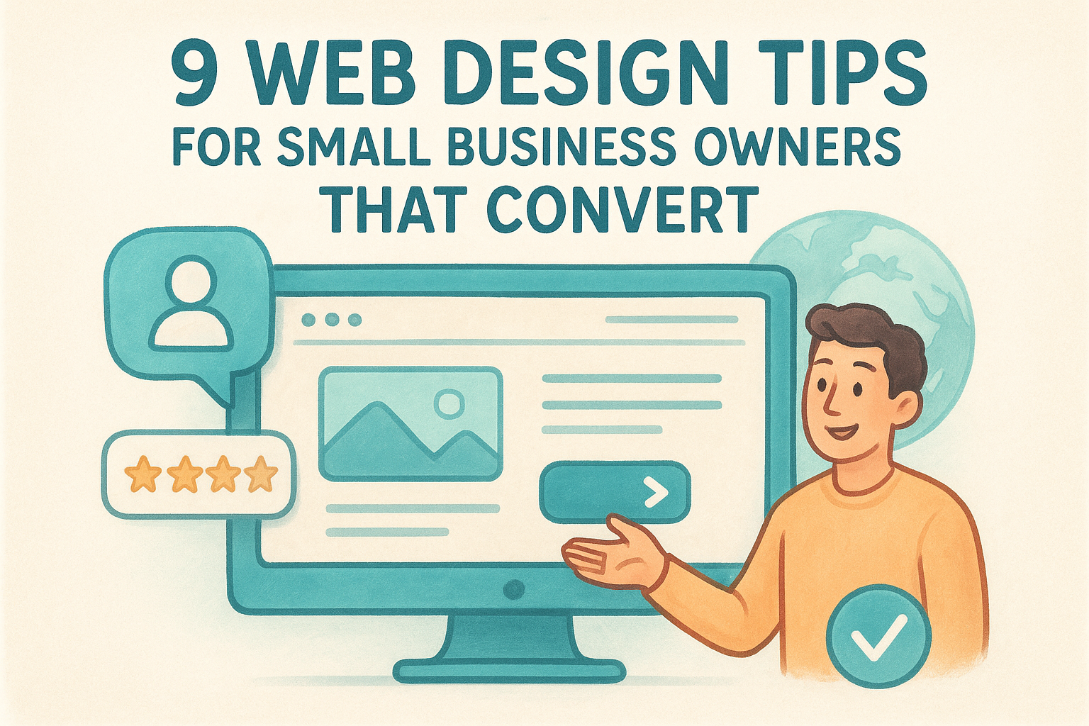
Convert more visitors with 9 practical tips for web design for small business owners. Learn to optimize for mobile, site speed, and clear navigation.
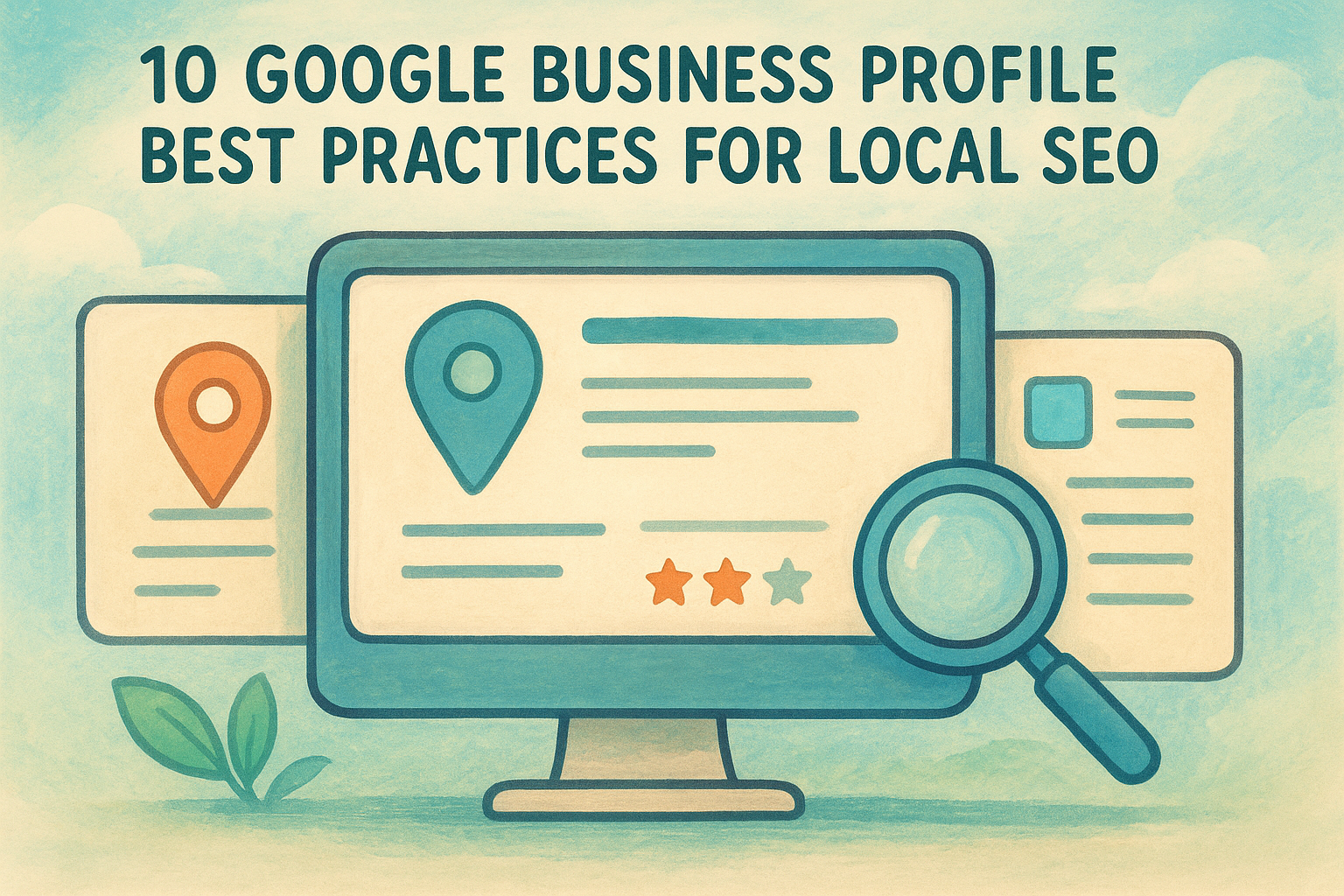
Rank higher in Google Maps with these 10 google business profile best practices. Learn to manage reviews, ensure NAP consistency, and optimize locations.
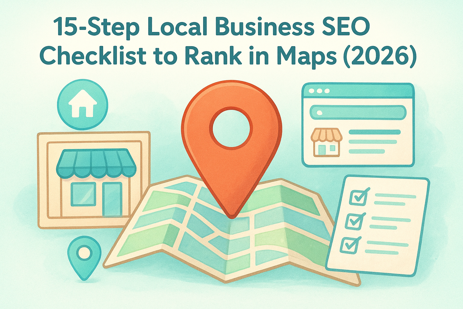
Boost your map rankings with this 15-step local business seo checklist. Learn to optimize profiles, fix NAP data, and drive more traffic to every location.
