June 23, 2026

How To Design A Mobile-Friendly Website: Speed & SEO In 2026

More than half of all web traffic comes from phones and tablets, and Google has been using mobile-first indexing as its default for years now. If your site doesn't work well on a small screen, you're losing both rankings and customers. For multi-location businesses and franchises, the stakes are even higher: each location needs to load quickly, display correctly, and convert visitors whether someone's searching from a desktop at home or a phone in their car. Knowing how to design a mobile-friendly website isn't optional anymore. It's the baseline.

At Multi Web Team, we build and manage custom websites for multi-location businesses, and mobile performance is baked into every site we deliver. We've seen firsthand how a slow, clunky mobile experience tanks local search visibility, and how fixing it drives real foot traffic to individual locations .

This guide breaks down the exact steps to design a website that's fast, mobile-optimized, and built for SEO in 2026. You'll learn the technical foundations, design best practices, and performance benchmarks that actually matter, whether you're building from scratch or reworking an existing site across multiple locations .

Mobile-friendly design standards in 2026

Understanding mobile-friendly design means knowing what Google and users actually expect right now. The bar has moved. A site that "worked on mobile" three years ago probably fails today's benchmarks. Google evaluates your site using the mobile version as the primary index , which means your desktop experience is secondary for ranking purposes. If you're figuring out how to design a mobile friendly website from the ground up, start with a clear picture of the current standards you're designing toward, not the ones from 2020.

Google's mobile-first indexing baseline

Google completed its rollout of mobile-first indexing in 2023, and the implications in 2026 are significant. Googlebot crawls your mobile version first, uses that content to determine relevance, and ranks accordingly. If your mobile pages are missing content, images, or structured data that your desktop version has, Google ignores that missing information entirely. That means every page across your site needs to deliver a complete, consistent experience on mobile before you optimize anything else.

If your mobile page is missing content that exists on your desktop version, Google treats that content as if it doesn't exist.

This applies directly to multi-location businesses. Each location page needs full content on mobile, including address, phone number, hours, and service-specific details . A stripped-down mobile version of a location page will rank lower, and there's no workaround for that.

Core Web Vitals targets for 2026

Core Web Vitals are Google's measurable signals for page experience, and they carry real weight in mobile rankings. Three metrics define whether your site passes Google's performance threshold:

Metric What it measures Good threshold
Largest Contentful Paint (LCP) How fast the main content loads Under 2.5 seconds
Interaction to Next Paint (INP) How fast the page responds to input Under 200 milliseconds
Cumulative Layout Shift (CLS) Visual stability during load Under 0.1

These thresholds apply specifically to mobile page performance , and Google's PageSpeed Insights tool lets you check your scores for free. A failing score on any of these metrics doesn't just hurt user experience. It directly affects where your pages rank in mobile search results.

Beyond Core Web Vitals, your site also needs to pass Google's mobile usability requirements : text readable without zooming, tap targets spaced at least 48px apart, and no horizontal scrolling on any viewport. These aren't suggestions. They're pass/fail criteria that appear in Google Search Console under the Mobile Usability report, and they affect every page you publish.

Step 1. Plan a mobile-first page hierarchy

Before you write a single line of CSS or choose a theme, you need to map out what content actually matters on each page. Mobile-first planning means you design for the smallest screen first, then expand outward. This forces you to make hard decisions about content priority that most desktop-first sites never bother with, and those decisions directly shape your rankings and conversions.

Start with the smallest screen and work up. If a piece of content isn't worth showing on mobile, it probably isn't worth showing at all.

Rank your content by importance

Every page on your site has a job. On a location page, that job is getting a visitor to call, visit, or book. List every content element on the page, then rank each one by how directly it supports that goal. Primary content (headline, CTA, phone number, address) goes at the top. Secondary content (about text, photos, reviews) sits below. Cut anything that doesn't move a visitor closer to action. For a location page, your priority stack should look like this:

  1. Location name and primary CTA (call or get directions)
  2. Phone number and hours
  3. Services offered at that location
  4. Customer reviews
  5. Photos and additional details

Structure your navigation for thumbs

Mobile navigation needs to work with one hand. Limit your main menu to five items or fewer, use a hamburger menu for secondary pages, and make sure your most important destination (such as "Find a Location" or "Book Now") is accessible from the primary header , not buried inside a dropdown. Dropdowns on mobile are difficult to use, so flatten your navigation structure as much as possible. When you think about how to design a mobile friendly website across multiple locations, a clean nav structure prevents users from bouncing before they reach the specific location page they need.

Step 2. Build a responsive layout that scales

A responsive layout adjusts automatically to any screen size, from a 320px phone to a 1440px desktop monitor. When you work through how to design a mobile friendly website, building responsiveness into your CSS architecture from the start is faster and cleaner than retrofitting it later. The core principle: stop using fixed pixel widths and start using flexible, relative units instead.

Use CSS Grid or Flexbox for your structure

CSS Grid and Flexbox are the two tools that handle modern responsive layouts without loading extra frameworks. Flexbox works best for single-axis layouts like navigation bars or button rows. Grid handles two-dimensional structures like page sections and location card grids. Here's a responsive card layout that scales across all screen sizes:

 .location-grid {
  display: grid;
  grid-template-columns: repeat(auto-fit, minmax(280px, 1fr));
  gap: 1.5rem;
  padding: 1rem;
} 

This code automatically creates one column on small screens and expands to multiple columns on larger viewports, with no device-specific breakpoints needed for the basic behavior.

Use auto-fit with minmax() to build grids that scale across any screen width without hardcoded pixel values.

Set breakpoints based on your content

Device-specific breakpoints (targeting exact phone models by name) break down fast because screen sizes change constantly. Instead, shrink your browser window and add a breakpoint wherever your layout starts to look wrong . Most sites need three to four breakpoints. A practical starting range:

Breakpoint Layout behavior
max-width: 480px Single column, stacked content
min-width: 768px Two-column content sections
min-width: 1024px Full desktop layout

Write your CSS mobile-first using @media (min-width: ...) and layer complexity as the viewport grows. This approach keeps your base styles lightweight and your mobile page load fast .

Step 3. Design for thumbs, forms, and accessibility

When you work through how to design a mobile friendly website, the visual layout is only part of the challenge. Touch interactions and accessibility determine whether real people can actually use what you build. Most mobile usability failures come down to two things: tap targets that are too small to hit reliably, and forms that are frustrating to complete on a phone keyboard. Fixing both improves conversion rates and eliminates errors flagged in Google Search Console.

Make tap targets large enough to use

Google requires tap targets of at least 48x48 CSS pixels with 8px of spacing between adjacent targets. Buttons, links, and form fields that fall below this threshold generate errors in the Mobile Usability report. Apply minimum sizing directly in your CSS to enforce this across every page:

 a, button, input, select, textarea {
  min-height: 48px;
  min-width: 48px;
  padding: 12px 16px;
} 

If a tap target is too small to hit without zooming, users leave and don't come back.

Your primary CTA buttons should run full-width on mobile screens. Full-width buttons are easier to tap, reduce missed interactions, and visually signal the action you want visitors to take.

Build forms that work on phone keyboards

Mobile forms frustrate users when they trigger the wrong keyboard or demand unnecessary typing. Use the correct HTML input types to automatically pull up the right keyboard for each field:

Input type Keyboard triggered
type="tel" Numeric phone keypad
type="email" Email keyboard with @ key
type="number" Numeric keypad
type="text" Standard keyboard

Pair each input with autocomplete attributes so browsers can pre-fill common fields like name, phone number, and address. Cut every form field that isn't strictly required. Shorter forms convert better on mobile, and every extra field increases the chance a visitor abandons before submitting.

Step 4. Optimize for speed and mobile SEO

Speed and SEO are two sides of the same coin when you're figuring out how to design a mobile friendly website . A page that loads slowly loses visitors before they even see your content, and Google uses real-world load times as a ranking signal for mobile search results. The faster your mobile pages load, the better they rank and convert.

Compress images and reduce page weight

Images are the single biggest contributor to slow mobile load times. Serve all images in WebP format , which delivers smaller file sizes than JPEG or PNG without visible quality loss. Use the loading="lazy" attribute on any image below the fold so the browser only fetches images when a user scrolls to them. Here's a practical template for every location page image:

 <img 
  src="location-storefront.webp" 
  alt="[Location Name] storefront" 
  width="800" 
  height="600" 
  loading="lazy"
> 

Always define explicit width and height attributes on every image. This prevents layout shift during load, which directly improves your CLS score and keeps Google's quality threshold in reach.

Undefined image dimensions are one of the most common causes of poor CLS scores on mobile pages.

Add mobile-specific SEO signals

Your mobile pages need structured data markup to help Google understand each location's details. Add LocalBusiness schema to every location page with accurate name, address, phone number, and hours. Beyond structured data, keep your meta viewport tag correctly set on every published page:

 <meta name="viewport" content="width=device-width, initial-scale=1"> 

Without this tag, mobile browsers render your page at desktop width and scale it down, which breaks your layout and generates errors in Google Search Console. Check every page to confirm this tag sits inside the <head> element before launch.

Keep your site mobile-ready

Knowing how to design a mobile friendly website gets you to launch, but mobile performance requires ongoing attention after that. Google updates its Core Web Vitals thresholds and mobile usability criteria regularly, so a site that passes today can slip six months from now. Run PageSpeed Insights on your highest-traffic pages every quarter, check the Mobile Usability report in Google Search Console after major updates, and test real devices whenever you change your layout or add new page templates. For multi-location businesses, run these checks on individual location pages, not just your homepage.

Staying current matters even more when your site spans dozens of locations. Small performance regressions on location pages compound quickly across your whole site and quietly drag down your local rankings before you notice. If you want a team that handles mobile performance, SEO, and ongoing updates for every location you run, explore Multi Web Team's website management services to see how it works.

By cinchweb June 22, 2026
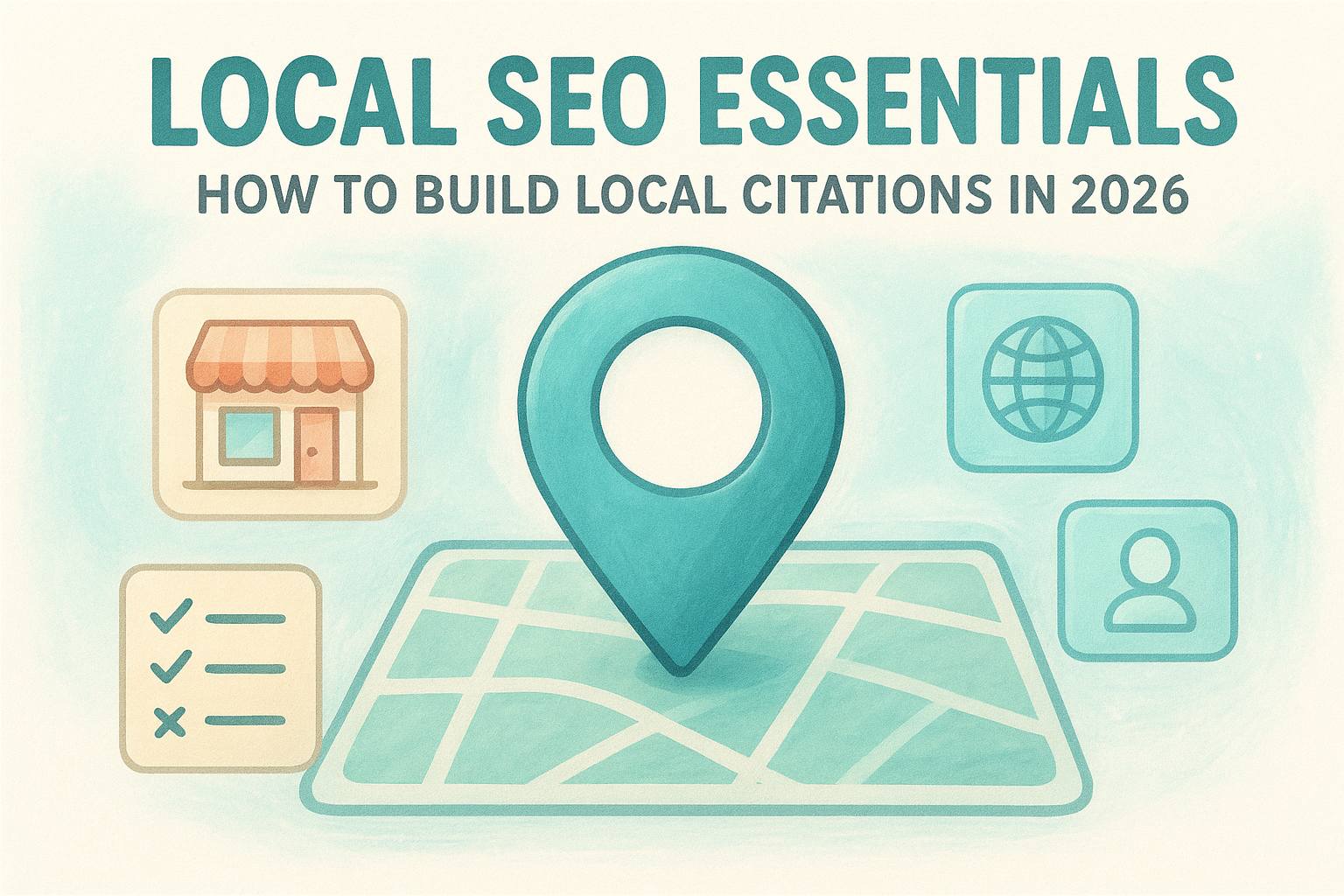
Learn how to build local citations to boost search visibility. Master NAP consistency, audit listings, and scale mentions for multi-location businesses.
By cinchweb June 20, 2026
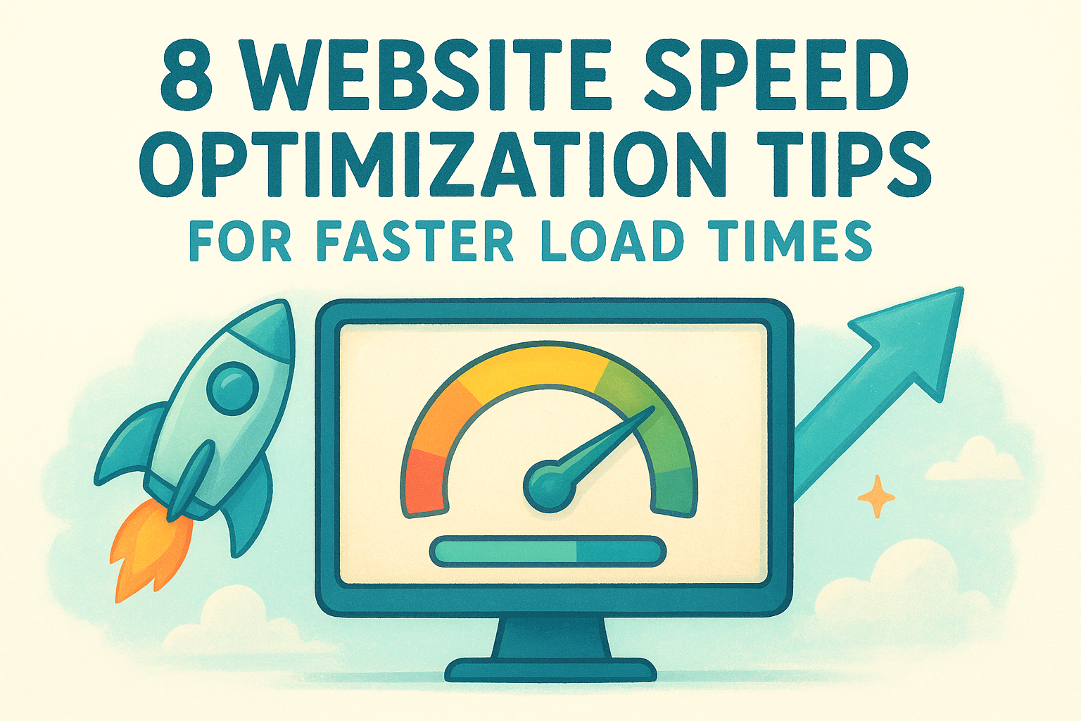
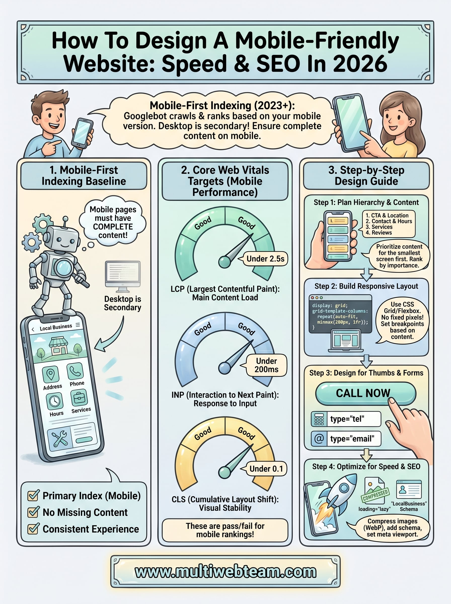
Stop losing visitors to slow pages. These 8 website speed optimization tips show you how to fix Core Web Vitals, optimize images, and slash your load times.
By cinchweb June 19, 2026
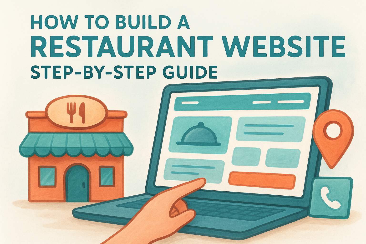
Learn how to build a restaurant website that drives diners. This step-by-step guide covers mobile design, local SEO, and live menus to boost your sales.
By cinchweb June 18, 2026
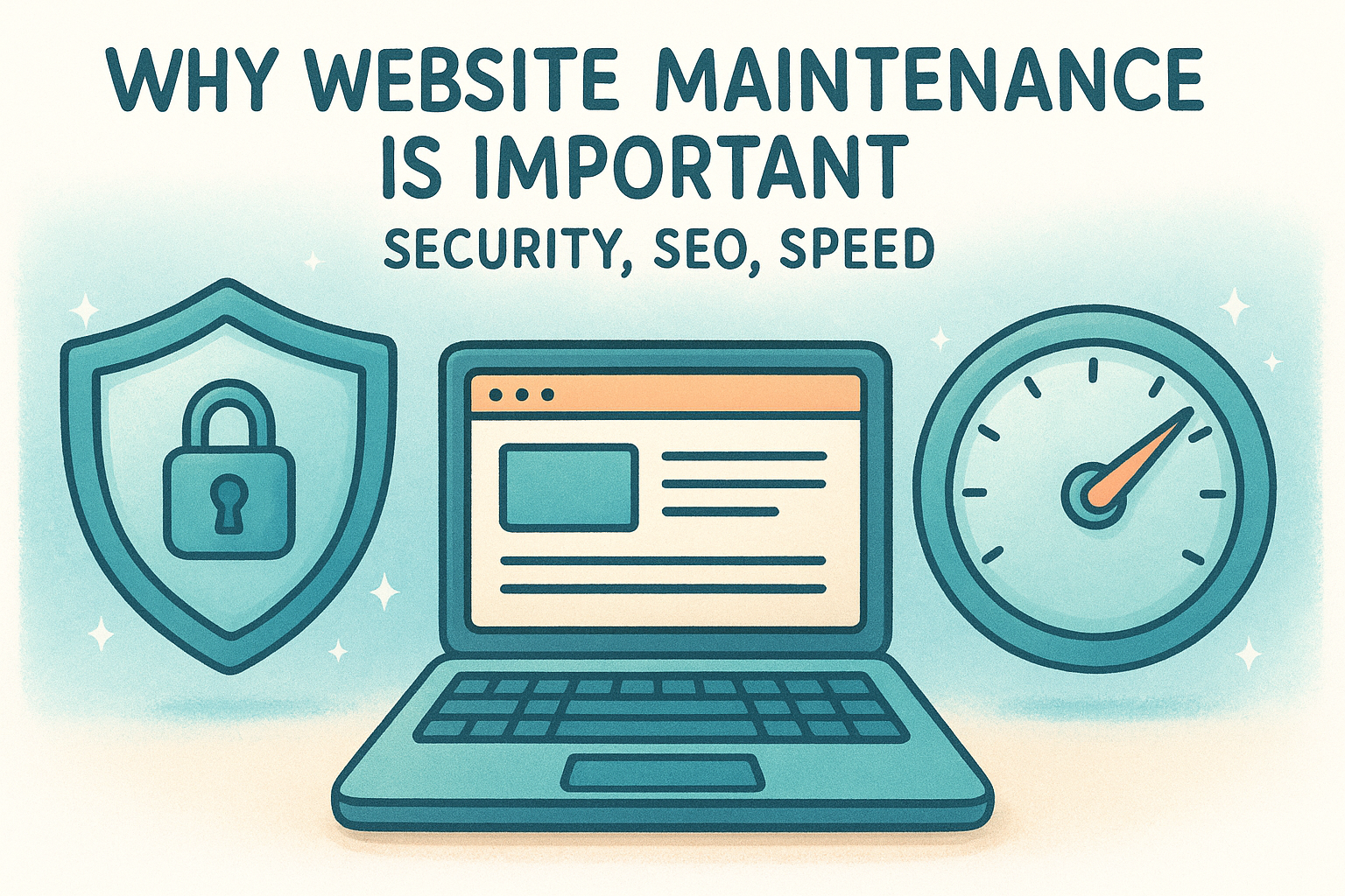
Learn why website maintenance is important for security, SEO, and speed. Protect your business from threats and ensure your site always runs smoothly.
By cinchweb June 18, 2026
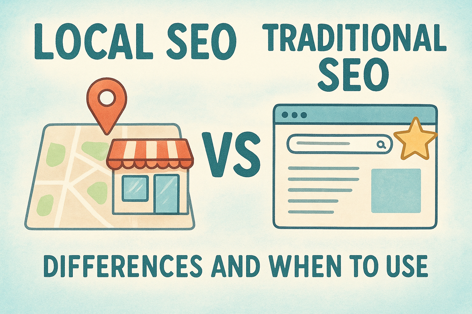
Understand the core differences in local seo vs traditional seo. Learn how to rank in Map Packs, drive foot traffic, and choose the right strategy for growth.
By cinchweb June 16, 2026
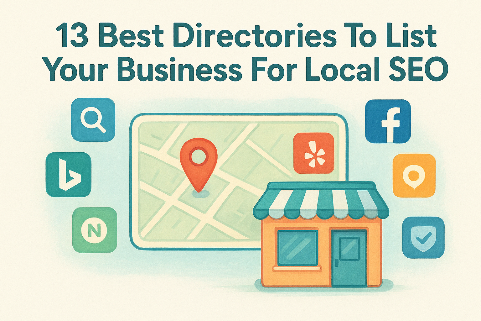
Boost local search visibility with the 13 best directories to list your business. Learn how to optimize profiles and manage citations to rank higher.
By cinchweb June 15, 2026
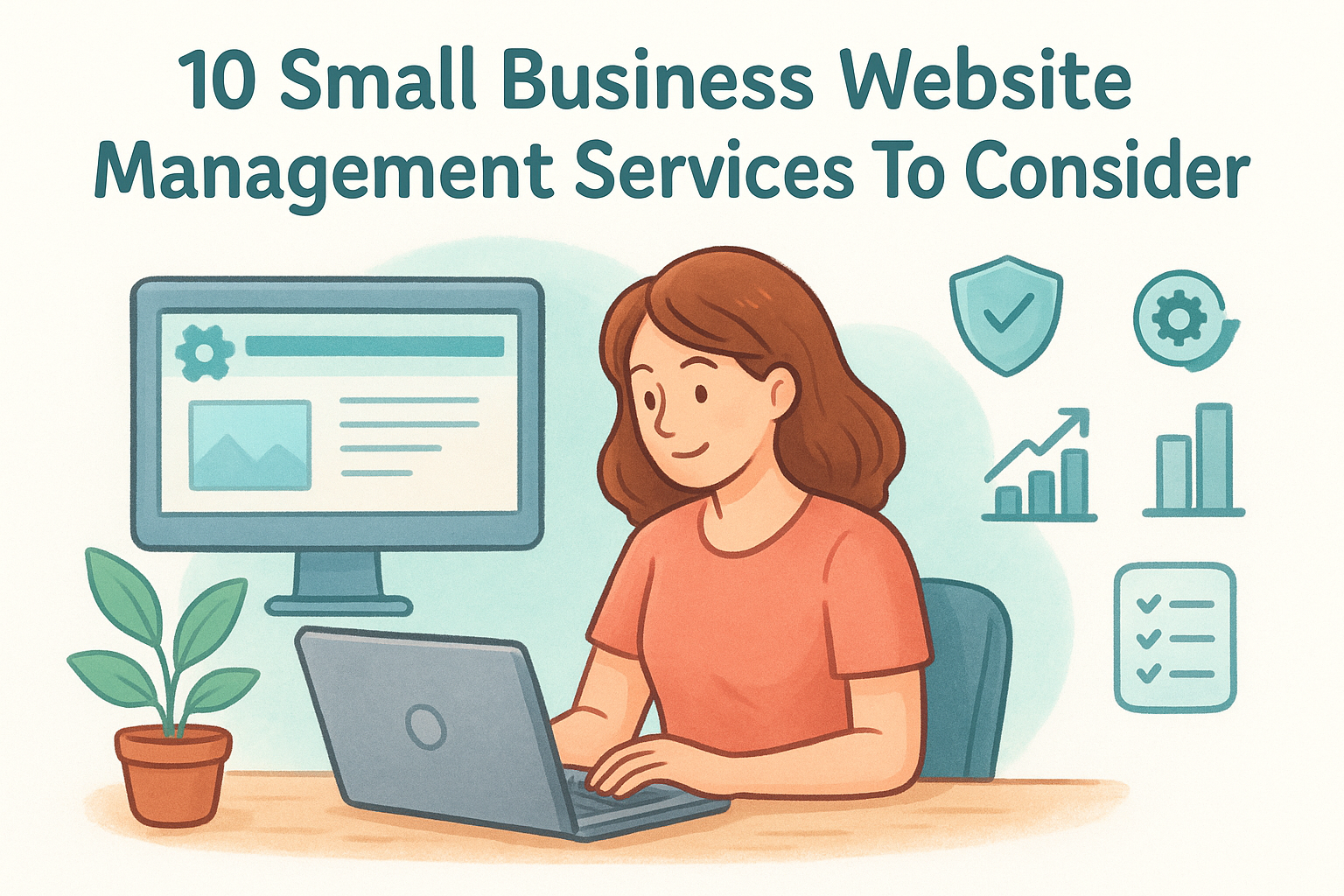
Compare 10 top small business website management services to find your best fit. Learn which agencies offer the SEO, security, and pricing model you need.
By cinchweb June 14, 2026
Find the right expert to boost your conversions. Discover the 11 best places to hire a landing page designer in 2026, from freelancers to specialized agencies.
By cinchweb June 14, 2026
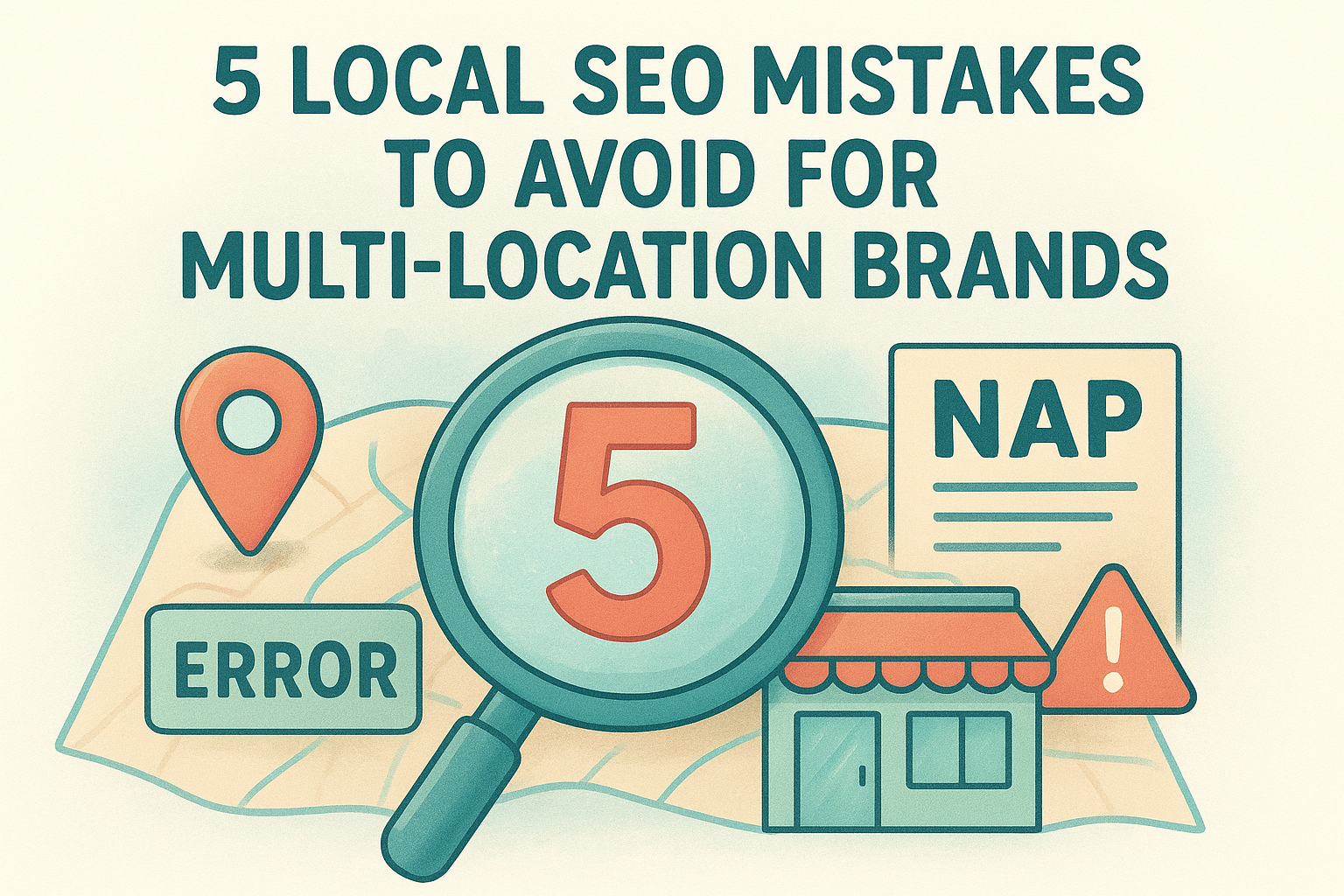
Stop losing traffic to NAP errors and thin content. Discover the critical local seo mistakes to avoid to keep your multi-location brand ranking high.
By cinchweb June 12, 2026
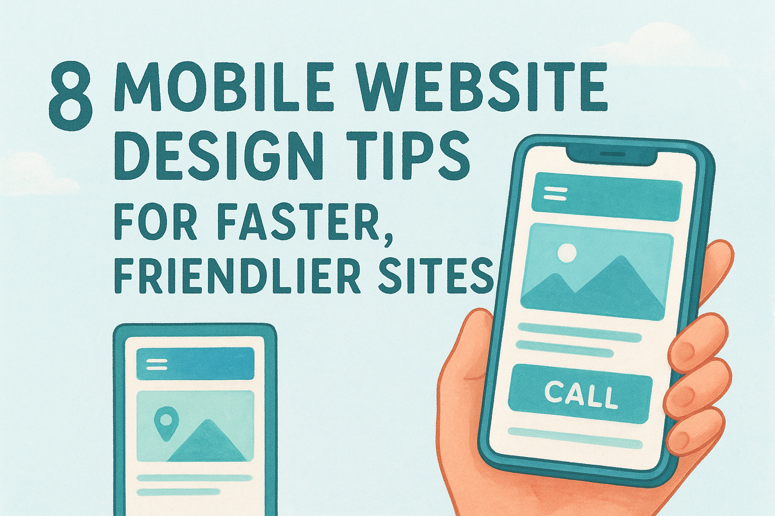
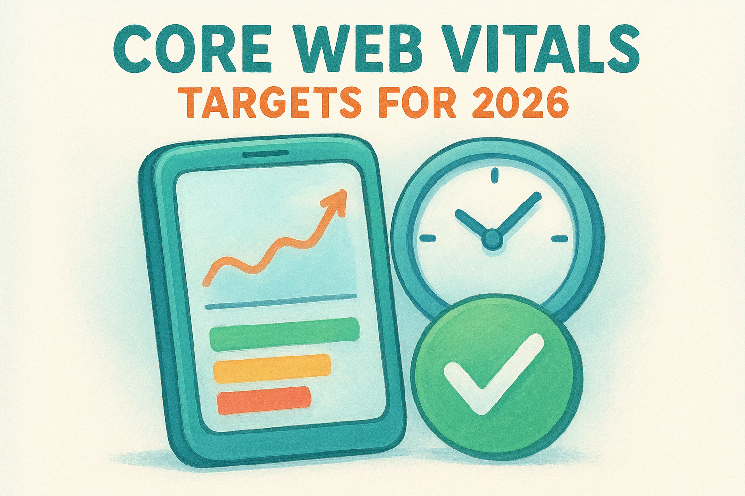
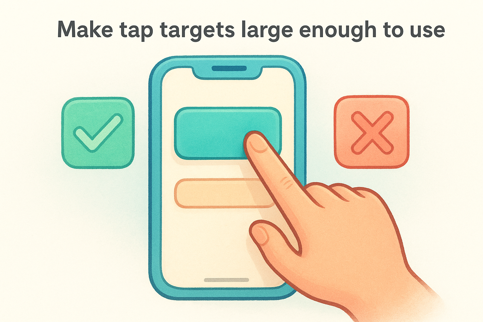
Boost site speed and usability with 8 mobile website design tips. Learn to optimize navigation, simplify forms, and drive more conversions on mobile devices.
SHOW MORE