8 Mobile Website Design Tips for Faster, Friendlier Sites
More than half of all web traffic comes from phones, and that number keeps climbing. If your site loads slowly, looks cramped, or makes people pinch-and-zoom to read anything, they'll leave, usually within seconds. For multi-location businesses and franchises, that's not just a bad user experience. It's lost revenue multiplied across every location you operate . The right mobile website design tips can fix that.
At Multi Web Team, we build and manage custom websites for multi-location businesses, so we see firsthand what works on small screens and what drives visitors away. Every site we design starts mobile-first because that's where your customers are. The principles behind great mobile design aren't secret , they just require attention to detail and a willingness to prioritize the user over everything else.
Below, we're sharing eight practical tips we apply to real client sites every day. Whether you're building from scratch or fixing an underperforming site, these will help you create a faster, friendlier mobile experience that actually converts visitors into customers.
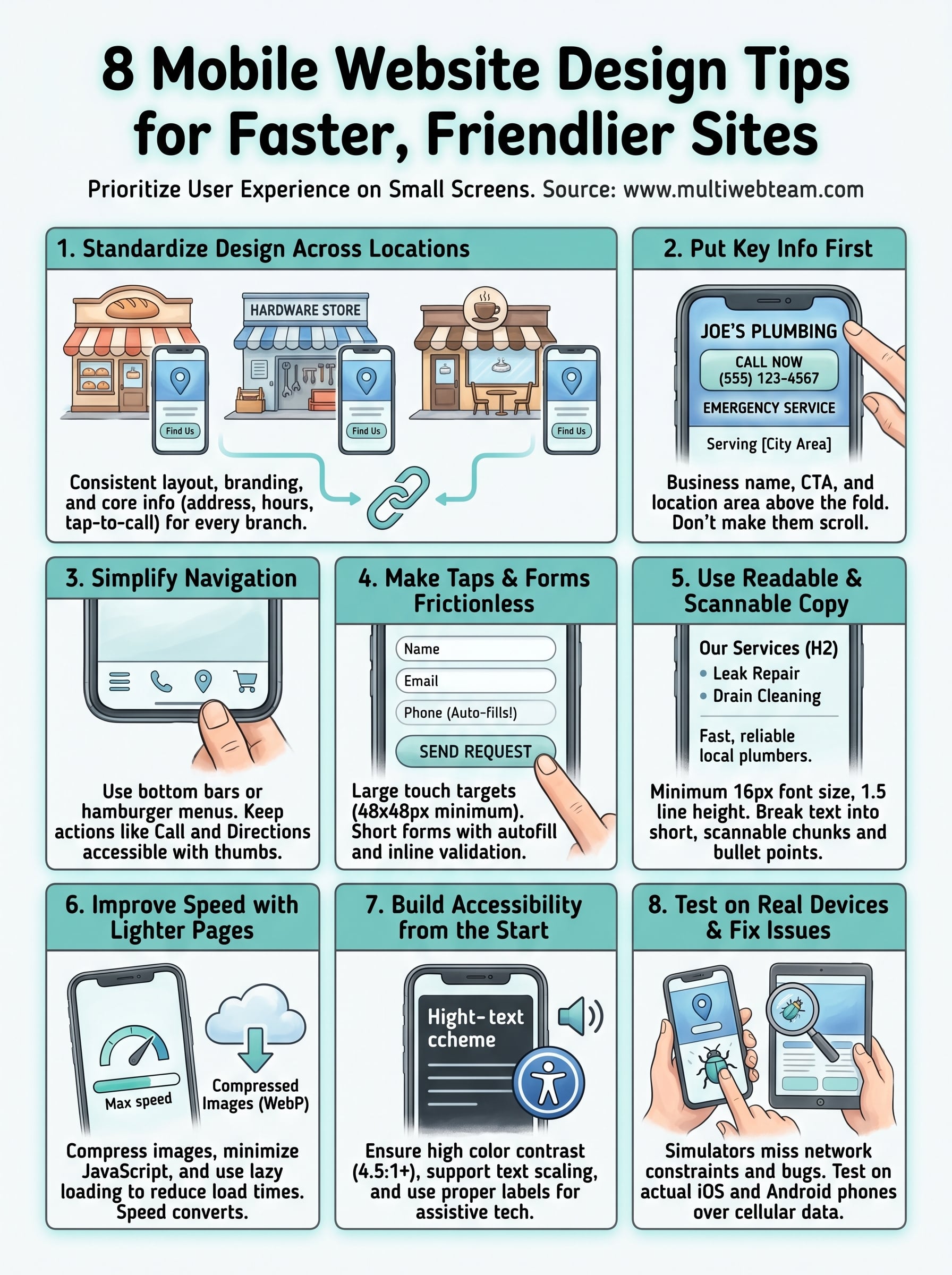
1. Standardize mobile design across locations
Running multiple locations means your website has to deliver a consistent mobile experience no matter which city or neighborhood a visitor searches from. Inconsistent layouts, broken buttons, or outdated information on individual location pages don't just frustrate users. They cost you customers who assume your business is disorganized.
When a managed web team makes sense
If you operate five locations or fifty, keeping every page updated manually quickly becomes a full-time job that pulls attention away from your actual operations. A managed web team makes sense the moment the volume of mobile fixes, content updates, and design decisions exceeds what your internal staff can reasonably handle. You shouldn't need a developer on call just to update your hours or swap out a photo.
How to keep brand and UX consistent across locations
Shared templates and a documented style guide are the fastest way to keep every location page looking and behaving the same on mobile. Set clear rules for font sizes, button colors, spacing, and layout structure so any new location page matches the existing ones without requiring custom design work each time. When your templates are built mobile-first from the start, consistency becomes automatic rather than something you have to chase .
Consistent mobile design across locations isn't just cosmetic. It directly affects how much visitors trust your brand when they land on a page they found through a local search.
Mobile essentials for location pages and store finders
Every location page needs a few non-negotiable mobile elements : a tap-to-call button, a map embed or directions link, current business hours, and a clear street address. Store finders should load fast and return results with minimal taps , ideally letting users search by zip code or share their device location for instant results. Anything that adds friction between a mobile visitor and the information they need reduces the chance they'll show up in person.
How Multi Web Team supports multi-location updates
One of the most actionable mobile website design tips for franchise and multi-location owners is to centralize your update process through a single managed service. Multi Web Team handles every location page under one subscription, so when you need to push a promotion, refresh photos, or correct hours, those changes go live across all locations without per-update fees or back-and-forth requests. Your web presence stays accurate and consistent while you focus on running your business.
2. Put key info first on every mobile page
Mobile visitors don't scroll to find what they need . They judge your page in the first few seconds, so prioritizing the right content at the top is one of the most effective mobile website design tips you can apply.
What "mobile-first hierarchy" looks like
Mobile-first hierarchy means your most critical content appears before any decorative elements . Think of the phone screen as a narrow column where every line has to earn its place .
Users rarely scroll past the first screenful if they don't immediately see value. Structure your content decisions around what a visitor needs first , not what looks impressive.
The must-have items above the fold
Your business name, primary call-to-action, and a tap-to-call button should all be visible without scrolling on any device. Adding your location or service area above the fold reduces friction for visitors who are ready to act.

Visitors who have to scroll just to find a phone number are visitors you're likely losing to a competitor.
How to structure a high-converting location page
Lead with your address and hours , followed immediately by a clear call-to-action. Supporting content like photos and reviews belongs below, where it reinforces a decision rather than delaying one.
Keep the page scannable from top to bottom so a visitor can confirm they're in the right place within seconds .
Mistakes that bury the action or the answer
Large hero images and long introductory text push your key details below the fold on most phones. Auto-playing videos and slow-loading carousels delay the moment a visitor can even read what you offer.
3. Simplify navigation for thumbs and speed
Mobile visitors navigate with their thumbs, not a mouse cursor, so your menu structure needs to work with natural hand positions and quick decisions. Cluttered navigation and hard-to-tap links create friction that sends visitors back to search results before they find what they need. Simplifying your navigation is one of the most practical mobile website design tips you can apply right now.
The best mobile menu patterns for service businesses
A hamburger menu (the three-line icon) works well for service businesses with several pages, keeping the screen clean while giving users access to everything. For sites with three to five key destinations, a bottom navigation bar puts links exactly where thumbs naturally rest. Avoid drop-down menus that require precise taps, since they consistently cause frustration on small screens.
Where to place primary actions like call and directions
Your tap-to-call button and directions link should appear in a fixed position that doesn't require scrolling. Placing these actions in a persistent header or floating button means a visitor can act the moment they decide to, without hunting through your page.
The easier you make it to call or get directions, the more likely a mobile visitor becomes a customer who walks through your door.
How to keep headers sticky without crowding the screen
A sticky header keeps your logo and primary action visible as users scroll, but keep it compact, ideally under 60 pixels tall, so it doesn't consume half the viewport. Limit sticky header content to one action and your brand name.
Quick navigation checklist for multi-page sites
Before publishing any location page, confirm your navigation works on real devices. Every tap target should measure at least 44x44 pixels , and no two links should sit close enough to trigger the wrong one. Test your menu on both iOS and Android to catch inconsistencies before they reach customers.
4. Make taps, buttons, and forms frictionless
Friction kills conversions on mobile. When buttons are too small to tap accurately or forms take too many steps to complete, visitors abandon the page rather than push through. Applying the right mobile website design tips here directly affects how many users actually complete the actions you want them to take.
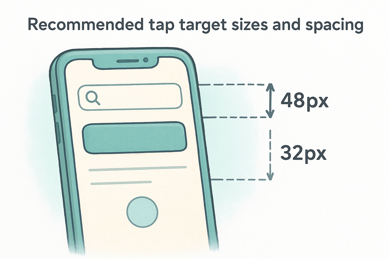
Recommended tap target sizes and spacing
Google recommends a minimum tap target size of 48x48 pixels for any interactive element, including buttons, links, and icons. Beyond size, spacing between targets matters just as much . When two tappable elements sit too close together, users accidentally trigger the wrong one, which creates frustration that often ends the session entirely.
How to design mobile forms people finish
Keep your forms as short as possible by asking only for what you genuinely need. Breaking longer forms into clearly labeled steps reduces cognitive load and makes the process feel manageable rather than overwhelming. A single-column layout prevents input fields from sitting side by side, which causes alignment problems on narrow screens.
A form with fewer fields consistently outperforms a longer one, even when the longer version collects more useful data.
Autofill, input types, and error messages that help
Using the correct HTML input types (tel for phone numbers, email for addresses) triggers the right keyboard layout automatically, removing one more step for the user. Enable autofill attributes so browsers can populate common fields without manual typing.
Common mobile UX issues that tank conversions
Dropdowns, date pickers, and custom-styled inputs often break on real devices even when they look fine in a browser preview. Test every form field on both iOS and Android and confirm error messages appear inline , directly next to the problem field, so users can fix mistakes without scrolling.
5. Use readable typography and scannable copy
Most mobile visitors scan your page rather than read it , which means typography and copy structure directly control whether they find what they need or leave. Applying these mobile website design tips around text and layout can significantly reduce your bounce rate.
Mobile font sizing and line spacing that works
Set your body text to at least 16px to prevent users from having to pinch-zoom to read anything. Pair that with a line height of 1.5 or greater so your text doesn't feel cramped on a narrow screen.
How to rewrite sections for scanning, not scrolling
Break long paragraphs into two or three sentences maximum so each block delivers one clear point. Front-load your sentences with the most important information first , since many visitors only read the beginning of each line before deciding to continue.
If your paragraphs run longer than three lines on a phone screen, most visitors will skip them entirely.
Using headings, bullets, and short paragraphs correctly
Use H2 and H3 headings to divide your content into clearly labeled chunks that visitors can jump between. Bullet lists work well for steps, features, or comparisons, but limit each list to five or six items before switching back to prose.
What to avoid with banners, sliders, and long intros
Large banner text and auto-advancing sliders delay the moment visitors reach useful content and often display poorly across different screen sizes. Cut lengthy introductions from the top of your pages and lead instead with the specific answer or action your visitor came for.
6. Improve mobile speed with lighter pages
Page speed is one of the most direct mobile website design tips you can act on because visitors don't wait. A slow site pushes users back to search results before they even see your offer, and every additional second of load time increases your bounce rate significantly.
The biggest causes of slow mobile sites
Most slow mobile pages share the same culprits: uncompressed images, unused JavaScript, and too many third-party requests loading before your content appears. Each of these adds time between a tap and a usable page, and on mobile networks, that delay compounds quickly.
A page that loads in one second converts roughly three times better than a page that takes five seconds.
Image and video best practices for mobile
Serve compressed images in WebP format rather than JPG or PNG, since WebP files are consistently smaller at the same visual quality. Use lazy loading so images below the fold only download when a visitor scrolls toward them, keeping initial load time low.
Smart choices for fonts, scripts, and third-party widgets
Limit yourself to two font families maximum and load only the weights you actually use. Third-party widgets like chat tools and social embeds each add their own scripts, so audit every plugin or embed on your mobile pages and remove anything that isn't earning its place.
How to spot speed issues with real-world testing
Run your pages through Google PageSpeed Insights to get specific, prioritized recommendations tied to real performance data. Test on an actual phone over a cellular connection, not just a desktop browser, because emulated mobile views miss network and hardware constraints that real devices expose immediately.
7. Build accessibility into every mobile screen
Accessibility isn't a bonus feature you add at the end of a project. Building it in from the start protects you from excluding a significant portion of your audience and keeps your site aligned with mobile website design tips that actually serve everyone who visits.
Color contrast, text scaling, and touch accessibility
Your text needs a contrast ratio of at least 4.5:1 against its background so users with low vision can read it without difficulty. Allow text scaling up to 200% without breaking your layout, since many users set their device's font size larger than the default.
Accessibility improvements rarely hurt anyone and frequently help everyone, including users on poor lighting or small screens.
Accessible navigation, menus, and focus states
Every interactive element needs a visible focus state so keyboard and switch-access users always know where they are on the page. Your mobile menus should close cleanly and return focus to the trigger button when dismissed, keeping the experience predictable for anyone relying on assistive technology.
Forms and error handling for assistive tech
Label every form field with a visible, descriptive label tag rather than placeholder text alone, since screen readers rely on labels to announce each field's purpose. Associate error messages directly with their input fields using ARIA attributes so assistive technology reads them in context rather than as disconnected text.
Accessibility checks to run before you publish
Before any page goes live, run it through Google Lighthouse to generate an automated accessibility score with specific items to fix. Pair that with manual testing using a screen reader on a real phone to catch issues automated tools consistently miss.
8. Test on real devices and fix issues fast
Simulators and browser developer tools give you a rough idea of how your site looks on mobile, but real devices expose the problems that matter most . Testing on actual phones is one of the most underused mobile website design tips because it takes more time, but it catches the exact issues your customers will encounter in real life.
What to test on iPhone and Android
Cover both platforms because iOS and Android handle fonts, inputs, and scroll behavior differently . Check that tap targets respond correctly, forms submit without errors, and all location-specific content displays accurately on both operating systems. Pay close attention to how your site handles different screen sizes within each platform, since the same layout can break on a smaller Android device while looking fine on a larger iPhone.
Mobile bugs that show up only on real devices
Network throttling in a browser emulator doesn't replicate a real LTE or 5G connection , so load times often appear faster than they actually are. Real devices also surface rendering bugs in custom CSS and JavaScript that emulators consistently miss, particularly around scroll events and fixed positioning.
Testing on a real phone over a cellular connection is the only way to know what your customers actually experience.
QA checklist for multi-location rollouts
Before pushing updates across locations, confirm every location page loads correctly , all tap-to-call buttons work, hours display accurately, and map embeds respond to touch. A structured checklist prevents a single broken update from affecting multiple locations at once.
How often to re-test after updates
Re-test your highest-traffic location pages after every significant update , including content changes, plugin updates, and theme modifications. Schedule a full mobile audit at least quarterly to catch regressions before they affect customer conversions.
Ready to apply these tips
These eight mobile website design tips cover the full range of what separates a site that converts from one that frustrates. From standardizing your location pages to testing on real devices, every tip on this list targets a specific friction point that costs multi-location businesses customers every day.
Putting all of this into practice takes time, and for businesses managing multiple locations, staying on top of mobile design, performance, and updates is a continuous job, not a one-time project. The details matter and compound quickly when you're responsible for keeping every location page accurate, fast, and easy to use on any phone.
Your customers won't wait for a slow page or work around a broken form. They'll move on to the next result. If you're ready to hand that responsibility to a team that handles it all, explore what Multi Web Team can do for your locations and see how a managed service keeps every location performing at its best on mobile.