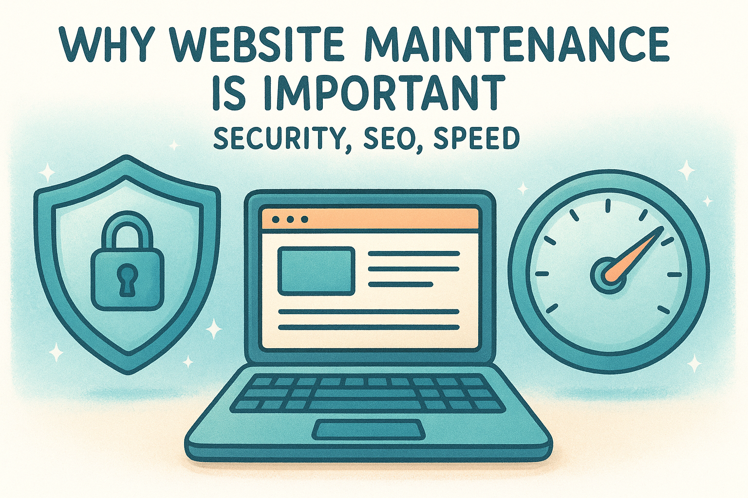
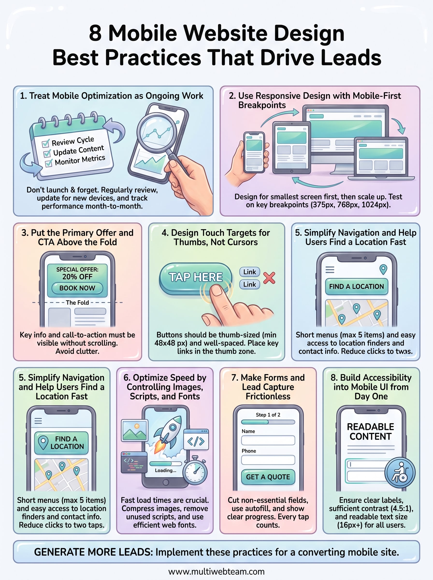
8 Mobile Website Design Best Practices That Drive Leads
More than half of all web traffic comes from phones, and for multi-location businesses, that number skews even higher. People searching for a nearby restaurant, gym, or service provider are almost always doing it from their pocket. If your site doesn't follow mobile website design best practices , those visitors bounce before they ever see your hours, your menu, or your "Book Now" button. That's not a minor UX issue. That's lost revenue across every single location.
The tricky part? Mobile design for a business with five, fifteen, or fifty locations isn't the same as optimizing a single-page portfolio site. Each location needs to load fast, display correctly on any screen size, and make it dead simple for a visitor to take action , whether that's calling, getting directions, or placing an order. Multiply those requirements across all your locations, and you've got a real challenge on your hands. It's exactly the kind of problem we solve daily at Multi Web Team , where we build and manage custom websites for multi-location businesses and franchises.
This article breaks down eight specific, proven practices that turn a clunky mobile experience into one that actually generates leads. No vague theory, just actionable steps you can evaluate your site against right now . Whether you're launching a new site or wondering why your current one isn't converting, these are the design decisions that move the needle.
1. Treat Mobile Optimization as Ongoing Work
Mobile optimization isn't a one-time project you check off and forget. User behavior shifts , new devices hit the market, Google's ranking criteria evolve, and your own business changes constantly with new locations, promotions, and services. Treating your mobile site as finished the moment it launches is one of the fastest ways to watch your mobile leads flatten out over time.
What this best practice means
Following mobile website design best practices means building a regular review cycle into how you run your site, not just how you build it. Every time you add a new location page , change a service, or run a seasonal offer, that update needs to render correctly on every screen size and connection speed your visitors actually use.
Why it drives more leads on mobile
Search engines reward sites that stay current and perform consistently. A broken CTA button or a slow-loading hero image on mobile can cut your conversion rate significantly, and you might not catch it until you're reviewing analytics weeks later. Mobile users don't wait. If your site stutters, they tap back and call whoever shows up next.
The difference between a mobile site that converts and one that doesn't often comes down to small, consistent improvements made month after month.
Where Multi Web Team fits for multi-location updates
Managing mobile updates across five or fifty locations is where most businesses hit a wall. Multi Web Team includes unlimited website updates under a monthly subscription, so when you change hours, push a new promotion, or open a new location, those changes go live across your entire site without per-update fees or a growing backlog of requests.
How to measure improvement month to month
You need a focused set of mobile-specific metrics to review every month: mobile bounce rate, average session duration on mobile, click-to-call events, and conversions segmented by device type. Google Search Console flags mobile usability errors directly in your dashboard, so you can catch and fix problems before they cost you leads. Set a recurring monthly review and compare each period against the last one.
2. Use Responsive Design with Mobile-First Breakpoints
Responsive design means your site automatically adjusts its layout to fit any screen size. Mobile-first means you design for the smallest screen first , then layer in complexity for larger screens. This approach keeps your mobile performance sharp and prevents bloated code from slowing things down.
What responsive and mobile-first mean in practice
With a mobile-first approach, your CSS starts with base styles for small screens and uses media queries to scale up. This prevents the common mistake of cramming a desktop layout down to mobile, which almost always breaks spacing, typography, and navigation in ways that are hard to fix without a rebuild.
Designing mobile-first from the start is faster to maintain and easier to optimize than retrofitting a desktop site for phones.
Layout rules that prevent mobile design breaks
Keep your layout to a single column on screens below 768px
. Avoid side-by-side content blocks that collapse awkwardly, and use relative units like percentages and rem
instead of fixed pixel widths so every element scales correctly across devices.
Key breakpoints to design and test
Focus on three core breakpoints that cover the devices most of your visitors actually use:
- 375px for small phones
- 768px for tablets
- 1024px for desktops
Testing at each of these gives you a reliable baseline before publishing any update.
Red flags that signal you need a rebuild
If your site uses a fixed-width layout , requires horizontal scrolling on mobile, or was last redesigned before 2018, you likely need a rebuild. These are clear signs your setup cannot support mobile website design best practices without a structural overhaul.
3. Put the Primary Offer and CTA Above the Fold
Mobile visitors make a decision about your site in under three seconds . If your primary offer and call-to-action aren't visible without scrolling, most of them will never find either one. Above the fold refers to everything a user sees the moment your page loads, before any scrolling occurs.
What to place in the first screen and why
Your first screen should answer three questions instantly : what you offer, who it's for, and what the visitor should do next. A clear headline, one supporting line of text, and a single CTA button is all you need. Resist the urge to load this area with logos, sliders, or secondary messages that compete for attention.

The more choices you give a mobile visitor above the fold, the fewer actions they actually take.
CTA patterns that increase taps and calls
Click-to-call buttons and prominent "Book Now" or "Get a Quote" links consistently outperform generic CTAs on mobile. Use high-contrast button colors that stand out from your background, and keep button text under five words so it reads instantly at a glance.
How to handle multi-location CTAs and routing
Multi-location businesses following mobile website design best practices should route visitors to location-specific pages, not a generic homepage. Use geolocation prompts or a visible "Find My Location" link near your primary CTA so visitors land on a page with their local address, hours, and contact details.
Common hero section mistakes to avoid
Avoid auto-playing video backgrounds that spike load times and drain mobile data. Full-screen image carousels and stacked banners push your CTA below the fold on smaller screens, which directly reduces the number of visitors who ever tap it.
4. Design Touch Targets for Thumbs, Not Cursors
Cursors are precise. Thumbs are not. When someone taps your site on their phone, they're using a fingertip that covers roughly 10mm of screen space. If your buttons and links are sized for mouse clicks, you're designing for a tool your mobile visitors don't use, and that mismatch cuts conversions directly.
Minimum tap sizes and spacing rules
Google recommends a minimum tap target size of 48x48 pixels for any interactive element. Beyond size, spacing matters just as much. Leave at least 8px between adjacent tap targets so users don't accidentally trigger the wrong element. Tightly packed links are one of the most common violations of mobile website design best practices that go unnoticed until your form submission rate quietly drops.
Tap targets that are too small or too close together frustrate users immediately, and frustrated users don't convert.
Thumb-zone placement for CTAs and key links
The bottom-center of the screen is where thumbs naturally rest when someone holds a phone single-handed. Place your most important CTAs and key links in that zone. Top corners are the hardest areas for thumbs to reach comfortably, so keep primary actions away from those spots.

Mobile-friendly components that reduce mis-taps
Replace small checkboxes with large toggle switches , and swap dropdown menus for scrollable option lists that are easier to tap accurately. Buttons need clear visual boundaries so users know exactly where the tap zone begins and ends.
How to test tap accuracy on real devices
Browser emulators don't replicate real touch behavior accurately. Test your site on actual Android and iOS devices. Tap every button, link, and form field yourself to find anything that requires more than one attempt to activate.
5. Simplify Navigation and Help Users Find a Location Fast
Navigation on mobile has to do one thing well: get your visitor where they need to go in two taps or fewer . For multi-location businesses, that usually means helping someone find their nearest location , see local hours, and take action. Complexity kills this fast.
Mobile navigation patterns that work
The best mobile navigation keeps your primary menu short , typically five items or fewer, and surfaces location-finding tools early. Sticky headers with a click-to-call button and a location link visible at all times consistently outperform menus buried behind multiple taps.
When to use a hamburger menu vs bottom navigation
A hamburger menu works well when your site has fewer than six nav items and your audience is comfortable with the pattern. Bottom navigation fits better when users need to switch between core sections frequently, like browsing services, checking locations, and contacting you. Choose based on how your visitors actually move through your site.
How to structure a location finder and store pages
Each location page needs its own unique URL and local content : address, hours, phone number, and a Google Maps embed. Following mobile website design best practices means linking to these pages prominently from your homepage and any location-finder tool you use, so visitors land on relevant, actionable information immediately.
A visitor who can't find their nearest location in two taps will find a competitor who makes it easier.
Navigation issues that cause bounces and drop-offs
Deeply nested menus and missing back buttons are the two most common navigation failures on mobile. If a user has to tap more than twice to reach a location page or contact option, your bounce rate will reflect that gap.
6. Optimize Speed by Controlling Images, Scripts, and Fonts
Page speed isn't a technical vanity metric. It directly determines whether a mobile visitor stays on your site or leaves before your content even loads. Every second of delay reduces the chance that visitor converts into a call, a booking, or a direction request.
Why speed directly affects leads
Google's data shows that a one-second delay in mobile load time can reduce conversions by up to 20 percent . Mobile visitors are often on slower connections, so any page that loads poorly on Wi-Fi will load far worse on a cellular network.
Speed is not a nice-to-have on mobile. It's the foundation every other mobile website design best practice is built on.
Image rules for mobile performance and clarity
Compress every image before uploading it , and use modern formats like WebP instead of PNG or JPEG wherever your server supports it. Always set explicit width and height attributes on image elements to prevent layout shifts while the page loads.
Script and tag cleanup that reduces load time
Third-party scripts like chat widgets, analytics tags, and ad pixels add significant weight to your page. Audit these regularly and remove any that aren't actively contributing to lead generation. Load non-critical scripts asynchronously so they don't block your page from rendering.
Core performance checks to run before publishing
Run every page through Google PageSpeed Insights before and after any major update. Focus on your Largest Contentful Paint and Total Blocking Time scores on mobile specifically, since those metrics reflect the experience your actual visitors have on their phones.
7. Make Forms and Lead Capture Frictionless
Every extra field you add to a mobile form costs you conversions. Mobile visitors filling out a contact form are using a small keyboard on a moving screen, and every unnecessary tap increases the chance they abandon the form entirely before hitting submit.
Mobile form fields to keep, cut, and reorder
Start by cutting every field that isn't essential to your next step with the lead. Name, phone number, and one qualifying question is usually enough to open a conversation. Put your most important fields first so users complete the critical information before they lose patience and close the tab.
Autofill, input types, and error handling that convert
Setting the correct HTML input type
for each field, like tel
for phone numbers and email
for email addresses, triggers the right keyboard automatically on mobile. Enable browser autofill
by using standard field names so returning visitors can complete forms in seconds. Show inline error messages directly below the problem field rather than at the top of the form, where mobile users often miss them.
Alternatives to long forms like click-to-call and chat
Following mobile website design best practices means recognizing that some visitors won't fill out any form at all. A prominent click-to-call button or a simple live chat option gives those visitors a direct path to your team without forcing them through a multi-field process.
The best lead capture tool is the one your mobile visitor actually uses.
How to reduce drop-offs on multi-step flows
Break longer forms into clearly labeled steps with a visible progress indicator. Showing users exactly how many steps remain keeps them committed to finishing rather than abandoning halfway through.
8. Build Accessibility into Mobile UI from Day One
Accessibility isn't a feature you bolt on after launch. Building it into your mobile UI from the start saves significant rework and ensures every visitor, regardless of ability, can use your site without friction. On mobile, accessibility gaps show up fast and affect more people than most business owners realize.
Accessibility basics that improve mobile usability for everyone
Accessibility improvements tend to help all users, not just those with disabilities. Clear labels, logical reading order, and adequate text size reduce cognitive load for every visitor. Follow WCAG 2.1 AA guidelines as your baseline standard, which covers the core requirements your mobile site needs to meet.
Color contrast, typography, and readable spacing rules
Your body text needs a contrast ratio of at least 4.5:1 against its background to meet accessibility standards. Use a minimum font size of 16px for body copy on mobile so users don't have to pinch-zoom to read your content. Line height set between 1.4 and 1.6 keeps paragraphs readable on small screens without requiring extra effort.
Readable text is the single most impactful accessibility improvement you can make to a mobile site.
Accessible navigation, labels, and focus states
Every form field needs a visible, descriptive label attached to it, not just placeholder text that disappears when someone starts typing. Navigation elements require clear focus states so keyboard and assistive technology users can track where they are on the page.
Simple accessibility checks your team can repeat
Run your pages through Google Lighthouse on a regular schedule to catch accessibility issues early. Following mobile website design best practices means making these audits part of your standard publishing process, not a one-off exercise done only at launch.
Next Steps
These eight mobile website design best practices give you a clear framework to evaluate where your site stands right now and which gaps are costing you the most leads. Speed, navigation, touch-friendly design, and accessible forms all work together. Improving one without the others leaves real conversion potential on the table.
For multi-location businesses, the challenge isn't just knowing what to fix. It's having the bandwidth to fix it consistently across every location page, every promotion, and every update your business needs. That's where ongoing management makes the difference between a site that performs and one that slowly loses ground.
If you're ready to stop patching a mobile experience that was never built to convert and want a team that handles design, updates, and local SEO across all your locations, talk to Multi Web Team about what a managed website subscription looks like for your business.