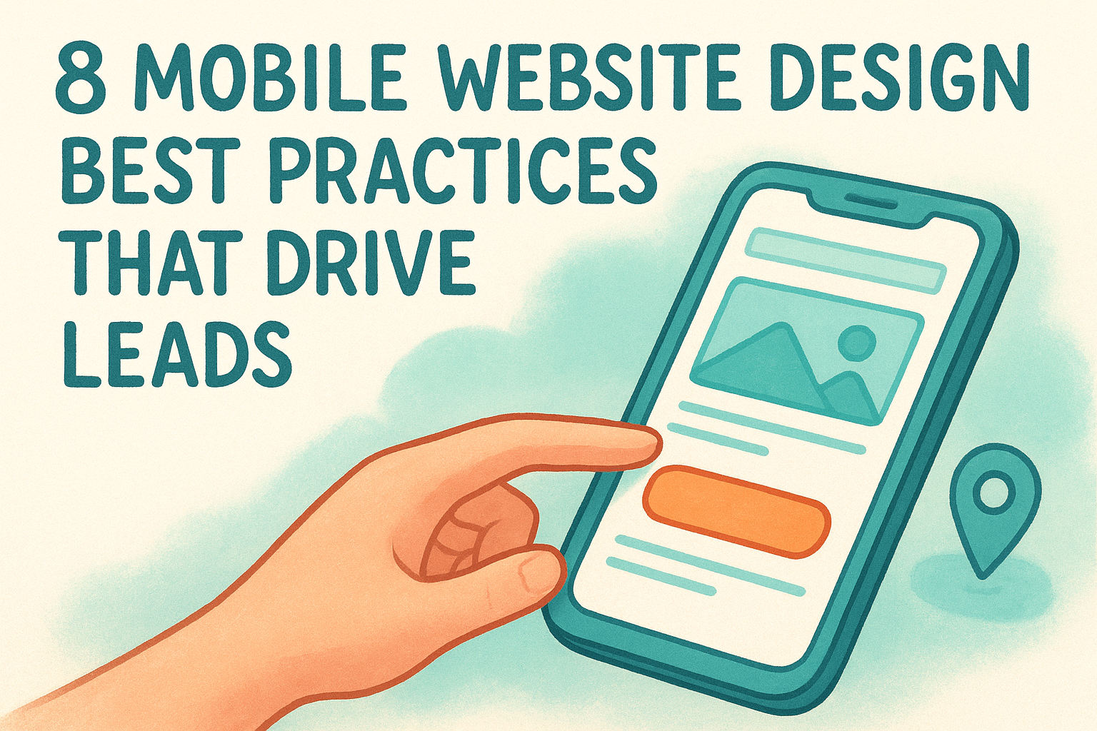
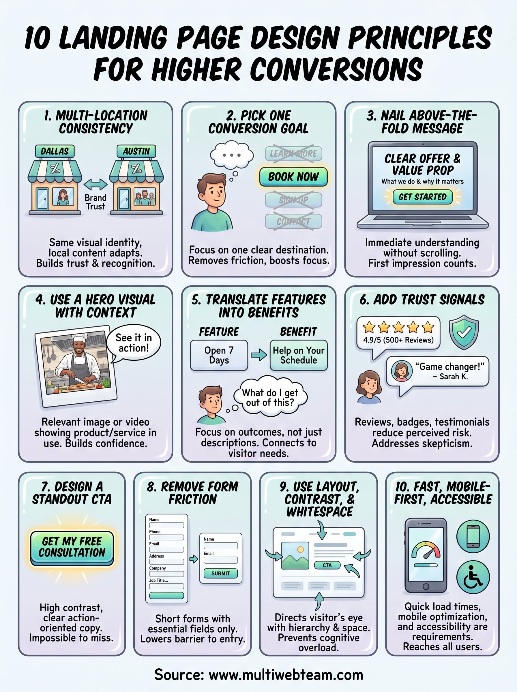
10 Landing Page Design Principles For Higher Conversions
You're spending money to drive traffic to a page, and that page isn't converting. The problem usually isn't the traffic source, it's the page itself. Understanding landing page design principles can mean the difference between a campaign that pays for itself and one that burns through your budget with nothing to show for it.
A well-designed landing page does one job: it turns visitors into customers. But getting there requires more than a nice layout and a bold button. It takes intentional design choices rooted in how people actually read, scan, and make decisions online. Every element, from the headline to the form placement, either moves someone closer to action or pushes them away.
At Multi Web Team, we build and manage websites for multi-location businesses and franchises, which means we design landing pages that need to perform across different markets and audiences. This list pulls from what we've seen work firsthand. Here are 10 principles that consistently lead to higher-converting landing pages, whether you're promoting a single location or fifty.
1. Build for multi-location consistency
When you run multiple locations, brand consistency is one of your biggest competitive advantages. Visitors who land on a page for your Dallas location should immediately recognize it as the same brand they encountered in Austin. Inconsistent design erodes trust quickly, and low trust kills conversions before a visitor even reads your offer.
What this principle means
Consistency across locations doesn't mean every page looks identical. It means your visual identity (logo, colors, fonts, and tone) stays the same while the local content (address, phone number, team photos, and local offers) adapts to each market. The structure and layout should feel familiar, but the details speak directly to that specific community.
How to apply it
Start by building a master landing page template that locks in your brand elements: header style, CTA button design, font choices, and color palette. From there, create location-specific versions that swap out local details without touching the core design. This approach gives you speed and scale without sacrificing brand integrity, which matters when you're managing pages across dozens of markets.
Treating your template as a locked foundation frees your team to focus on local customization rather than rebuilding from scratch for every new market.
Multi-location tips
Each location page needs to do two things well: reinforce your brand and speak directly to the local audience. A few practical moves that work:
- Use the location name in the headline and page title
- Feature photos from that actual location, not generic stock images
- Include local phone numbers and addresses rather than a national catch-all contact
These details signal to visitors that you serve their specific area, which builds immediate relevance and increases the chance they take action.
Common mistakes to avoid
The biggest mistake multi-location businesses make is treating each location page as a completely separate project . This leads to inconsistent design, mismatched CTAs, and a fragmented experience that confuses visitors who interact with more than one location. Another common error is ignoring mobile layouts when duplicating templates, so always test each location page on a phone before it goes live.
2. Pick one conversion goal
One of the most important landing page design principles is focus. A page that tries to push visitors toward multiple actions ends up pushing them toward none. Every element on the page should serve a single conversion goal, whether that's booking an appointment, claiming an offer, or requesting a quote.
What this principle means
Your landing page needs one clear destination . One CTA, one goal, one decision for the visitor to make. When you give someone three different options, you're asking them to do your job for you, which adds friction and drops conversions.
How to apply it
Before you design anything, write down the single action you want a visitor to take. Then remove every element that doesn't support that action, including navigation menus, footer links, and secondary offers. A focused page consistently outperforms one that tries to serve multiple goals at once.
The fewer exits you give visitors, the more likely they are to take the action you actually want.
Multi-location tips
Each location page should have its own specific conversion goal tied to that market's priorities . One location might prioritize phone calls while another focuses on online bookings. Align the goal with how that specific audience prefers to engage.
Common mistakes to avoid
Adding secondary CTAs "just in case" is a common trap. It feels helpful, but it splits visitor focus and reduces your overall conversion rate across every location page.
3. Nail your above-the-fold message
The section of your page that loads before anyone scrolls is your first and most important impression . If visitors don't understand your offer within a few seconds of landing, they leave. Most people never scroll at all, which means your above-the-fold content either earns their attention or loses them entirely.
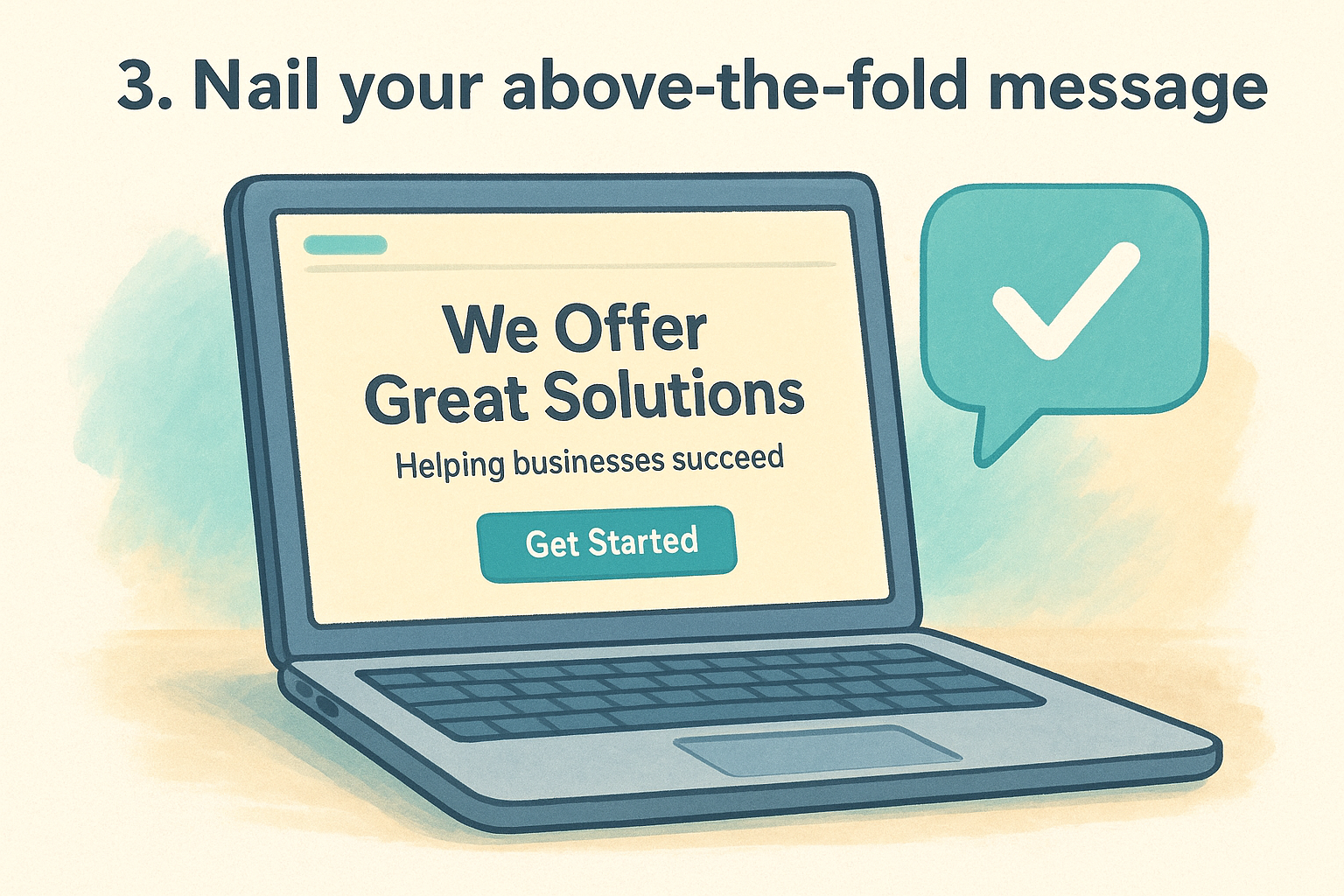
What this principle means
This principle is one of the foundational landing page design principles : your headline, subheadline, and primary CTA need to communicate exactly what you offer and why it matters , all before the visitor does anything. Clarity beats cleverness every time.
How to apply it
Write a headline that states what you do and who you do it for in plain language. Follow it with a single supporting sentence that adds context or reinforces the value. Place your primary CTA button in this section so a ready-to-act visitor never has to scroll to find it.
If a stranger can't understand your offer in five seconds, your headline needs work.
Multi-location tips
For multi-location businesses, the above-the-fold area should immediately confirm which location the page serves . Including the city or region name in the headline or directly beneath it tells visitors they're in the right place, which reduces bounce rate and increases the chance they keep reading.
Common mistakes to avoid
Avoid leading with your company name or history as the headline. Visitors care about what you can do for them , not who you are yet. Vague headlines like "Your local experts" fail to communicate any real value and push potential customers away before they even consider your offer.
4. Use a hero visual with context
A strong image can do what a paragraph of copy cannot: it shows visitors exactly what they're getting before they read a single word. But the wrong visual, or one without clear context, creates confusion and slows down the decision-making process. Choosing the right hero image is one of the most underestimated landing page design principles.
What this principle means
Your hero visual is the primary image or video that appears in the above-the-fold section of your page. Its job is to reinforce your offer, not just fill space. A relevant visual gives visitors an immediate sense of what your business does and who it serves, which builds confidence before they even start reading.
How to apply it
Choose an image that shows your product or service in use , ideally with real people in a recognizable context. Avoid generic stock photos that could belong to any business. A photo of your actual team, location, or customers in action communicates far more than a staged image from a stock library.
Authenticity in your hero visual signals to visitors that a real business is behind the page.
Multi-location tips
For multi-location businesses, use location-specific photos whenever possible. A photo of your actual storefront or staff in a particular city builds local familiarity and confirms to visitors that this page is relevant to their area.
Common mistakes to avoid
Avoid using large decorative visuals that slow page load times without adding meaning. A beautiful image that takes four seconds to load costs you conversions faster than a plain background ever would.
5. Translate features into benefits
Visitors don't buy features. They buy what those features do for them . One of the most commonly ignored landing page design principles is the shift from describing what your business offers to explaining what your visitor gains from it.
What this principle means
A feature describes what something is . A benefit describes what it does for you . "Open seven days a week" is a feature. "Get help on your schedule, including weekends" is a benefit. The difference is small on paper but significant in how it lands with a visitor who is deciding whether to act.
How to apply it
Go through every line of copy on your page and ask: "So what does this mean for me?" If you can answer that question, you have found the benefit worth writing. Replace feature-focused language with outcome-focused language that connects directly to what the visitor cares about .
Every sentence on your page should answer the question your visitor is already asking: "What do I get out of this?"
Multi-location tips
Different locations may serve customers with different priorities . A location in a busy urban area might do better by emphasizing speed and convenience , while a suburban location might lead with family-friendly service. Tailor your benefit language to what actually matters to each local audience.
Common mistakes to avoid
Listing features in bullet points without translating them to outcomes is the most common error. Another mistake is writing benefits that are too vague to be meaningful , like "great service" or "high quality," which tell the visitor nothing specific about what they will actually experience.
6. Add trust signals that reduce risk
People don't hand over their contact information or money to a business they don't trust. Trust signals are the elements on your page that reduce the perceived risk of taking action, and they work by showing visitors that real people have already made this decision and found it worthwhile.
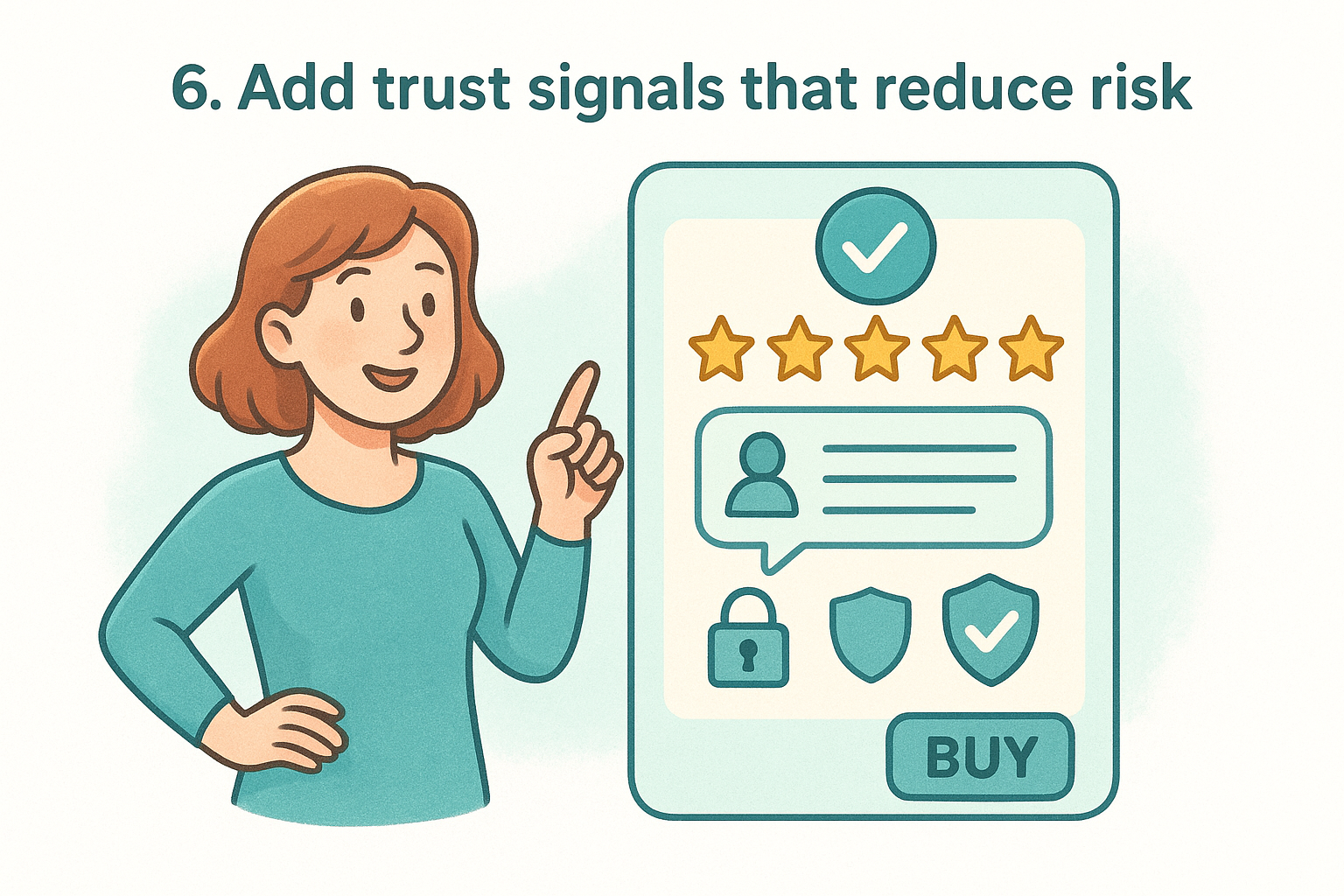
What this principle means
Among the most conversion-critical landing page design principles , this one focuses on removing doubt. Visitors arrive with skepticism, and your page needs to address that skepticism directly before asking them to commit to any action.
How to apply it
Place trust signals close to your primary CTA so they're visible at the exact moment of decision. Strong options include customer reviews with full names, star ratings, security badges, and partner or certification logos. A short, specific testimonial from a real customer carries more persuasive weight than a dozen generic marketing claims in your body copy.
One specific, authentic review beats five generic five-star ratings every time.
Multi-location tips
For multi-location businesses, use location-specific reviews so visitors see feedback from customers in their own area. A review that mentions a specific neighborhood or local branch makes the social proof feel immediately relevant rather than distant or unrelated.
Common mistakes to avoid
Avoid placing trust signals in your footer where few visitors ever scroll . Generic badges with no recognizable brand or real certification behind them also backfire because visitors quickly recognize them as meaningless decoration rather than genuine evidence of credibility .
7. Design a CTA that stands out
Your call-to-action button is the single most important element on your landing page. Everything else, your headline, your visuals, your copy, exists to get visitors to that button. If it blends into the page or uses weak language, your conversion rate will reflect it .
What this principle means
Among all landing page design principles , this one is the most visually direct. Your CTA needs to be impossible to miss and immediately clear about what happens when someone clicks it. Color, size, placement, and copy all work together to create a button that draws the eye and removes hesitation before a visitor acts.
How to apply it
Use a high-contrast color for your button that doesn't appear anywhere else on the page so it stands out on sight. Write button copy that describes the specific action and outcome , such as "Book My Free Consultation" instead of "Submit." Place the CTA above the fold and repeat it lower on longer pages so visitors can act at any point without scrolling back up.
Your CTA copy should tell visitors exactly what they get, not just what they do.
Multi-location tips
Each location page should use location-specific CTA language where it adds relevance. Phrases like "Book at Our Austin Location" confirm to visitors that they are taking action at the right place , which reduces hesitation and increases clicks.
Common mistakes to avoid
Avoid using neutral colors like gray or white for your button, which makes it disappear into the background. Using vague copy like "Click Here" or "Learn More" leaves visitors uncertain about what comes next and reduces the urgency to act.
8. Remove friction from forms
Your form is the final gate between a visitor and a conversion. If it feels complicated, long, or unclear, even motivated visitors abandon it before completing the action. Reducing friction in your forms is one of the most direct ways to improve results from any page built around solid landing page design principles .
What this principle means
Form friction is anything that makes a visitor pause, hesitate, or give up before submitting. This includes too many required fields, confusing labels, poor mobile formatting, and no explanation of what happens after someone hits submit. Every unnecessary question you add costs you conversions.
How to apply it
Trim your form down to only the fields you actually need to follow up with a lead. For most landing pages, that means a name, phone number or email, and possibly one qualifying question. Place your form above the fold or directly beside your CTA so visitors don't have to hunt for it.
The shorter your form, the lower the barrier to entry and the higher your submission rate.
Multi-location tips
If you run forms across multiple locations, make sure each form routes submissions to the correct location automatically. A visitor who submits a form for your Chicago location and gets a callback from your Denver team will not convert, and will not return.
Common mistakes to avoid
Avoid adding optional fields that still appear required due to poor design. Requiring a phone number when you only need an email is another common mistake that pushes visitors away right before they commit.
9. Use layout, contrast, and whitespace
Visitors don't read landing pages like a book. They scan quickly , looking for information that matters to them, and your layout either guides that scan toward a conversion or lets their attention scatter across the page. How you arrange every element is just as important as what those elements say.
What this principle means
Layout, contrast, and whitespace work together to direct the visitor's eye through your page in a deliberate sequence. Contrast makes key elements stand out. Whitespace gives the page room to breathe and prevents cognitive overload. Together, these are among the most underused landing page design principles in practice.
How to apply it
Structure your page with a clear visual hierarchy : headline at the top, supporting details in the middle, CTA at key stopping points. Use contrast to separate important elements from the background, and add whitespace around your CTA and headlines so they command attention rather than compete with surrounding content.
A cluttered page signals a cluttered business. Give your offer the space it needs to land.
Multi-location tips
When you replicate layouts across locations, keep the visual hierarchy identical so returning visitors always know where to look. Consistent spacing and contrast across location pages builds brand recognition without requiring additional design work per market.
Common mistakes to avoid
Filling every inch of the page with content is a common error that overwhelms visitors and dilutes your actual message. Avoid applying similar contrast levels to both your CTA and surrounding text, which forces the eye to work harder than it should to find the action you want taken.
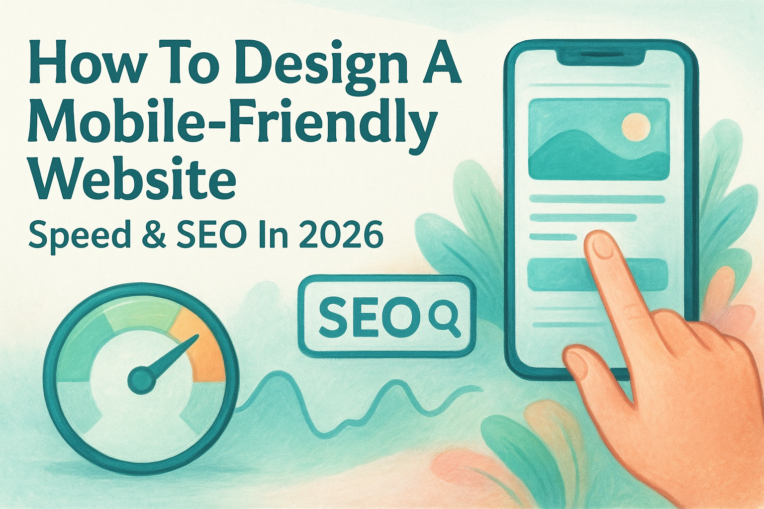
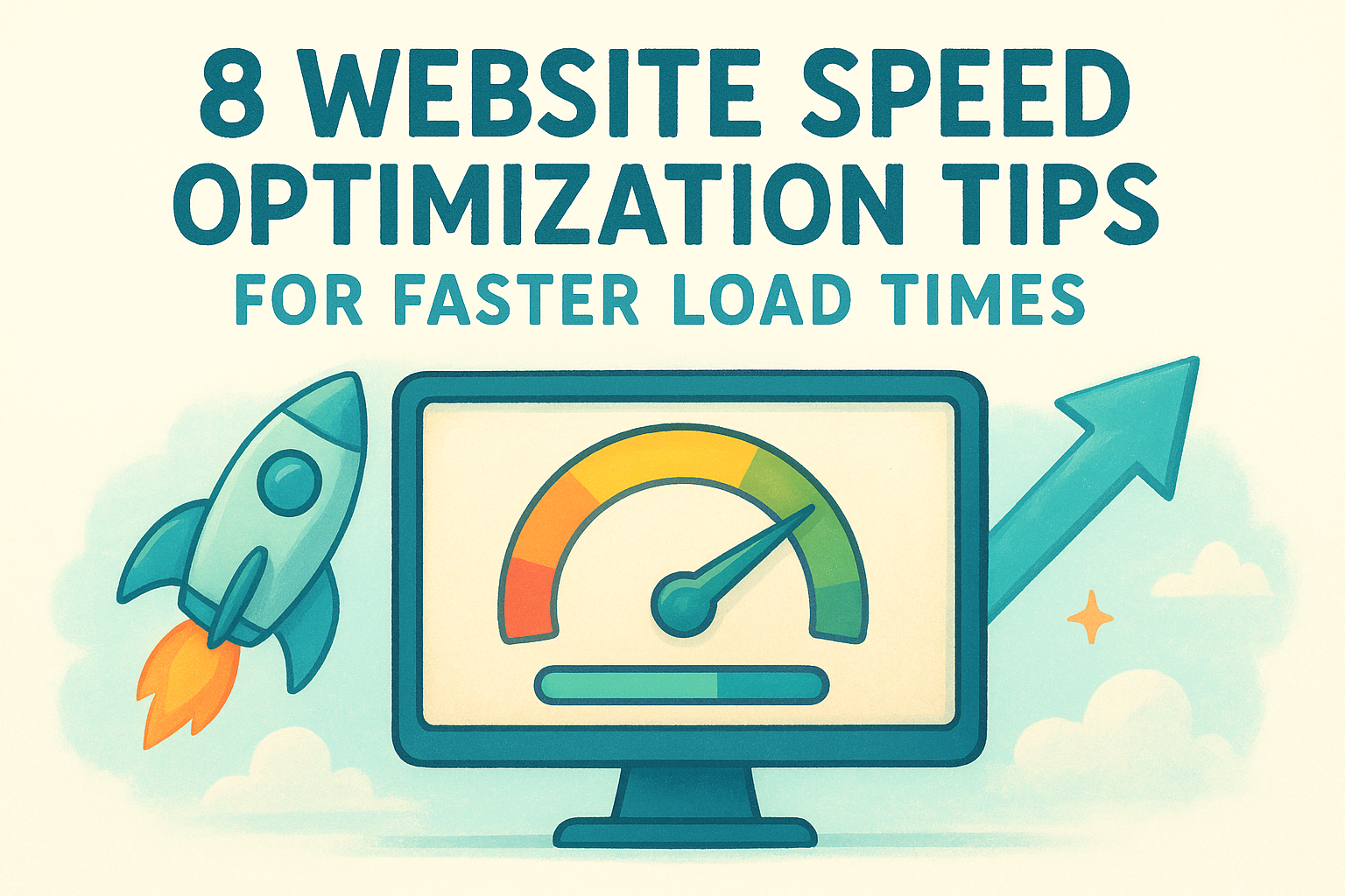
10. Make it fast, mobile-first, accessible
A page that loads slowly or breaks on a phone fails before the design even gets a chance to work. Page speed, mobile responsiveness, and accessibility are not optional extras among solid landing page design principles ; they are baseline requirements that determine whether your page reaches and converts real visitors.
What this principle means
Most of your visitors arrive on a mobile device , and many of them are on a slow connection. A page that takes more than three seconds to load loses a significant portion of those visitors before they see anything. Accessibility means your page works for visitors with visual or motor impairments , which also improves usability for everyone else on the page.
How to apply it
Compress images before uploading them and avoid loading scripts that aren't essential to the page. Use a mobile-first design approach where you build and test the mobile layout before expanding to desktop. Run your page through Google PageSpeed Insights to identify the specific issues slowing your load time down.
A one-second delay in page load time can reduce conversions by up to 7 percent.
Multi-location tips
Each location page carries its own images and local content , so check load times individually for every page rather than assuming they all perform the same way.
Common mistakes to avoid
Avoid uploading full-resolution photos directly from a camera without compression. Relying on desktop-only testing is another mistake that leaves mobile visitors with a broken experience and a lower conversion rate across every location you manage.
Bring it all together
These 10 landing page design principles give you a clear framework for turning visitors into customers. Each principle works on its own, but they deliver the strongest results when you apply them together. Your headline draws attention, your trust signals reduce doubt, your CTA closes the gap, and your page speed makes sure visitors actually reach all of it in the first place.
For multi-location businesses, the stakes are higher. You need pages that perform consistently across every market while still speaking directly to each local audience. Getting that balance right takes a design system built with intention from the start , not one patched together location by location as you scale.
Building and managing that system takes real time and expertise . If you want a dedicated team that handles it for you, Multi Web Team specializes in custom websites for multi-location businesses that are built to convert and managed to stay that way.