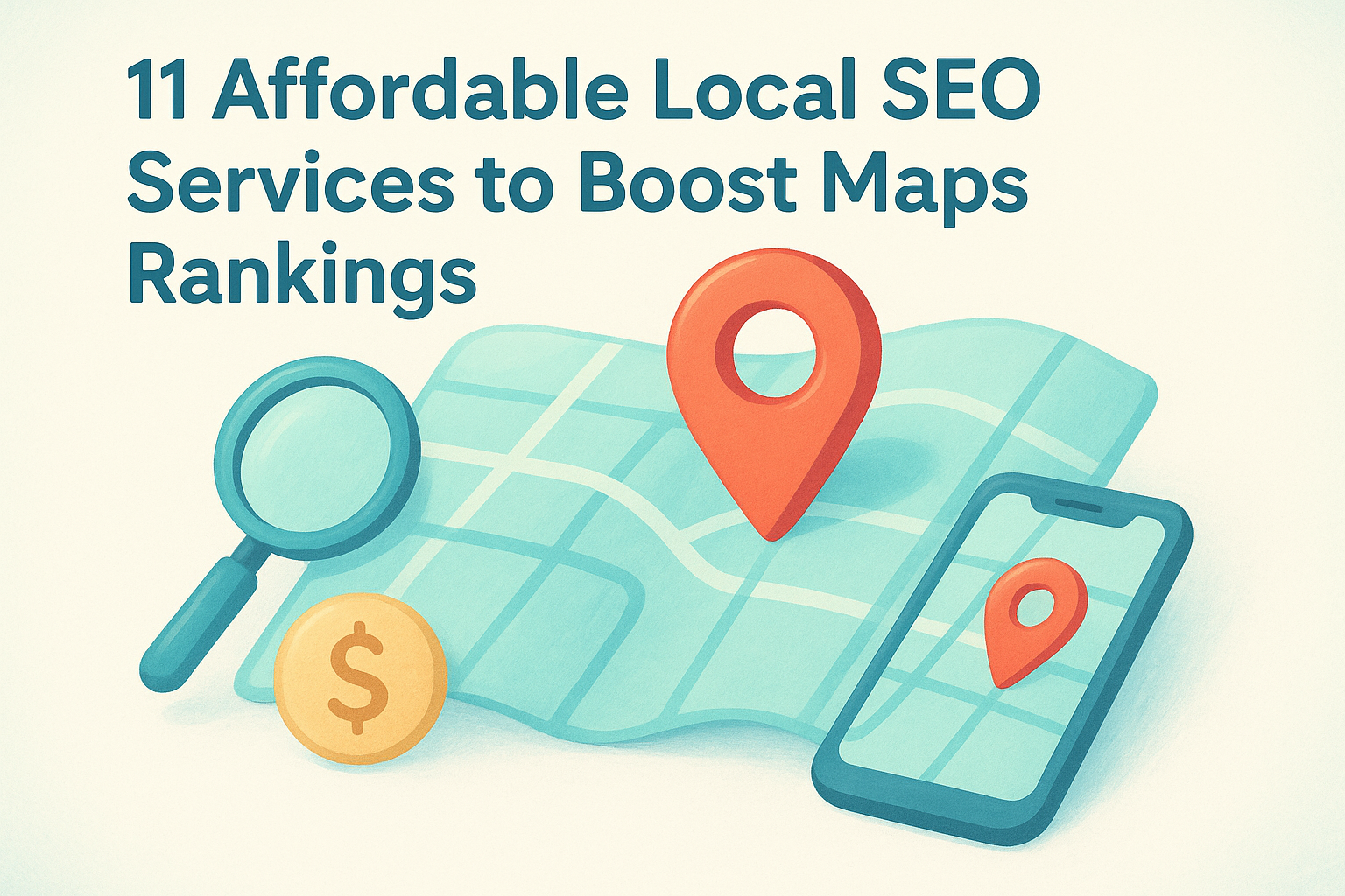
12 Medical Practice Website Design Tips To Win New Patients
Patients Google you before they ever call your office. If your website looks outdated, loads slowly, or makes it hard to book an appointment, they'll move on to the next practice in the search results. That's not a guess, it's what happens every day. Medical practice website design tips matter because your website is often the first impression a potential patient gets, and first impressions drive decisions about who to trust with their health.
A well-designed medical practice website does more than look professional. It builds credibility , answers patient questions, and removes friction from the process of scheduling that first visit. A poorly designed one does the opposite, it creates doubt, frustrates visitors, and quietly sends new patients to your competitors.
At Multi Web Team, we design and manage websites for multi-location businesses , including medical practices expanding across multiple offices. We've seen firsthand what works, what doesn't, and where most practice websites fall short. The patterns are consistent, and the fixes are often more straightforward than you'd expect.
Below, we've put together 12 actionable design tips that will help your medical practice website earn trust, rank better in local search, and convert visitors into booked appointments. Whether you're building a new site from scratch or looking to improve what you already have , these recommendations are grounded in real-world results, not theory.
1. Choose a web team that supports multiple locations
If your practice has more than one office, your website vendor needs to understand multi-location architecture from day one. Not every web agency is built to handle location-specific pages, local SEO, and consistent branding across multiple offices at the same time. Getting this wrong early creates structural problems that cost more to fix later than they would have to build correctly from the start.
What to do
Look for a web team with demonstrated experience managing multi-location websites , particularly for healthcare or service-based businesses. Your vendor should be able to build individual location pages that rank in local search while maintaining a unified brand identity across the entire site. Ask to see real examples of multi-location sites they've built and ask directly how they handle ongoing updates across all locations, not just the initial launch.
Your web team should also understand the specific compliance and content requirements that come with healthcare websites, including accurate provider information, current hours, and location-specific services. A generalist agency that has never worked with a multi-location medical client is likely to miss these details.
Why it matters
A web team that only builds single-site projects will likely create a structure that hurts your local search visibility . When each location doesn't have its own optimized page, Google has no clear signal about which office serves which area. Patients searching for a doctor near them won't find you, even if you have an office a mile away.
Practices with five or more locations can lose thousands of potential patient visits per year simply because their website treats the business as one location instead of many.
How to implement it
Start by asking any prospective vendor two direct questions : Can you build and manage individual location pages, and do you include ongoing local SEO as part of your service? If the answer to either is no, or unclear, keep looking. You want a team that handles both the design and the ongoing updates under one arrangement, so nothing gets missed when you add a new location or change your hours.
Common mistakes to avoid
The most common mistake is hiring a general web design agency that treats your multi-location practice like a single-site project . They'll build one homepage, maybe a contact page with all your addresses listed, and consider it done. That structure won't rank in local search and won't help patients find the right office. A second mistake is agreeing to per-update pricing , which discourages you from keeping location pages accurate as providers, hours, and services change over time.
2. Design around the top patient tasks
Your website exists to help patients do specific things: book an appointment, find a location, check their provider's credentials, or learn about a service. Most medical websites bury these tasks under layers of navigation and marketing copy that patients don't care about. When you design around what patients actually need, every page becomes more useful and more likely to convert .
What to do
Identify the three to five actions most visitors come to your site to complete. For most practices, that list includes booking an appointment, finding office hours, verifying insurance acceptance, and reviewing provider bios. Build your navigation and page layouts around these tasks first, before you think about anything else.
Why it matters
When patients can't find what they need quickly, they leave. Friction is a conversion killer , and in healthcare, a frustrated visitor usually means a lost patient, not just a lost click. One of the most practical medical practice website design tips is to treat your homepage like a task list, not a brochure.
The average user decides within a few seconds whether a website will answer their question or not.
How to implement it
Put your most-used actions in the header: a prominent phone number, a booking button , and a location finder. Keep these elements visible on every page, not just the homepage, so patients never have to hunt for the next step.
Common mistakes to avoid
Avoid building navigation around your internal org chart instead of patient behavior. Grouping pages by department makes sense internally but creates real confusion for someone who just wants to book a specific service or find the nearest office.
3. Build a mobile-first experience
Most patients search for a doctor on their phone. If your site doesn't load cleanly on a small screen , you're losing patients before they ever read a word about your practice. Building a mobile-first experience means designing for the phone layout first, then scaling up to desktop, not the other way around.
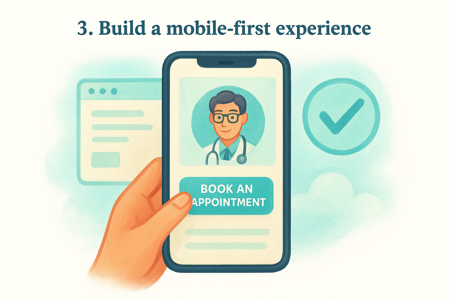
What to do
Start every design decision by asking how it looks and functions on a four-inch screen . Buttons need to be large enough to tap without zooming in. Text needs to be readable without pinching. Your appointment booking option should appear above the fold on mobile, meaning patients see it without scrolling.
Why it matters
Google uses mobile-first indexing, which means it crawls and ranks your site based on the mobile version , not the desktop version. A site that looks great on a laptop but breaks on a phone will underperform in search rankings, regardless of how strong your other SEO work is.
If your mobile experience is slow or hard to navigate, Google treats your entire site as low quality, not just the mobile version.
How to implement it
Test your site using Google's Mobile-Friendly Test to identify specific issues. Fix tap target sizing , eliminate horizontal scrolling, and compress images so pages load in under three seconds on a standard mobile connection.
Common mistakes to avoid
One of the most overlooked medical practice website design tips is assuming your desktop site automatically adapts well to mobile. Responsive design handles the basics, but it doesn't guarantee a clean user experience. Check your mobile layout manually on actual devices, not just a browser preview, before you consider it done.
4. Create high-converting location pages
Each office your practice operates needs its own dedicated page, not a shared contact page listing all addresses together. Location-specific pages are one of the most important medical practice website design tips you can act on, because they tell both patients and search engines exactly where you practice and what each location specifically offers .
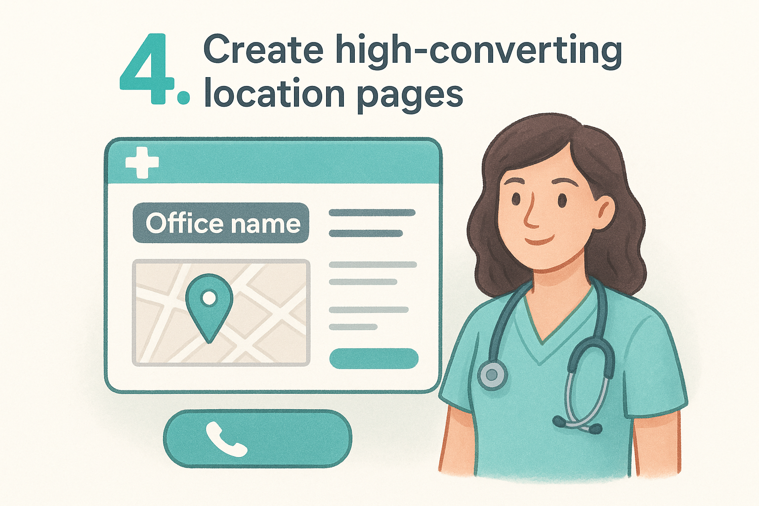
What to do
Build a separate, fully developed page for each practice location . At minimum, every location page should include:
- Office address and direct phone number
- Current hours of operation
- Accepted insurance plans
- Services available at that specific office
- Photos of the actual space and staff
Why it matters
Patients searching for a nearby provider want confirmation that your office is close, accessible, and relevant before they commit to calling. A generic contact page listing all your addresses fails that test. When each location has its own page, Google can match it directly to local search queries from patients in that area.
A well-built location page works like a mini-homepage for that specific office, giving local patients every reason to choose you over the next result.
How to implement it
Use a consistent page template across all locations so the structure stays uniform, but customize the written content for each office. Include an embedded map and a click-to-call button so patients can act immediately without digging through the site for basic contact details.
Common mistakes to avoid
Avoid copying the same description across every location page with only the address swapped out. Duplicate content signals to Google that your pages add no unique value, which hurts your rankings. Every location page needs distinct, specific content that reflects what actually happens at that particular office.
5. Strengthen local SEO with clean data
Local SEO for a medical practice depends heavily on consistent, accurate business information across every platform where your practice appears. When your name, address, and phone number vary across listings, search engines lose confidence in your data and rank you lower as a result.
What to do
Audit every place your practice information appears online, including Google Business Profile , Yelp, Healthgrades, and any directory listings your practice has claimed or been automatically added to. Every listing needs to match your website exactly, down to suite numbers, phone number formatting, and hours of operation.
Why it matters
Google cross-references your website against external listings to verify that your business information is accurate and trustworthy . Inconsistencies create doubt in Google's ranking system and can suppress your visibility in local search results, even if your website is well-designed. This is one of the most practical medical practice website design tips to act on because the fix costs nothing except time.
Practices with consistent name, address, and phone data across 10 or more directories tend to rank noticeably higher in local map results than those with scattered or outdated listings.
How to implement it
Start with your Google Business Profile since it carries the most weight in local search. Verify that your hours, address, and services match exactly what appears on your website. Then work through the major health-specific directories and correct any discrepancies.
Common mistakes to avoid
Don't overlook old listings from previous office locations or phone numbers you no longer use. Outdated data sitting in directories actively works against your local rankings and can send patients to the wrong address.
6. Make providers and services easy to compare
When patients visit your website, they often need to choose between multiple providers or decide which location offers the specific service they need. If that information is scattered, incomplete, or hard to scan , patients default to calling, leaving, or picking whoever looks most organized. One of the most underused medical practice website design tips is structuring your provider and service pages so patients can make decisions without extra effort.
What to do
Give every provider a dedicated profile page that includes their photo, credentials, specialties, languages spoken, and the locations where they practice. Do the same for services: each treatment or specialty deserves its own dedicated service page with a clear description, what to expect during a visit, and which locations offer it.
Why it matters
Patients compare providers the same way they compare products online. They look for clear, specific information presented in a consistent format . When your profiles follow a uniform structure, patients feel confident they're getting the full picture rather than wondering what you left out.
Practices that give each provider a complete, standalone page see more direct appointment requests tied to specific doctors, which signals higher patient intent.
How to implement it
Use a consistent template for every provider bio and every service page. Include a booking button on each provider profile so patients can act the moment they decide. Link provider pages to the specific services they perform and the locations where they work to keep everything connected.
Common mistakes to avoid
Avoid listing all providers on one crowded page with only a name and headshot. Thin profiles give patients nothing to evaluate and push them toward competitors who present their team more completely.
7. Use clear calls to action for every page
Every page on your medical website has a job to do. If a visitor reads through a provider bio, a service description, or a location page and then has no obvious next step in front of them, most will leave without taking action. Clear calls to action are one of the most consistently overlooked medical practice website design tips , and fixing this takes less effort than most practices expect.
What to do
Each page needs at least one prominent, specific call to action that tells the visitor exactly what to do next. Use direct language like "Book an Appointment," "Call Our Office," or "Find Your Location" rather than vague phrases like "Learn More" or "Get Started." Your primary CTA should appear above the fold and repeat at the bottom of every page.
Why it matters
Patients rarely take action unless you make the path obvious. A well-placed, specific CTA removes the mental work of figuring out what to do next. When patients can see a clear next step, conversion rates improve across every page type.
Practices that place a booking button above the fold on every service and provider page consistently capture more appointment requests than those that limit the CTA to a contact page.
How to implement it
Use contrasting button colors so your CTA stands out from the surrounding page design. Place action buttons inside service descriptions, provider bios , and location pages, not just your homepage.
Common mistakes to avoid
Avoid putting too many competing CTAs on a single page, which creates decision paralysis for the visitor. Pick one primary action per page and make that button impossible to miss.
8. Simplify forms and protect patient privacy
Online forms are often the final step between a visitor and a booked appointment. If your forms are too long, confusing, or feel insecure , patients abandon them and either call or leave altogether. Simplifying your forms and making privacy protections visible are two of the most practical medical practice website design tips you can apply right now.
What to do
Keep every form as short as possible while still collecting what you need to confirm the appointment. For a first contact form, name, phone number, preferred location, and a preferred time window is typically enough. Avoid asking for detailed medical history or insurance information upfront; collect that once the patient is confirmed.
Why it matters
Patients are cautious about sharing personal information online, especially with a provider they haven't visited yet. A long form signals unnecessary friction , and a form that feels insecure signals risk. Both outcomes push patients toward practices that make the process easier.
A form that takes under 60 seconds to complete converts at a significantly higher rate than one that asks for five or more fields of personal detail.
How to implement it
Display a clear privacy statement near every form that explains how you use and protect patient data. Use HTTPS across your entire site and make sure your form tool complies with HIPAA requirements if it captures any health-related information. A visible lock icon and a brief "your information is secure" note reduce hesitation noticeably.
Common mistakes to avoid
Avoid using generic contact forms that don't confirm anything after submission. Patients need immediate confirmation that their request was received, along with a clear expected response time , or they'll assume the form failed and call anyway.
9. Publish content that answers real patient questions
Patients search for answers before they search for providers. Blog posts, service pages, and FAQ sections that directly address common patient concerns put your practice in front of people at the exact moment they're looking for help. Content is one of the most underrated medical practice website design tips because it works in the background, driving search traffic and building trust at the same time.
What to do
Write content around specific questions your patients ask at appointments or over the phone . Topics like what to expect during a first visit, how insurance coverage works for a given service, and condition-specific FAQs all perform well in search because they match how patients actually type queries into Google.
Why it matters
Fresh, relevant content signals to search engines that your site is active and authoritative . It also keeps patients on your site longer, which improves engagement metrics that factor into how Google ranks your pages.
Practices that publish even one or two well-written patient-focused articles per month consistently outrank competitors whose websites haven't changed in years.
How to implement it
Create a simple editorial calendar with four to six topics per month drawn from questions your front desk hears repeatedly. Keep each article focused on one specific question and include a CTA at the end pointing patients toward booking an appointment.
Common mistakes to avoid
Avoid writing content that is vague or too technical for a general patient audience. Also avoid publishing articles that try to cover every variation of a topic in one post; focused, specific content ranks better and reads more clearly.
10. Add trust signals without clutter
Patients decide whether to trust your practice before they read a single line of body copy. Trust signals like credentials, patient reviews, and board certifications give visitors the confidence to take the next step, but piling too many of them onto one page produces the opposite effect. One of the most practical medical practice website design tips is learning to place trust signals strategically rather than scattering them everywhere.
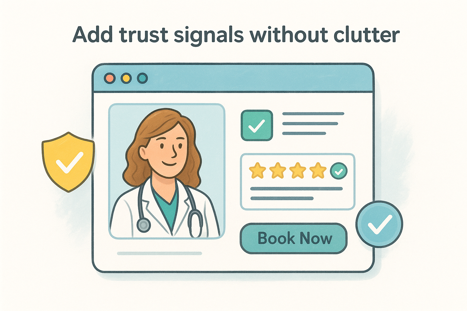
What to do
Display your most credible signals in the places patients look first. Put board certifications and accreditations near your provider bios, and place verified patient reviews close to your booking buttons where they can directly influence the decision to schedule an appointment.
Why it matters
Patients visiting a medical website are making a high-stakes decision about their health. Clear, verifiable signals like Google ratings, professional affiliations, and recognizable insurance logos reduce hesitation by confirming that your practice is legitimate and capable.
Practices that display verified patient reviews near their call-to-action buttons see measurably higher appointment conversion rates than those that relegate reviews to a standalone testimonials page.
How to implement it
Limit each page to two or three trust elements placed in natural reading positions. Use real patient review snippets from Google or Healthgrades rather than self-written testimonials, and link to the source so patients can verify them independently.
Common mistakes to avoid
Avoid stacking logos, badges, and award graphics in a row without context. A wall of images with no explanation reads as noise rather than credibility. Also avoid displaying outdated review dates , which signal to new visitors that your practice hasn't attracted recent patients.
11. Meet accessibility and performance standards
Accessibility and performance are not optional features you add after launch. They determine whether all patients can reach and use your content and whether search engines rank your site competitively. Ignoring either one costs you patients and visibility before they ever read a word about your practice.
Tip 11: Make the site accessible to all patients
Your site needs to work for patients with visual, motor, or cognitive disabilities. Follow WCAG 2.1 guidelines , which require alt text on images, sufficient color contrast, and keyboard navigation support for every interactive element. An accessible site serves a broader patient base and signals that your practice genuinely includes everyone.
Accessibility also protects your practice legally, since healthcare websites face increasing scrutiny under the Americans with Disabilities Act.
Tip 12: Improve speed, security, and uptime
Slow pages lose patients before they finish loading. Target a page load time under three seconds on both mobile and desktop. Compress images, use reliable hosting, and add a content delivery network to keep response times steady. Your site also needs an active SSL certificate for HTTPS, which patients notice and search engines reward directly in rankings.
How to implement it
Run your site through Google PageSpeed Insights to get a prioritized fix list. Address uncompressed images and render-blocking scripts first since these two issues produce the largest speed improvements with the least effort.
Common mistakes to avoid
Many practices follow these medical practice website design tips for content and SEO but treat speed and accessibility as afterthoughts. Skipping audits and ignoring performance scores quietly drains your rankings and turns away the patients who need you most.
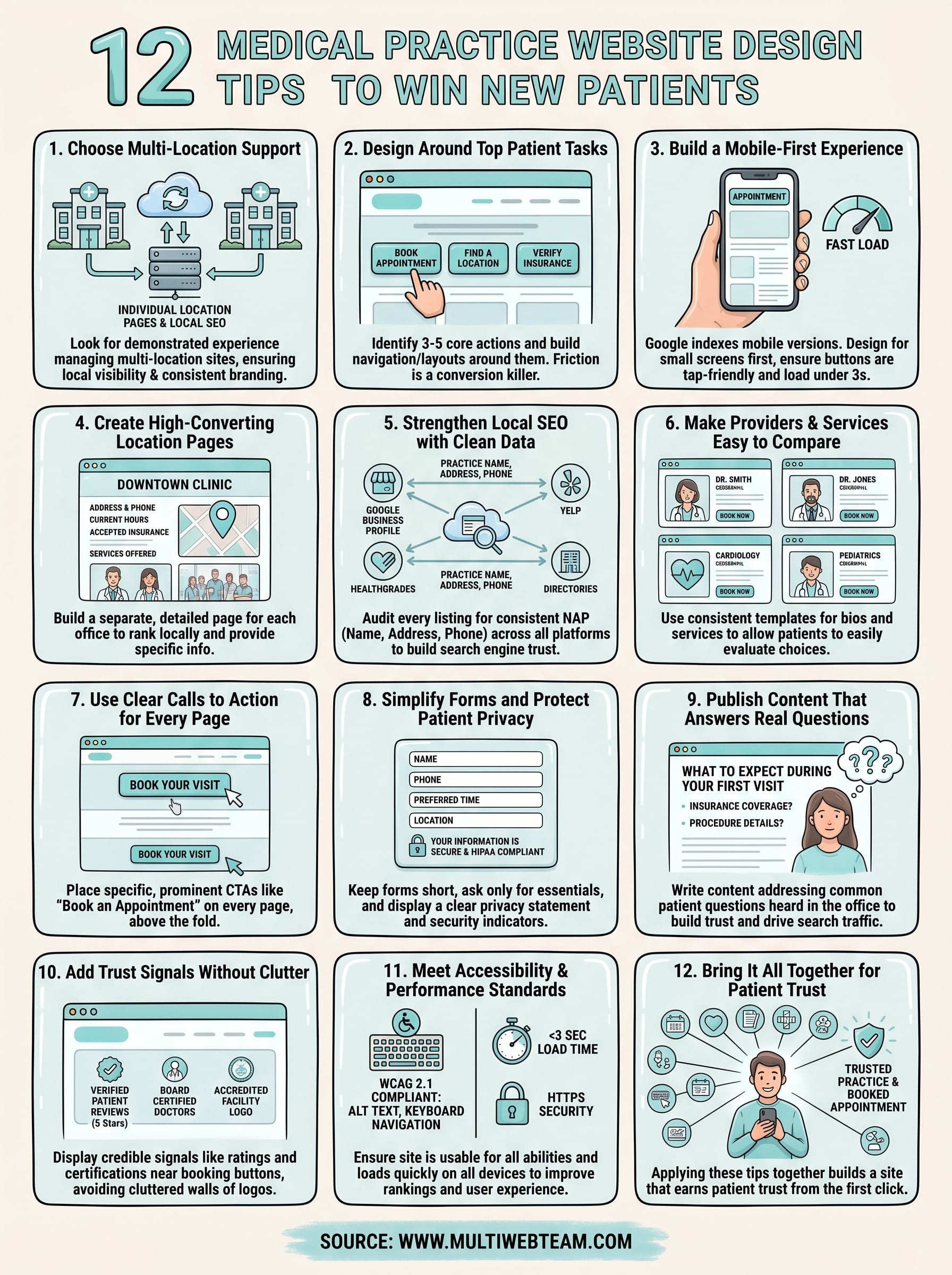
Bring it all together
These 12 medical practice website design tips cover the decisions that separate practices winning new patients online from those losing them to better-designed competitors. Each tip connects to the others : clean local SEO data supports your location pages, strong CTAs make your trust signals actionable, and fast load times ensure your content actually reaches patients. No single fix transforms your results overnight, but applying these recommendations together builds a site that earns patient trust from the first click.
Your website is working around the clock, either sending patients toward your booking form or sending them elsewhere. Getting the design and management right is not a one-time project; it requires consistent updates, accurate location data, and content that keeps pace with how patients search. If your practice operates across multiple locations and needs a web team built for exactly that, visit Multi Web Team to learn how we handle design, updates, and local SEO under one straightforward subscription.