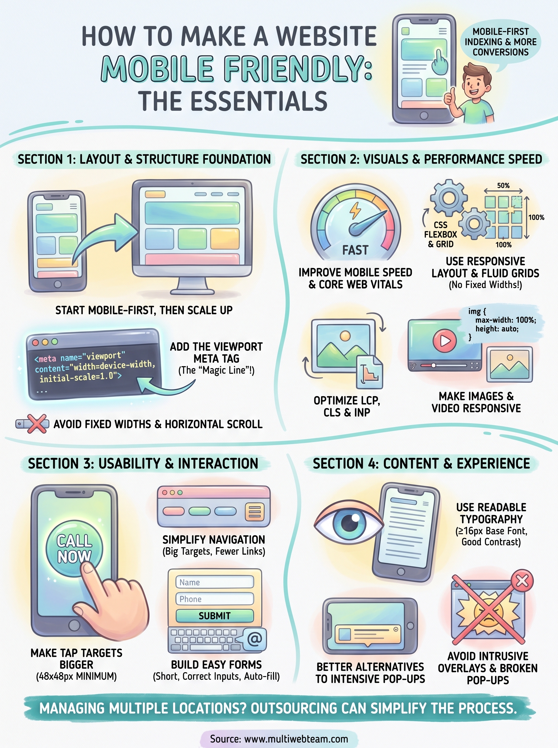
How To Make a Website Mobile Friendly: 13 Practical Tips
More than half of all web traffic comes from phones and tablets. If your site doesn't work well on a smaller screen, you're losing visitors, and customers, before they even see what you offer. That's why knowing how to make a website mobile friendly isn't optional anymore. It's a core part of running a business online, especially when you're managing multiple locations that each need to perform in local search .
The fix isn't just shrinking your desktop site to fit a phone. A truly mobile-friendly website loads fast, reads easily without pinching and zooming, and guides visitors toward action, whether that's calling your nearest location, placing an order, or booking an appointment. Google also uses mobile-first indexing , which means it primarily evaluates the mobile version of your site when deciding where to rank you .
At Multi Web Team, we build and manage websites for multi-location businesses and franchises, so we deal with mobile optimization across dozens of location pages every day. This article pulls from that hands-on experience. Below, you'll find 13 practical tips that cover responsive design, page speed, navigation, and more, everything you need to give mobile visitors a smooth experience that actually converts.
1. Let Multi Web Team handle mobile optimization
If you run a multi-location business or franchise , mobile optimization isn't a one-time project. Every new location page, seasonal promotion, or menu update needs to look and work correctly on phones. Doing that work in-house takes time, technical skill, and consistent attention that most business owners simply don't have.
When to outsource mobile-friendly work
The clearest sign you need outside help is when your site generates complaints from customers who can't navigate it on their phones, or when Google Search Console flags mobile usability errors you don't know how to fix. If figuring out how to make a website mobile friendly is pulling you away from running locations, outsourcing is the right call.
Another strong signal is scale . When you manage five, ten, or twenty locations, keeping every page current and optimized for mobile is a real workload. Each location update, phone number change, or promotion needs to render correctly on every screen size. At that point, a dedicated external team handles it faster and more consistently than an in-house generalist ever could.
Outsourcing mobile optimization makes the most sense when the cost of getting it wrong, lost customers and lower search rankings, exceeds the cost of professional help.
What a mobile-friendly subscription service covers
Multi Web Team's subscription model includes ongoing mobile optimization as part of the full service. That covers responsive layout maintenance, image optimization, page speed improvements, and location-specific updates across all your pages. When you add a new location or update a promotion, those changes go live correctly formatted for mobile without you touching a line of code.
Here's what a typical subscription covers:
- Custom mobile-friendly design for each location page
- Unlimited content updates including photos, promotions, and videos
- Monthly speed and performance monitoring
- Mobile SEO optimization for local search rankings
- Fixes for any mobile usability issues that come up
What to prepare before you hand off the work
Before Multi Web Team starts, gather a few things so onboarding goes smoothly. Pull together your brand assets : logo files, brand colors, and any existing fonts or style guidelines. Collect content for each location , including addresses, phone numbers, hours, and any location-specific photos or offers. If you have an existing site, list the pages that matter most so the team knows where to focus first.
You don't need technical knowledge to get started. What helps most is a clear picture of what each location needs to communicate and who your customers are. The more context you share upfront, the faster your mobile-optimized site gets built and published.
2. Start with a mobile-first layout and content
Mobile-first is one of the most effective strategies when figuring out how to make a website mobile friendly . Instead of designing a full desktop layout and then squeezing it down for smaller screens, you build for the smallest screen first and scale up from there. This approach forces you to make intentional choices about what matters most before you add complexity.
What mobile-first actually means
Building mobile-first means writing your base CSS for small screens, then using media queries to add styles for larger viewports. It's a design and development philosophy , not just a setting you toggle on. The result is leaner code that loads faster on phones, which is exactly where most of your visitors already are.
When you design for the smallest screen first, you're forced to focus on what actually matters to your users, and that clarity carries over to every other screen size.
How to prioritize content for small screens
On a phone, screen space is limited , so every element needs to earn its place. Start by listing the most important actions a visitor should take on each page, whether that's calling a location, reading your hours, or placing an order. Put those elements at the top. Secondary content like detailed descriptions or additional photos can follow lower on the page.
Quick mobile-first layout rules that work
A few straightforward rules help you avoid the most common layout mistakes on small screens:
- Set your base font size to at least 16px so text is readable without zooming
- Use single-column layouts as the default and add columns only at wider breakpoints
- Keep buttons and calls to action above the fold on mobile whenever possible
- Avoid side-by-side content blocks that collapse into illegible narrow columns
3. Add the viewport meta tag
Without the viewport meta tag, a mobile browser treats your page as if it were a full desktop layout and scales everything down to fit the screen. The result is a tiny, unreadable page where visitors immediately pinch and zoom just to read basic content. Adding this single line of HTML is one of the most direct steps in how to make a website mobile friendly.
What the viewport tag does on phones
The viewport meta tag tells the browser how to scale and size your page relative to the device's screen width. Without it, phones default to rendering pages at a fixed width, usually 980px, and then shrinking everything to fit. That tag corrects this by matching your page width to the actual screen width and letting your CSS work exactly as you wrote it.
The exact tag to use and where it goes
Place this tag inside the <head>
section
of every HTML page
on your site:
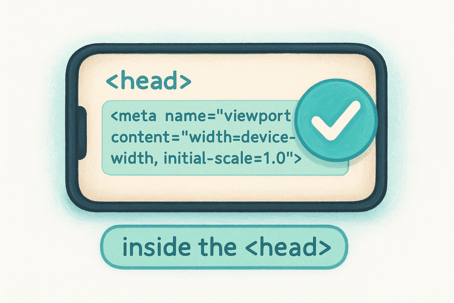
<meta name="viewport" content="width=device-width, initial-scale=1.0">
width=device-width
sets the page width to match the physical screen width of the device. initial-scale=1.0
sets the zoom level to 100% on first load. Both attributes are required because they handle different behaviors. Most CMS platforms
include this tag through their default themes, but check your page source to confirm it's actually there.
Missing the viewport tag breaks your mobile layout even when your responsive CSS is otherwise correct.
Common viewport mistakes to avoid
A few viewport settings cause real problems that are easy to overlook:
-
user-scalable=noblocks users from zooming, which is an accessibility violation and frustrates visitors with low vision - A fixed width value
like
width=320instead ofdevice-widthlocks your layout to one specific screen size -
initial-scalevalues other than 1.0 distort the zoom level on first load and create a disorienting experience for users
4. Use responsive layout with breakpoints
Responsive layout is the technical backbone of how to make a website mobile friendly . It lets a single codebase serve every screen size correctly, without duplicating content or maintaining separate versions of your site. Breakpoints are the specific screen widths where your layout shifts to better fit the device displaying it.
Responsive design vs separate mobile site
A responsive site adjusts its layout through CSS media queries
rather than redirecting phone users to a separate URL like m.example.com
. Maintaining two separate sites doubles your update workload and creates SEO problems
because links and content can differ between versions. Responsive design keeps everything in one place, which Google prefers and your team will appreciate when rolling out updates across multiple locations.
One responsive codebase is easier to maintain, harder to break, and better for your search rankings than managing a separate mobile site.
Breakpoints that cover most devices
You don't need a breakpoint for every device on the market. Three to four breakpoints cover the vast majority of real-world traffic:

- 320px to 480px : small phones
- 481px to 768px : larger phones and small tablets
- 769px to 1024px : tablets and small laptops
- 1025px and above : desktops and wide screens
How to write media queries without chaos
Write your base styles
for mobile first, then layer media queries on top as screen width increases. This keeps your stylesheet organized and avoids overriding styles repeatedly. Use min-width
in your queries rather than max-width
because mobile-first logic builds up rather than strips down.
Target your media queries around content needs , not specific device names. Device names change constantly, but the point where your layout breaks does not. Write breakpoints where your design actually needs to shift, and you'll cover virtually every screen without a tangled list of device-specific rules.
5. Build fluid grids with Flexbox and CSS Grid
Fluid grids allow your layout to stretch and compress naturally across different screen widths without breaking. When you're figuring out how to make a website mobile friendly, CSS Flexbox and CSS Grid are the two tools that handle this better than any float-based approach from a decade ago. Both are supported in all modern browsers and require no external libraries.
When to use Flexbox vs Grid
Choosing between these two tools comes down to how many dimensions your layout uses . Flexbox handles one-dimensional arrangements, such as a row of buttons or a vertical navigation stack, while Grid manages two-dimensional layouts where rows and columns need to align simultaneously across the page.
- Flexbox : navigation bars, card rows, button groups, and centered content blocks
- CSS Grid : full-page layouts, image galleries, and sidebar-plus-content structures
How to avoid fragile column layouts
Fixed-width columns are one of the most common causes of horizontal scrolling
on mobile. Use percentage-based widths or the fr
unit
in Grid to let columns resize proportionally with the viewport instead of overflowing it.
Adding min-width: 0
to Grid and Flex children is a small fix that prevents content overflow
when text or images are wider than the container expects. Without it, long words or embedded media can quietly break your layout on narrow screens.
A layout built on rigid pixel widths will break the moment a user opens it on a screen size you didn't test for.
Patterns for stacking content on mobile
The most reliable mobile pattern is a single-column stack
as your default. With Flexbox, set flex-direction: column
in base styles and switch to flex-direction: row
at wider breakpoints. With Grid, start with grid-template-columns: 1fr
and expand to multiple columns using a min-width
media query as screen size increases.
Both approaches let you write clean, predictable CSS that scales up gracefully rather than collapsing under the weight of too many overrides and device-specific hacks.
6. Stop using fixed widths that cause horizontal scroll
Horizontal scrolling is one of the fastest ways to lose a mobile visitor. When someone has to scroll sideways just to read your page, they leave immediately. Fixed pixel widths are the most common cause, and removing them is a direct step in learning how to make a website mobile friendly across every screen size.
CSS properties that usually cause overflow
Several CSS properties create overflow when the viewport is narrower than the value you set. width
set to a fixed pixel value
, such as width: 800px
, is the primary offender. Other frequent culprits include:
-
paddingormarginvalues that push elements beyond the container edge -
min-widthdeclarations that prevent elements from shrinking below a set size - Inline styles with hard-coded widths that override your responsive CSS entirely
A single fixed-width element buried in your layout can break the horizontal scroll behavior of an entire page.
How to make containers scale correctly
Replace fixed widths with relative units
like percentages, vw
(viewport width), or the max-width
property paired with width: 100%
. Setting max-width: 100%
on containers and images prevents them from ever exceeding the screen width. Apply box-sizing: border-box
globally so padding and borders are calculated inside the element's declared width rather than added on top of it, which eliminates a common source of unexpected overflow without requiring layout rewrites.
How to diagnose overflow fast
Open your browser's developer tools
and resize the viewport while watching the Elements panel. Chrome DevTools highlights overflowing elements in red when you enable the Layout panel. You can also add a temporary CSS snippet, * { outline: 1px solid red; }
, to visually expose every element's boundaries
and quickly identify which container is pushing past the screen edge.
7. Make images and video responsive
Large images and improperly embedded videos are two of the most reliable ways to break a mobile layout. On smaller screens, an image wider than the viewport pushes content sideways and forces horizontal scrolling. Understanding how to make a website mobile friendly means treating media with the same care you give your text and layout structure.
The safest CSS for responsive images
The simplest fix for responsive images is a two-line CSS rule that applies globally. Add this to your stylesheet:
 img {
  max-width: 100%;
  height: auto;
}
max-width: 100%
prevents any image from exceeding its container's width, while height: auto
keeps the aspect ratio intact so images don't stretch or squish on narrow screens. This rule alone eliminates the majority of image overflow problems without touching your HTML.
Applying max-width: 100% and height: auto to all images globally is the single most effective CSS rule for preventing image overflow on mobile.
When to use srcset and the picture element
The srcset
attribute lets you serve different image sizes
based on the visitor's screen width and resolution. Instead of loading a 2000px wide hero image on a phone, the browser selects the smallest file that still looks sharp
on that specific display, cutting load time without sacrificing visual quality.
The <picture>
element goes further by letting you swap image formats entirely. You can serve WebP for browsers that support it
and fall back to JPEG or PNG for older ones. Use <picture>
when you need different crops or compositions at different screen sizes, not just size variations.
Mobile-friendly video embeds that don't break layouts
Standard iframe embeds for YouTube or Vimeo use fixed pixel dimensions
by default, which overflow narrow screens immediately. Wrap every iframe in a container div and apply position: relative
with a percentage-based padding-bottom
value to maintain the correct aspect ratio. Set the iframe itself to position: absolute
with width: 100%
and height: 100%
so it fills the container at any screen size.
8. Improve mobile speed and Core Web Vitals
Page speed directly affects both user experience and search rankings . Google uses Core Web Vitals as part of its ranking signals, so a slow mobile site doesn't just frustrate visitors, it pushes you down in search results. Knowing how to make a website mobile friendly includes more than layout and readability. Speed is a critical piece that multi-location businesses often overlook when managing multiple pages simultaneously.
The mobile speed issues that matter most
Core Web Vitals measure three specific performance signals: Largest Contentful Paint (LCP) , which tracks how fast your main content loads; Interaction to Next Paint (INP) , which measures responsiveness to user input; and Cumulative Layout Shift (CLS) , which flags unexpected visual movement during load. On mobile, poor LCP is the most common failure because phones have slower processors and often rely on cellular connections rather than fast Wi-Fi.
Run your pages through Google PageSpeed Insights regularly to get mobile-specific scores and actionable recommendations for each Core Web Vital.
How to reduce JavaScript and third-party bloat
Large JavaScript bundles are one of the biggest drags on mobile load times. Audit your scripts and remove anything that isn't actively contributing to the page experience. Third-party scripts like chat widgets, advertising tags, and analytics tools each add their own load time, and combining several of them can add seconds to your mobile page speed.
Caching, compression, and modern formats to use
Enable browser caching so returning visitors load your pages faster by pulling assets from their local storage instead of re-downloading everything. Use Gzip or Brotli compression on your server to reduce file sizes before they travel over the network. Serve images in modern formats like WebP, which delivers smaller file sizes than JPEG or PNG at comparable visual quality.
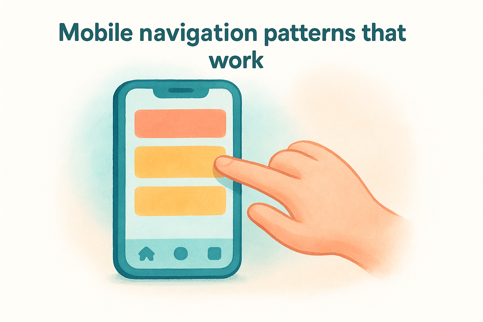
9. Simplify navigation for thumbs
Navigation that works on a desktop often fails completely on mobile. Menus with many items , small text links , and flyout dropdowns require precision that a finger simply can't match. When you think about how to make a website mobile friendly, your navigation structure needs the same attention as your layout and typography.
Mobile navigation patterns that work
Your default navigation approach on mobile should prioritize fewer choices and bigger targets . Most visitors on a phone have a specific goal in mind, so surface the two or three most important sections immediately rather than exposing every page in your sitemap at once. Bottom navigation bars work well for sites with a small core set of destinations because they keep primary links within easy thumb reach without requiring users to scroll back to the top of the page.
When to use a hamburger menu and when not to
The hamburger menu, the three-line icon that expands a full menu panel, is the most common mobile navigation pattern , but it hides your options behind an extra tap. Use it when you have more than four or five navigation items and there's no clean way to surface them all directly on screen. Avoid it when your site has two or three key actions that most visitors need. In that case, keep those links visible in a fixed top bar so users never have to hunt for them.
Hiding your most important link inside a collapsed menu adds friction at exactly the moment a visitor is deciding whether to stay or leave.
How to keep key actions easy to find
Pin your most critical call-to-action , such as a phone number, location finder, or booking button, to a fixed position on screen so it stays visible as visitors scroll. Sticky headers or bottom bars serve this purpose well and reduce the effort a mobile visitor needs to take the next step.
10. Make tap targets bigger and add spacing
Tap targets are any element a visitor touches to take action, including buttons, links, form fields, and navigation items . When these elements are too small or packed too closely together, visitors tap the wrong thing, get frustrated, and leave. Making targets large enough to hit accurately is a core part of understanding how to make a website mobile friendly without making users work for basic interactions.
Minimum sizes and spacing for touch
Google recommends a minimum tap target size of 48x48 pixels for any interactive element. That size matches the average adult fingertip contact area and gives visitors a comfortable margin to tap accurately on the first try. Space targets at least 8px apart so a missed tap on one element doesn't accidentally trigger its neighbor.
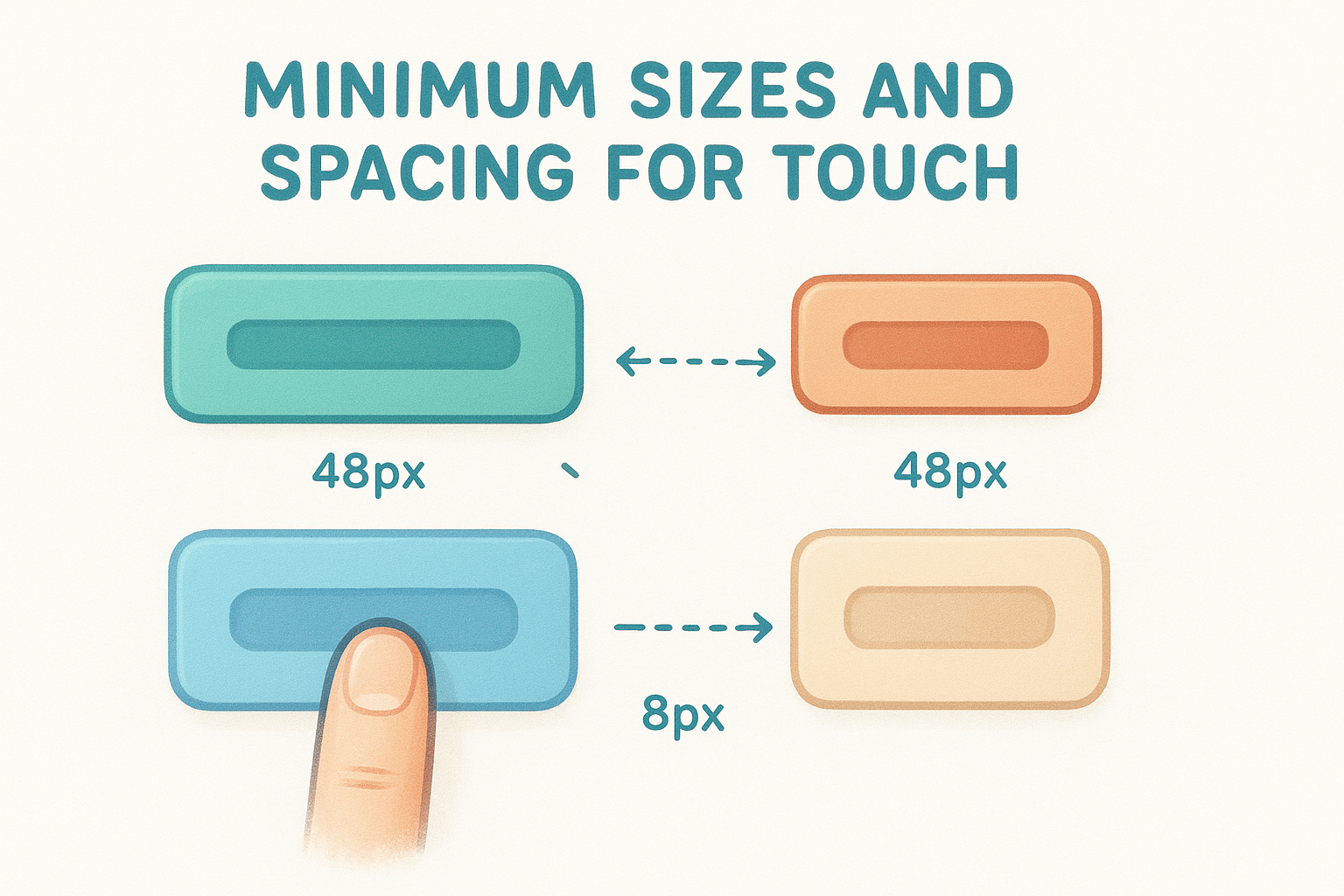
Google's own tools flag tap targets smaller than 48x48 pixels as a mobile usability error in Search Console.
Link and button design that prevents mis-taps
Use padding rather than fixed height and width to expand clickable areas without distorting your layout . A text link inside a navigation menu should have enough padding around it that the full surrounding area responds to a tap, not just the text characters themselves.
Avoid placing two tappable elements side by side with less than 8px of separation, especially on small phones where screen density varies. Giving buttons a visible background color and distinct shape also reduces mis-taps by making it immediately clear which elements are interactive.
Mobile-friendly tables and lists without tiny links
Tables on mobile frequently produce cramped, untappable links. If your table contains linked text in narrow columns , restructure the content as a vertical list or card layout instead. For lists with linked items, increase line height and padding so each item has enough vertical space to tap cleanly without triggering an adjacent row.
11. Use readable typography on small screens
Typography is easy to overlook when you're focused on layout and speed , but unreadable text on a phone is just as damaging as a broken layout. Visitors who can't read content without zooming leave immediately. Part of knowing how to make a website mobile friendly is setting type that works across every screen size.
Font sizing that avoids zooming and squinting
Set your base body font size to at least 16px on mobile. Anything smaller forces visitors to pinch and zoom, which breaks the reading flow. Headings should scale proportionally so the hierarchy stays clear on small displays. A starting point for most sites:
- Body text : 16px minimum
- H2 headings : 20px to 24px
- H1 headings : 24px to 32px
Line length, spacing, and contrast for mobile
Keep your line length between 45 and 75 characters on mobile for comfortable reading. Lines that run edge to edge on a phone screen tire the eye quickly. Set line-height to at least 1.5 for body text to give each line room.
Low contrast between text and background is one of the most common mobile accessibility failures, and it becomes worse in bright outdoor lighting conditions.
Your text-to-background contrast ratio should meet at least 4.5:1 to satisfy WCAG AA standards. That level keeps your content readable for most visitors regardless of screen brightness or light conditions.
Responsive type with rem, clamp, and viewport units
Use rem units for font sizes
so type scales with the user's browser settings instead of overriding them with fixed pixels. The CSS clamp()
function
sets a minimum, preferred, and maximum size in one declaration, removing the need for separate rules inside every breakpoint.
A practical example: font-size: clamp(1rem, 2.5vw, 1.25rem)
scales body text fluidly
between 16px and 20px based on viewport width, with no extra media queries
required.
12. Build forms that feel easy on mobile
Forms are where visitors take action, and a clunky form on a phone will stop that action cold. If you care about how to make a website mobile friendly , your forms need the same attention you give your layout and navigation. A contact form, booking request , or lead capture that feels painful to fill out on a small screen costs you real customers.
Shorten forms without losing lead quality
Every additional field you add to a form increases the chance a mobile visitor gives up before submitting. Audit each form and remove any field that doesn't directly help you follow up. For a lead form, name, phone number, and a single open question often capture everything you need without overwhelming someone tapping on a phone with one thumb.
Cutting a form from eight fields to four typically increases mobile completion rates more than any visual design change.
Use the right input types and autofill
HTML input types do more than structure your data. Setting type="email"
brings up a keyboard with the @ symbol already accessible
, while type="tel"
triggers a numeric keypad. These small choices remove friction for every visitor who fills out your form. Add the autocomplete
attribute
to common fields like name, email, and phone so browsers can pre-fill them automatically, which saves significant time for mobile users.
Mobile-friendly validation and error messages
Validation that waits until a visitor submits the form before flagging errors forces them to scroll back through every field to find the problem. Use inline validation that checks each field as the visitor moves to the next one. Keep error messages specific and placed directly below the problem field so there's no guessing about what needs to be fixed before they can submit.
13. Avoid intrusive pop-ups and broken overlays
Pop-ups that cover your entire screen on mobile do more than annoy visitors. They send a direct signal to Google that your page delivers a poor experience, and Google penalizes pages that use them aggressively in mobile search rankings. Understanding this is part of knowing how to make a website mobile friendly in a way that doesn't undercut your own SEO at the same time.
What Google and users hate on mobile
Google explicitly penalizes pages that show large interstitials immediately after a visitor arrives from search results. Visitors on phones have almost no tolerance for these barriers because dismissing a full-screen overlay on a small touch screen often requires tapping a tiny close button precisely. The specific formats Google flags include:
- Full-screen pop-ups that block all content on page load
- Overlays that require dismissal before the page becomes readable
- Standalone interstitials that push the main content far below the fold
Google's interstitials guidance treats intrusive pop-ups as a negative ranking signal specifically for mobile visitors arriving from search results.
Better alternatives to pop-ups on small screens
Replace full-screen overlays with smaller, less disruptive formats that still communicate your message. A sticky banner at the bottom of the screen keeps your offer visible while leaving the page content fully accessible. Inline content blocks placed naturally within the page flow also perform well because visitors encounter them while reading rather than being blocked before they've seen anything.
How to keep banners and chat widgets from blocking content
Chat widgets and promotional banners frequently overlap critical page content on narrow screens without anyone ever testing on an actual phone. Set explicit z-index and position values for these elements and verify them across multiple screen sizes before they go live. A widget covering your phone number or primary call-to-action button costs you conversions on every mobile visit.
Next steps
You now have a complete picture of how to make a website mobile friendly , from viewport tags and fluid grids to tap targets, typography, and intrusive overlays. Each tip in this list targets a specific failure point that costs real businesses real customers every day. Start by testing your current site on Google PageSpeed Insights and Search Console to identify which issues are already hurting your rankings and user experience.
If you run multiple locations, applying all thirteen of these improvements across every location page takes significant time and technical knowledge. Most business owners do better by focusing on operations and handing the technical work to people who do it daily. Multi Web Team builds and manages mobile-optimized websites specifically for multi-location businesses and franchises, handling everything from responsive design to ongoing updates under one subscription. If you want a site that works correctly on every screen without managing it yourself, see what Multi Web Team offers.