Landing Page Conversion: How To Optimize A Landing Page
You're sending traffic to a landing page, but the conversions aren't there. Clicks come in, visitors leave, and you're left wondering what went wrong. The problem usually isn't your offer, it's the page itself. Knowing how to optimize a landing page can be the difference between a page that collects dust and one that consistently turns visitors into customers .
For multi-location businesses and franchises, this challenge multiplies. Each location may need its own landing pages for local promotions, seasonal campaigns, or service-specific offers. A single poorly optimized page doesn't just cost you one conversion, it costs you dozens across every market you serve. That's exactly why at Multi Web Team, we build and manage landing pages designed to perform , not just look good, for businesses operating across multiple locations and territories .
This guide breaks down the full process of optimizing a landing page for higher conversions. You'll learn how to sharpen your messaging, structure your layout for action, speed up load times, write calls-to-action that actually get clicked, and test your way to measurable improvements . Every recommendation here comes from principles we apply daily when building and managing websites for franchise and multi-location clients. Whether you're building your first landing page or reworking one that's underperforming, this is the playbook to get it right .
What landing page optimization means and what to measure
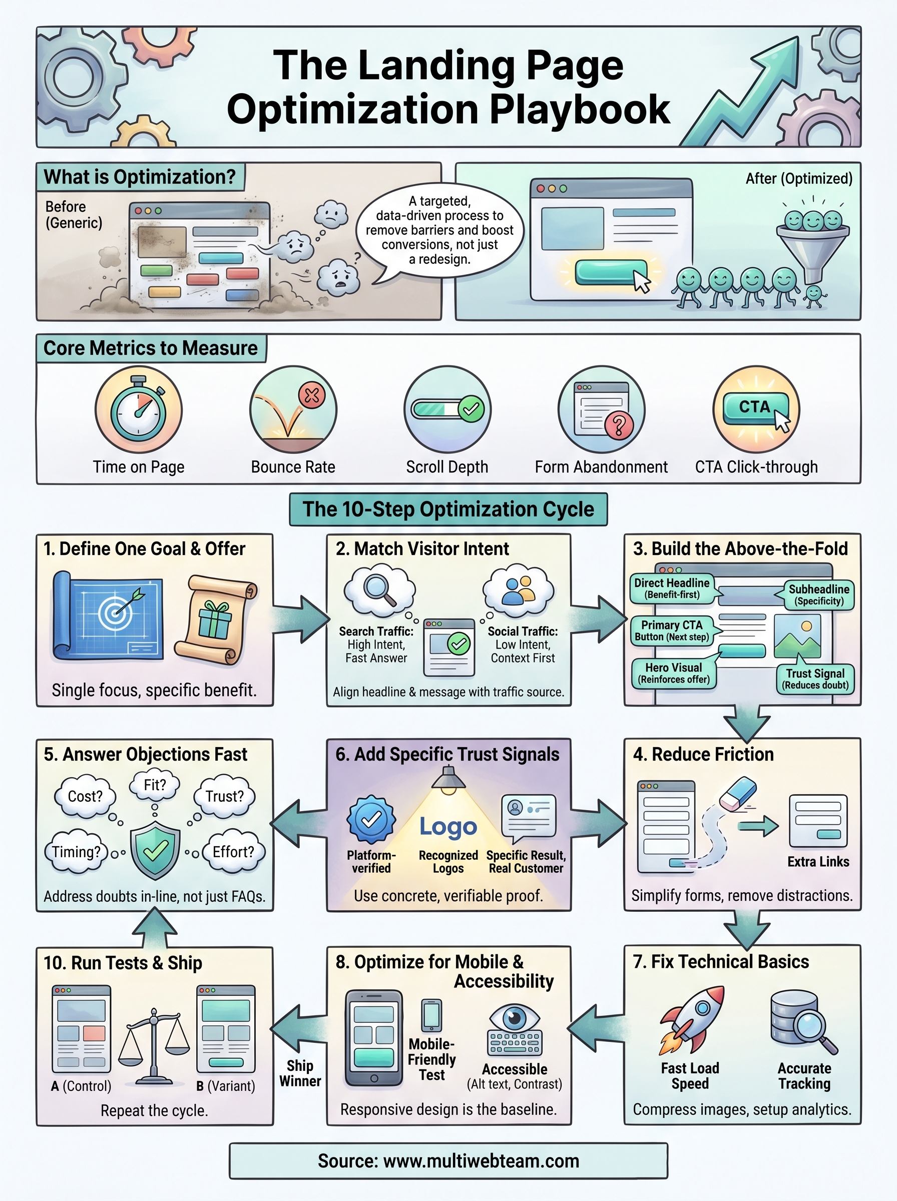
Landing page optimization is the process of making deliberate, data-driven changes to a page so more visitors complete a specific target action . That action might be filling out a form, calling a phone number, booking an appointment, or buying a product. The goal isn't to make the page prettier. The goal is to remove every barrier between your visitor and that one action.
Many businesses confuse optimization with redesign. Redesign is a visual overhaul. Optimization is a targeted, repeatable process of identifying what stops visitors from converting and fixing it systematically. Understanding how to optimize a landing page starts with accepting that most pages fail for functional reasons, not aesthetic ones. You can apply optimization to an existing page without touching the design at all.
What optimization actually changes
Optimization touches every element that influences a visitor's decision. That includes your headline , which is usually the first thing someone reads, along with the subheadline, the main call-to-action button, the form length, the images, the social proof you display, the page load speed, and even the order in which information appears. Each of these elements either helps visitors move forward or gives them a reason to leave.
The most impactful optimizations are rarely the most obvious ones. A single change to a headline or button label can shift conversion rates in ways a full visual redesign never could.
Changing everything at once makes it impossible to know what actually worked . A structured approach focuses on one variable at a time , measures the result, and builds on what you learn. That's the only way to accumulate real knowledge about your audience.
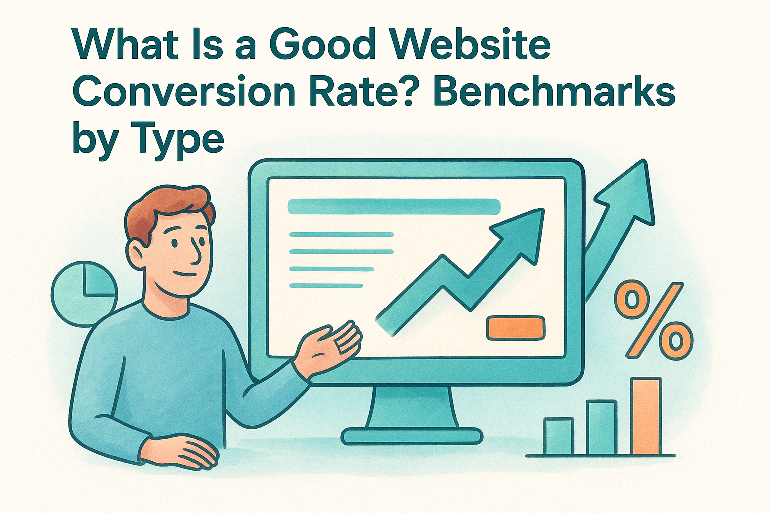
The metrics that tell you if it's working
Before you make any changes, you need to know what to measure. Without clear metrics, you have no way to confirm whether your changes helped or hurt performance. The table below covers the core metrics every landing page should track from day one.
| Metric | What it measures | Why it matters |
|---|---|---|
| Conversion rate | Percentage of visitors who complete the goal | Your primary indicator of page success |
| Bounce rate | Percentage who leave without any interaction | High bounce often signals a mismatch between ad and page |
| Time on page | How long visitors stay | Low time suggests messaging isn't holding attention |
| Scroll depth | How far down visitors scroll | Shows whether key content is actually being seen |
| Form abandonment rate | Visitors who start but don't submit a form | Points to friction in your form or offer |
| Click-through rate on CTA | How often the main button gets clicked | Measures headline and offer strength together |
Your conversion rate is the headline number, but it doesn't tell the full story on its own. If visitors scroll past your CTA without clicking, that's a layout problem. If they abandon your form halfway through, that's a friction problem. If they bounce in under five seconds, that's a messaging or targeting mismatch . Tracking all of these metrics together gives you a complete picture of where your page is losing people and what to fix first.
Step 1. Choose one conversion goal and one offer
Every landing page that fails to convert has one thing in common: it asks visitors to do too many things at once . When you give someone four options, you dilute the page's focus and split their attention. Knowing how to optimize a landing page starts with a single decision: pick one goal and build everything around it. That means one primary call-to-action, one offer, and one path forward for the visitor.
How to define your conversion goal
Your conversion goal is the specific action you want a visitor to take when they land on your page. Before you write a single word of copy or design a single element, write your goal down in one clear sentence . If you can't say it in one sentence, the goal isn't defined well enough yet.
A page that chases multiple goals converts worse than a page with a single focused purpose, every time.
Here are the most common landing page goals and what each one requires:
| Goal | Primary action | Key page element |
|---|---|---|
| Lead generation | Form submission | Short form, strong offer |
| Phone inquiry | Click-to-call | Prominent phone number |
| Appointment booking | Calendar booking | Embedded scheduler |
| Product purchase | Add to cart / buy now | Product detail, clear price |
| Event registration | Sign-up form | Date, benefit summary |
Choose one row from this list and commit to it before you touch anything else on the page.
How to define your offer
Your offer is what the visitor gets in exchange for completing your goal. Weak offers produce weak conversion rates, no matter how well the rest of the page is built. A strong offer is specific, tangible, and low-risk for the visitor.
Use this template to draft your offer statement before writing any page copy:
 We help [target visitor] get [specific result]
by [method or service], with [risk reducer].
Example: We help first-time gym members get a free 7-day trial
with no credit card required.
Once you have this statement locked in , every headline, subheadline, and CTA on your page should reinforce it directly. A tight offer keeps your page focused on one outcome and gives visitors a clear reason to act.
Step 2. Match the page to visitor intent and traffic source
The visitor who clicks a Google ad is in a completely different mindset than someone who clicks a link in a follow-up email. Each traffic source carries its own level of awareness and intent signal , and your landing page needs to match both. A page built for cold social traffic will underperform with warm search traffic, and vice versa. Sending mismatched traffic to a generic landing page is one of the clearest ways to lose conversions that were already within reach.
How traffic source shapes what your page needs to do
Different sources deliver visitors at different points in the decision process. Paid search visitors already searched for something specific, so they arrive with high intent and low patience . They want fast confirmation that your page delivers what they searched for. Social traffic, by contrast, often arrives with curiosity but no firm commitment . Those visitors need more context and a softer opening before they're ready to act.
| Traffic source | Visitor mindset | Page priority |
|---|---|---|
| Paid search (Google Ads) | High intent, solution-focused | Match headline to ad copy exactly |
| Organic search (SEO) | Research-oriented | Answer the search query directly |
| Social media (paid or organic) | Low intent, browsing | Lead with the problem, build context first |
| Email campaign | Warm, familiar with brand | Reference the email offer explicitly |
| Referral / partner site | Moderate intent, trust borrowed | Acknowledge the source, build on that trust |
Aligning copy to visitor intent
One of the most actionable parts of knowing how to optimize a landing page is applying message match. Message match means your headline mirrors the exact language your visitor used or saw right before they landed on your page. If your Google ad says "Local HVAC Repair, Same Day Service," your headline should reflect that promise directly, not open with something generic.
Mismatched messaging between an ad and a landing page is one of the fastest ways to lose a visitor who was already ready to convert.
Use this template to audit your current message match before making any copy changes:
 Traffic source: [Google Ads / Email / Social / Organic]
Ad or link text: [copy from ad, email, or referring page]
Page headline: [your current headline]
Match score: Strong / Partial / None
Fix: Rewrite the headline to reflect the exact promise made at the source.
Run this check for every traffic source sending visitors to the page.
Step 3. Build an above-the-fold section that converts
The above-the-fold section is the first thing visitors see before they scroll. It occupies the screen space that loads immediately, giving you roughly three seconds to convince someone to stay. If this section fails, the rest of the page rarely gets a chance. Every decision you make about headline placement, visuals, and the call-to-action button needs to start here, not halfway down the page.
The five elements your above-the-fold section needs
When you think about how to optimize a landing page , this section deserves more attention than any other. Five core elements work together to create an above-the-fold section that holds attention and drives action: a direct headline , a supporting subheadline, a primary CTA button, a relevant visual, and a brief trust signal. Each element has a specific job, and when one is missing or weak, the whole section suffers.
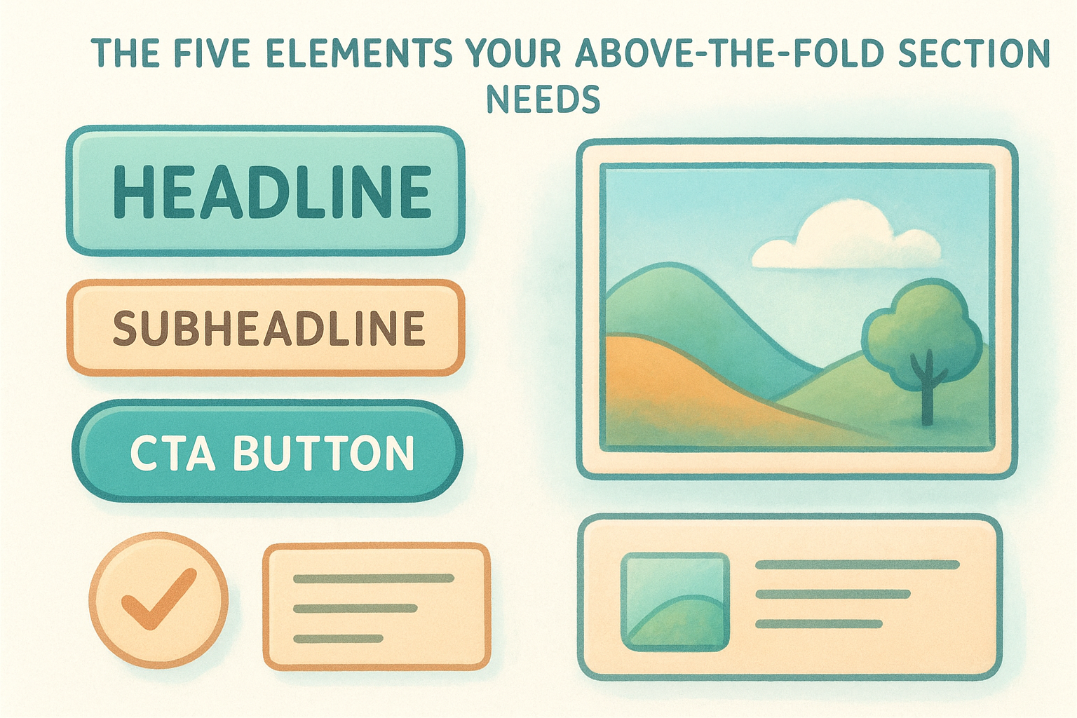
| Element | Purpose | What to avoid |
|---|---|---|
| Headline | State the core benefit clearly | Vague or clever phrasing |
| Subheadline | Add specificity or remove doubt | Repeating the headline |
| CTA button | Give visitors the next step | Weak labels like "Submit" |
| Hero visual | Reinforce the offer visually | Generic stock photos |
| Trust signal | Reduce hesitation immediately | Long testimonial blocks |
Your headline carries the most weight of any element on the page. If it doesn't match what the visitor expected, nothing else on the page will save the conversion.
How to write a headline that gets visitors to stay
Your headline needs to answer one question in under ten words : what does the visitor get? Lead with the outcome or benefit, not your company name or a clever slogan. Use the offer statement you built in Step 1 as your starting point, then strip it down to its core promise.
Use this template to draft your above-the-fold headline and subheadline:
 Headline: Get [specific result] [timeframe or qualifier]
Subheadline: [Who it's for] + [how it works] + [risk reducer]
Example:
Headline: Get a Custom Website Built for Your Franchise in 30 Days
Subheadline: Built for multi-location businesses, managed monthly,
no large upfront fees.
Test your headline by reading it aloud. If it takes more than one read to understand the offer, rewrite it. Clarity always beats creativity when the goal is conversion.
Step 4. Remove distractions and reduce friction
Every element on your landing page that doesn't support the conversion goal is actively working against it. Navigation menus, sidebar links, unrelated offers, and auto-playing videos all pull your visitor's attention away from the single action you want them to take. When you think about how to optimize a landing page , removing friction means making the path to conversion as short and obstacle-free as possible. Visitors don't leave because your offer is bad; they leave because something on the page gave them a reason to stop.
The more choices you give a visitor on a landing page, the less likely they are to complete the one that matters.
What counts as friction on a landing page
Friction is any element that slows a visitor down , creates doubt, or introduces a new decision before they complete your goal. It shows up in obvious places like long forms with unnecessary fields, but it also hides in subtler spots like multiple competing CTA buttons or dense, unbroken paragraphs. Use this checklist to identify friction points on your current page:
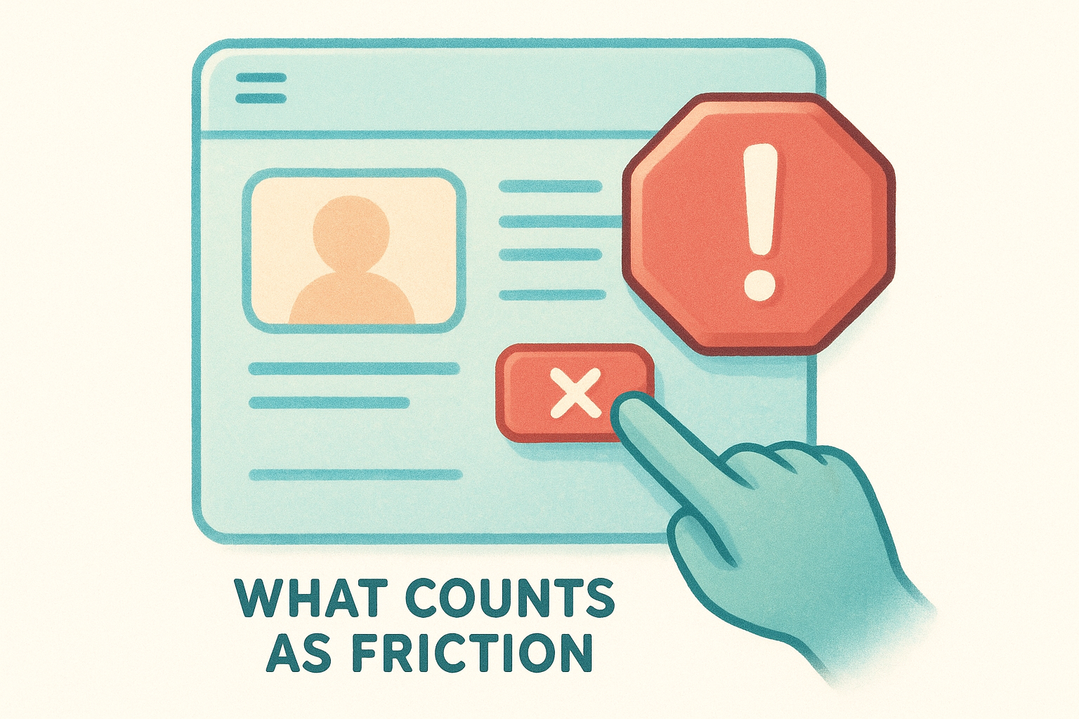
- Navigation bar or header menu linking to other pages
- More than one primary CTA button using different labels
- Form fields asking for information you don't immediately need
- Pop-ups that interrupt before the visitor has read the page
- Testimonials or content sections unrelated to the specific offer
- Walls of text with no visual breaks or subheadings
- Outbound links that take visitors off the page before they convert
How to simplify your form
Your form length directly controls your conversion rate . Every field you add gives someone a new reason to abandon the process. For most lead generation landing pages, three fields is the ceiling : name, email, and one qualifying question at most. If your sales process requires more information, collect it after the initial conversion, not before it.
Use this template to audit and trim your current form:
 Current fields: [list every field on your form]
Required for first contact: [which fields do you actually need?]
Fields to remove: [everything not required for first contact]
Post-conversion fields: [move remaining fields to a follow-up step]
Cut your form down to only what you need to start the conversation , and move everything else to a second step or a follow-up.
Step 5. Write copy that answers objections fast
Every visitor who lands on your page carries unspoken doubts before they convert. These objections form silently: "Is this too expensive?" "Will this actually work for my situation?" "Can I trust this company?" Knowing how to optimize a landing page means getting ahead of those doubts before they push someone toward the back button. Your copy needs to address the most common objections directly, in plain language, without burying the answers in fine print or a separate FAQ section.
The objections your page needs to answer
Most landing pages ignore objections entirely, leaving visitors to resolve their doubts on their own, which usually means they leave. The concerns your visitors carry depend on your specific offer, but five objection categories appear on almost every landing page regardless of industry .
| Objection | What the visitor is thinking | How to address it |
|---|---|---|
| Cost | "This is probably too expensive" | Name the price or frame it against the cost of doing nothing |
| Fit | "This might not work for my situation" | Specify exactly who the offer is designed for |
| Trust | "I don't know this company" | Add a customer result or a recognizable credential |
| Timing | "I'm not ready to decide right now" | Create urgency through limited availability or a deadline |
| Effort | "This will take too much of my time" | Quantify how simple the process is in three steps or fewer |
Leaving objections unanswered on your page doesn't protect the visitor from doubt; it guarantees they leave with it unresolved.
How to write objection-handling copy
Place objection-handling language directly in your subheadlines, bullet points, and body copy, not in a generic FAQ section buried at the bottom. Use a short statement that names the concern and immediately answers it in the same line, so visitors never have to go looking for reassurance.
Use this template to write copy that removes specific doubts in-line:
 Objection: [What the visitor fears]
Copy response: [Direct one-sentence answer]
Example:
Objection: "I don't want a long contract."
Copy response: "No long-term contracts. Cancel any month, no questions."
Write one response for each of the five objection categories listed above, then place each one near the section of your page where that specific doubt is most likely to surface , not grouped together at the end.
Step 6. Add trust signals without clutter
Visitors who don't trust your page won't convert, regardless of how strong your offer is. Trust signals close that gap by giving visitors external evidence that your claims are real and your business is legitimate. The challenge is that too many trust signals, placed without purpose, create visual noise that competes with your CTA instead of supporting it. When you think about how to optimize a landing page, the goal is to place the right trust signal in the right spot, not to collect every badge and testimonial you own and stack them in a row.
A single specific customer result placed near your CTA does more to build trust than ten generic five-star reviews displayed in a carousel.
The trust signals that convert without crowding the page
Not all trust signals carry the same weight on a landing page. Specific results from real customers outperform vague praise every time. A testimonial that says "We got 40 new leads in our first month" is far more persuasive than "Great service, highly recommend." Choose trust signals that are concrete, verifiable, and directly relevant to the offer on the page.
| Trust signal type | Strongest form | Weakest form |
|---|---|---|
| Customer testimonial | Specific result with name and company | Anonymous quote with no detail |
| Rating or review | Platform-verified score (Google, Yelp) | Self-reported star rating |
| Logo proof | Recognized brand logos you've worked with | Generic icons with no context |
| Certification or credential | Industry-recognized, linked to source | Unverified badge with no origin |
| Guarantee | Specific terms stated plainly | Vague "satisfaction guaranteed" claim |
How to place trust signals on the page
Placement determines whether a trust signal reduces doubt at the right moment or disappears into the scroll. Position your strongest testimonial directly above or below your primary CTA, where hesitation is highest. Place a guarantee statement or risk reducer just below your form or button, not in the footer where nobody sees it.
Use this template to map your trust signals before placing them:
 Trust signal: [type and specific content]
Doubt it addresses: [cost / fit / trust / timing / effort]
Placement: [above CTA / below form / near price / hero section]
Run this for each trust signal you plan to include. Remove any that don't address a specific doubt your visitor carries, because a trust signal that maps to no clear objection adds clutter, not confidence.
Step 7. Fix speed, tracking, and technical basics
A landing page with strong copy and a clear offer will still underperform if the technical foundation is broken . Slow load times drive visitors away before your headline even renders. Missing tracking means you're running blind when you try to measure results. Understanding how to optimize a landing page requires fixing these basics before you run a single test, because every optimization you ship after this point depends on fast load times and reliable data.
How page speed affects conversion rate
Page speed is not a secondary concern. Research from Google shows that as page load time increases from one second to three seconds, the probability of a visitor bouncing increases by 32 percent . For landing pages running paid traffic, that's money spent delivering visitors who never see your offer. Every extra second of load time costs you conversions directly.
Cutting your load time from four seconds to two seconds can have a bigger impact on conversion rate than any copy or design change you make.
Use this checklist to identify and fix the most common speed issues on your page:
- Compress all images using a tool like Google's Squoosh before uploading
- Remove any third-party scripts that don't directly support the conversion goal
- Enable browser caching so returning visitors load the page faster
- Use a content delivery network (CDN) if your audience spans multiple regions
- Defer non-critical JavaScript so it loads after the main page content
What to set up in your tracking before you test anything
You cannot improve what you cannot measure. Before you change a single element on your page, confirm that your conversion tracking and analytics are recording accurately . A misconfigured goal in Google Analytics will produce data that sends you in the wrong direction for every test that follows.
Use this tracking setup template to confirm your baseline is in place:
 Conversion goal: [form submission / call click / booking]
Tracking tool: [Google Analytics 4 / Google Tag Manager]
Goal trigger: [URL destination / button click event]
Confirmation: Test and verify a live conversion fires correctly
Baseline period: Record 14 days of data before making changes
Lock in this setup before you touch anything else on the page.
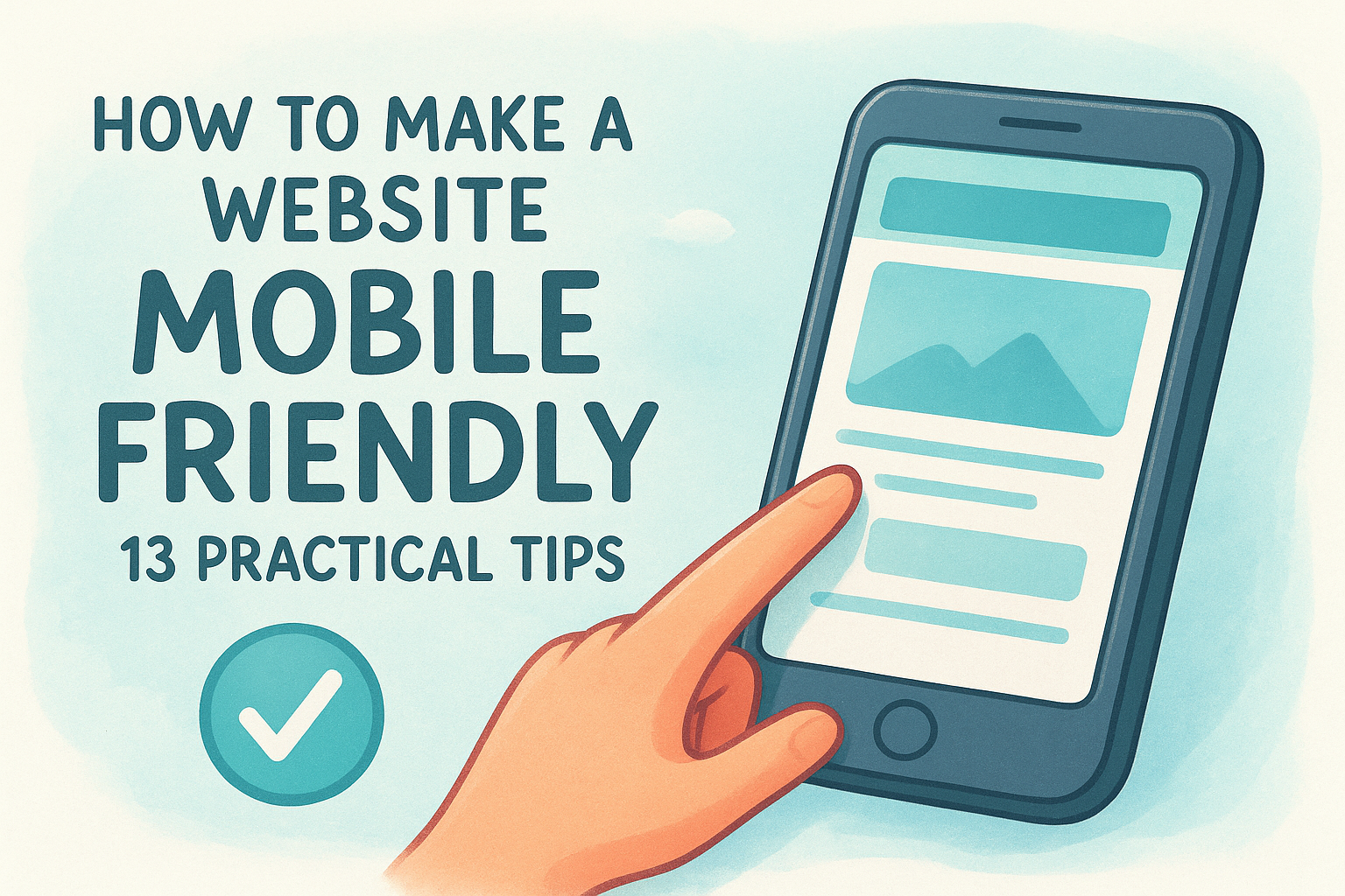
Step 8. Optimize for mobile and accessibility
More than half of all web traffic now arrives on a mobile device , which means your landing page needs to perform just as well on a phone screen as it does on a desktop. Part of knowing how to optimize a landing page is treating mobile not as an afterthought but as the primary context your visitors experience. A form that renders broken on a small screen or a CTA button that's too small to tap will kill conversions that your copy and offer already earned.
A landing page that loads and functions correctly on mobile is not a bonus feature; it is the baseline expectation for every visitor arriving from a smartphone.
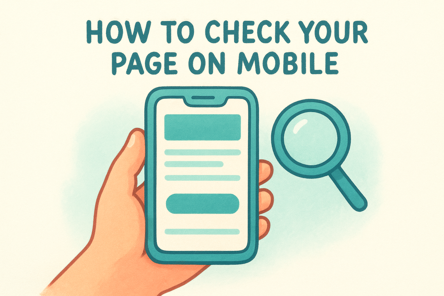
How to check your page on mobile
You don't need a device lab to audit your page's mobile experience . Google's Mobile-Friendly Test at search.google.com/test/mobile-friendly gives you an immediate report on whether your page renders correctly on small screens. Run your page through this tool before you touch anything else, and use the output as your starting checklist. Pay particular attention to tap target sizes and text scaling , since these two issues account for the majority of mobile conversion failures.
Work through these core mobile checks on your current page:
- CTA button is at least 44 pixels tall and easy to tap without zooming
- Font size is at least 16 pixels for body text so visitors don't need to pinch to read
- Form fields expand to full width on small screens and don't require horizontal scrolling
- Images scale correctly without overflowing the viewport
- No content is blocked by pop-ups that cover the full screen on mobile
Making your page accessible to all visitors
Accessibility means your page works for visitors who use screen readers, keyboard navigation, or other assistive tools. Beyond being the right approach, accessible pages also tend to load faster and rank better because they follow clean, structured code practices. Add descriptive alt text to every image, use clear label elements on all form fields, and ensure your color contrast meets the minimum ratio of 4.5:1 for body text as defined in the Web Content Accessibility Guidelines. Skipping accessibility basics costs you real visitors and creates legal risk for businesses operating in regulated industries.
Use this template to confirm your accessibility basics before launch:
 Alt text: Added to all images [yes / no]
Form labels: Each field has a visible label [yes / no]
Color contrast: Body text meets 4.5:1 ratio [yes / no]
Keyboard navigation: CTA reachable without a mouse [yes / no]
Step 9. Find leaks with analytics and user behavior data
Optimization without data is guesswork. Before you change headlines, rewrite copy, or restructure your layout, you need to know where visitors are dropping off and what behavior is happening before they leave . Part of knowing how to optimize a landing page is recognizing that analytics tools tell you what visitors do in aggregate, while behavior tools like heatmaps and session recordings show you the individual moments where a page loses someone. Together, these two data sources give you a clear map of exactly where your page is leaking conversions.
Numbers tell you that a problem exists; behavior data tells you where on the page it lives.
Where to look for conversion leaks
Your analytics dashboard holds the signals you need, but you have to know which patterns point to a real problem versus normal variation. High bounce rates combined with low time-on-page point to a messaging mismatch at the top of the page. High scroll depth with low CTA clicks suggests your offer or button copy isn't compelling enough to generate action even when visitors are engaged. Use Google Analytics 4 to pull these reports for your specific landing page URL and compare them against the baseline data you recorded in Step 7.
Look for these specific leak patterns in your data:
- Bounce rate above 70% with session time under 30 seconds: messaging mismatch or slow load
- Scroll depth dropping off before the CTA: key content is positioned too far down the page
- Form views high but submissions low: friction exists inside the form itself
- CTA button visible but click rate under 2%: weak button label or surrounding copy
How to read behavior data alongside your metrics
Behavior data layers visual context on top of your numbers so you can see exactly where visitors stop engaging. Heatmaps show which sections of the page receive the most attention and which go completely ignored. Session recordings reveal moments where visitors hover, hesitate, or repeatedly click something that isn't a link. Use this data to identify the specific page element causing the drop-off, then prioritize that fix before running any formal tests.

Use this template to document what you find before taking action:
 Leak identified: [specific behavior or metric]
Data source: [Google Analytics / heatmap / session recording]
Page element affected: [headline / form / CTA / section]
Hypothesis: [why this is causing the drop-off]
Proposed fix: [one change to test]
Step 10. Run tests and ship a repeatable process
All the changes you've made through Steps 1 to 9 give you a stronger page, but without structured testing , you're still making educated guesses. The only way to know whether a change improved your conversion rate is to measure it against the version it replaced, under the same conditions, with real traffic. That is the core logic behind A/B testing, and it's the step that separates one-time fixes from a compounding optimization system .
How to set up and run an A/B test
Running a valid A/B test means changing one element at a time and splitting your traffic evenly between the original version (the control) and the new variant . Test your headline before your button label. Test your button label before your form length. When you change multiple elements at once, you lose the ability to identify which change drove the result.
A test that runs for fewer than two weeks or fewer than 100 conversions per variant does not produce reliable data, regardless of what the numbers appear to show.
Use this template to structure each test before you run it:
 Test name: [element being tested]
Control: [current version]
Variant: [new version]
Hypothesis: [why you expect the variant to perform better]
Primary metric: [conversion rate / CTA click rate / form submissions]
Minimum sample: 100 conversions per variant
Minimum duration: 14 days
Result: [winner / no significant difference]
Next action: [ship the winner / run a follow-up test]
Building a repeatable optimization process
A single successful test is useful. A systematic process that runs continuously is what actually moves your conversion rate over time. When you treat how to optimize a landing page as an ongoing cycle rather than a one-time project, every test you complete teaches you something about your audience that informs the next one.
Run this four-step cycle after every test concludes:
- Review the data and confirm statistical significance before drawing any conclusions
- Ship the winning variant as your new control
- Document what you learned and why it worked
- Prioritize the next element to test based on your leak analysis from Step 9
Repeating this cycle consistently is what builds a landing page that improves itself over time rather than one that sits static after launch.
Next steps to keep improving
You now have a complete framework for how to optimize a landing page , from defining a single conversion goal to running structured A/B tests. The steps work together as a system , and the results compound when you apply them in order rather than jumping to whichever fix seems easiest.
Your next move is to pick the one step that addresses your biggest current leak and start there. Don't wait until every element is perfect before launching a test. Improvement happens through iteration , not through planning, and every test you run teaches you something specific about your audience that no checklist can predict in advance.
If you manage multiple locations and need landing pages built to convert from day one , Multi Web Team handles design, optimization, and ongoing management so you can focus on running your business instead of troubleshooting underperforming pages.